Heaven knows if this campaign will actually offer anything we haven't already over the last 25 years. What would be really nice is seeing the characters, I don't know, LOOKING at each other in the promotional material instead of just staring into the great beyond. But we'll see.
Disney Princesses Got a Makeover
-
PatchofBlue

- Anniversary Edition
- Posts: 1005
- Joined: Tue Feb 28, 2023 3:30 pm
- Gender: Male
Re: Disney Princesses Got a Makeover
Heaven knows if this campaign will actually offer anything we haven't already over the last 25 years. What would be really nice is seeing the characters, I don't know, LOOKING at each other in the promotional material instead of just staring into the great beyond. But we'll see.
-
Disney Duster

- Ultimate Collector's Edition
- Posts: 14160
- Joined: Fri Jun 17, 2005 6:02 am
- Gender: Male
- Location: America
Re: Disney Princesses Got a Makeover
I don't mind the shading either.
The Princesses did all look at and interact with each other (even hug!) in the Ultimate Princess campaign.
The Princesses did all look at and interact with each other (even hug!) in the Ultimate Princess campaign.

-
Thumper_93

- Anniversary Edition
- Posts: 1148
- Joined: Mon Aug 01, 2011 7:51 am
- Location: Phantom Manor
Re: Disney Princesses Got a Makeover
So tired about the same artworks over and over. They look really weird with this new “style”. They tried this years ago in some merchandise released for Disney store and it looks as bad as it looks today. They have enough money to change the clip arts each 2 years.


Re: Disney Princesses Got a Makeover
I really like Cinderella's transformation like pose. The other one where she's holding the slipper on a finger, with that goofy smile is so unlike her.

If it's not baroque, don't fix it.
-
blackcauldron85

- Ultimate Collector's Edition
- Posts: 16714
- Joined: Sat Jun 17, 2006 7:54 am
- Gender: Female
- Contact:
Re: Disney Princesses Got a Makeover
Except for the top picture, Cinderella looks off in the other pictures. Like, that face does not look like Cinderella. And the picture with Aurora; her face is kind of off-model, too.

-
Sotiris

- Ultimate Collector's Edition
- Posts: 21468
- Joined: Sat Sep 23, 2006 3:06 am
- Gender: Male
- Location: Fantasyland
Re: Disney Princesses Got a Makeover
Disney Princess - Create Your World: Voices of Belle, Ariel, Tiana, and Jasmine
https://www.youtube.com/watch?v=RfOImtMvQ1s
Live Blog – “Disney Princess: Create Your World” Event
https://www.laughingplace.com/w/disney- ... rld-event/
Iconic Voices of Disney Princesses Ariel, Tiana, Belle and Jasmine On Their Favorite Fan Moments, Advice for Young Creatives
https://www.hollywoodreporter.com/lifes ... 235963927/


-
Disney Duster
- Ultimate Collector's Edition
- Posts: 14160
- Joined: Fri Jun 17, 2005 6:02 am
- Gender: Male
- Location: America
Re: Disney Princesses Got a Makeover
What transformation like pose? You mean like when she looks in the water fountain?
Re: Disney Princesses Got a Makeover
This is the one I mean, Duster. Yeah, I guess it's when she looks at her reflexion in the water.

If it's not baroque, don't fix it.
-
Disney Duster
- Ultimate Collector's Edition
- Posts: 14160
- Joined: Fri Jun 17, 2005 6:02 am
- Gender: Male
- Location: America
-
Thumper_93
- Anniversary Edition
- Posts: 1148
- Joined: Mon Aug 01, 2011 7:51 am
- Location: Phantom Manor
-
Disney Duster
- Ultimate Collector's Edition
- Posts: 14160
- Joined: Fri Jun 17, 2005 6:02 am
- Gender: Male
- Location: America

Re: Disney Princesses Got a Makeover
Iconic Voices of Disney Princesses Ariel, Tiana, Belle and Jasmine on Their Favorite Fan Moments, Advice for Young Creatives
Jodi Benson, Anika Noni Rose, Paige O'Hara and Linda Larkin were on hand to celebrate the House of Mouse's new "Create Your World" campaign highlighting Disney royal characters.
-
Sotiris
- Ultimate Collector's Edition
- Posts: 21468
- Joined: Sat Sep 23, 2006 3:06 am
- Gender: Male
- Location: Fantasyland
Re: Disney Princesses Got a Makeover
From a Japanese exhibit for the 'Create Your World' campaign.


Source: https://x.com/naturalBLUE/status/1828295504649662575
Source: https://x.com/naturalBLUE/status/1828295504649662575
-
Disney's Divinity

- Ultimate Collector's Edition
- Posts: 16407
- Joined: Thu Mar 17, 2005 9:26 am
- Gender: Male
Re: Disney Princesses Got a Makeover
The best thing about those is seeing all their names written with their original logo style. I mean, we'd seen a lot of them already (including Tiana because of the TV series being made), but nice to see it for Aurora, Belle, Ariel, etc.

Listening to most often lately:
Christina Aguilera ~ "Cruz"
Sombr ~ "homewrecker"
Megan Moroney ~ "Beautiful Things"
-
Disney Duster
- Ultimate Collector's Edition
- Posts: 14160
- Joined: Fri Jun 17, 2005 6:02 am
- Gender: Male
- Location: America
Re: Disney Princesses Got a Makeover
I like seeing their names like that, too, Divinity. But the best thing to me was seeing the artwork. Cinderella's colors are correct and she is extremely on-model, as is her castle, probably because they heavily used a pose of Cindy from the film ("A wonderful dream come true!" twirl). Except Ariel and Aurora look off-model to me.
-
Thumper_93
- Anniversary Edition
- Posts: 1148
- Joined: Mon Aug 01, 2011 7:51 am
- Location: Phantom Manor
Re: Disney Princesses Got a Makeover
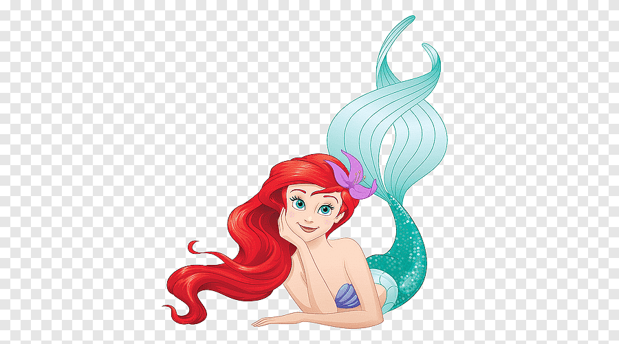
This Ariel artwork is really weird. One of the worst used by them. The other one that I don't like is the one that she's holding a starfish covering her face.Disney Duster wrote: ↑Wed Aug 28, 2024 10:12 pm I like seeing their names like that, too, Divinity. But the best thing to me was seeing the artwork. Cinderella's colors are correct and she is extremely on-model, as is her castle, probably because they heavily used a pose of Cindy from the film ("A wonderful dream come true!" twirl). Except Ariel and Aurora look off-model to me.
-
Disney Duster
- Ultimate Collector's Edition
- Posts: 14160
- Joined: Fri Jun 17, 2005 6:02 am
- Gender: Male
- Location: America
-
Thumper_93
- Anniversary Edition
- Posts: 1148
- Joined: Mon Aug 01, 2011 7:51 am
- Location: Phantom Manor

-
carolinakid
- Collector's Edition
- Posts: 2048
- Joined: Sun Jun 08, 2008 9:58 am
- Gender: Male
- Location: New Jersey but soon to be Florida!
Re: Disney Princesses Got a Makeover
The starfish Ariel makes me think of how they draw Betty, Veronica, Sabrina or Josie from Archie Comics.
-
Thumper_93
- Anniversary Edition
- Posts: 1148
- Joined: Mon Aug 01, 2011 7:51 am
- Location: Phantom Manor
Re: Disney Princesses Got a Makeover
She looks like on of these characters, that's true.carolinakid wrote: ↑Fri Aug 30, 2024 2:34 am The starfish Ariel makes me think of how they draw Betty, Veronica, Sabrina or Josie from Archie Comics.
What I can't understand is how Disney give a positive feedback to the second artwork that I posted. It's off model and she looks really weird in this cipart. Don't know who designed it but it's one of the ugliest Ariel's artwork that I've ever seen.