Sleeping Beauty Confirmed for DVD AND BLU-RAY in 2008 !!!

All topics relating to Disney-branded content.
Locked
User avatar
REINIER
Anniversary Edition
Posts: 1026
Joined: Tue Jul 31, 2007 3:15 am
Location: NETHERLANDS, THE

Post by REINIER »

I might be mistaken but the left series seem so much clearer to me than the right?????
Seems to me left is 2008 material, just watch closely.
Then again I might be mistaken off course :D
When it comes to brains, I got the lion-share,
but when it comes to bruth strength, I'm afraid I'm at the shallow end of the gene pool
Image
User avatar
Disney's Divinity
Ultimate Collector's Edition
Posts: 16239
Joined: Thu Mar 17, 2005 9:26 am
Gender: Male

Post by Disney's Divinity »

Yeah, the lines seem much more defined in the SE, but I really like the color in the PE. Everything just seems warmer, more earthy and in contrast to the more menacing, sickly Maleficent. It does seem almost like an entirely different film to me.
Image
Listening to most often lately:
Taylor Swift ~ ~ "The Fate of Ophelia"
Taylor Swift ~ "Eldest Daughter"
Taylor Swift ~ "CANCELLED!"
User avatar
Disney Duster
Ultimate Collector's Edition
Posts: 14019
Joined: Fri Jun 17, 2005 6:02 am
Gender: Male
Location: America

Sleeping Beauty: Platinum Edition

Post by Disney Duster »

NOTE ON THE SCREENCAPS: The ones on the left, of the SE, are taken from the DVD. The ones on the right, the PE, are taken from the internet. Thus, the ones on the right with the new restoration will not be the best example of what it really looks like.

However...I am very, very worried about the thinner/disappearing lines I'm noticing, just like with Cinderella's restoration...but there aren't color issues, except some paleness.

Disneykid Thank you for the screencaps, and you know how much your opinion matters to me. For Merryweather being cut in half, I guess you're right, the new ratio will show her. Actually, the newly restored pink dress makes me like it better than the blue dress (well, sometimes, it depends on the shot, I prefer the blue dress when it's purpley), a testament to the amazingness of the restoration, but also bringing up again the question of how different the film should look. I really don't like the blonder Aurora in the blue-eyed close-up. That really doesn't look right. But another thing this restoration (specifically your screencaps) did for me is notice Aurora's hand glows with the green light of the curse, another indication Aurora was forced to touch it and no matter what you do, you can't escape fate (you can't escape death?! Well, with true love's kiss...).

PrincePhillipFan, well, you should get thanked first and the most, but I didn't want to see so much! Well, everyone watching the videos and getting excited about them got the best of me! The walk-through looks amazingly cooler than I ever imagined, but the rest of the features also look up to that level of goodness, extensiveness, care, attention and, even, honesty. This release will be so amazing.
Last edited by Disney Duster on Sun Aug 17, 2008 8:33 pm, edited 1 time in total.
Image
User avatar
Disneykid
Diamond Edition
Posts: 4816
Joined: Fri Apr 18, 2003 9:10 am
Location: Wonderland

Post by Disneykid »

Thanks for the backup, Disney Duster! Funny how we're now experiencing a role reveral (a couple of pages back people were criticizing the soft screencaps you had made, and I had to remind them that they were taken from low quality Flash, too).

Even though I like the way the new closeup of Aurora looks, I can understand being turned off from it since it's so drastic. It's times like these where I wish we could take a look at the original cels (even if those would be different to accomodate Technicolor).

Which disappearing lines do you mean? The ones I see seem to be a result of the fuzzy flash (like the lines on dragon Maleficent).
User avatar
disneystarsfan
Gold Classic Collection
Posts: 187
Joined: Wed Oct 04, 2006 2:04 am
Location: Genie's Lamp
Contact:

Post by disneystarsfan »

PeterPanfan wrote:I like the SE's restoration a lot better after looking at Disneykid's caps...
you have to remember though that SE screencap is from the dvd while the PE Blu-ray screencap is from an Internet source so it's not completely precise in quality.

despite a little off comparison. i'm still glad Disneykid posted it though because we can get somewhat of an idea.
Disney Animation is the Best!
Image
User avatar
jeremy88
Anniversary Edition
Posts: 1119
Joined: Wed Jun 28, 2006 12:03 am

Post by jeremy88 »

Well theres no doubt in my mind that the PE will look better then the SE. But by those screen caps, I think I'd prefer the SE, it's more bright/Vivid and I feel you see a lot more. Kind of like how I prefer the color scheme going on in the SE of Peter Pan as opposed to the pailer colors that of the PE. In other words the image on screen is really clear, but the colors are kind of off IMO anyways.

Not to say I think the PE restoration will be bad, I'm sure it will be quite good, since these screen caps were taken from the internet and can't compare to the actual DVD itself. In any case, thanks for posting comparison screenshots DisneyKid!
<img src="http://i30.photobucket.com/albums/c312/ ... sney-1.jpg" border="0" alt="Photobucket"></a>
User avatar
universALLove
Collector's Edition
Posts: 2401
Joined: Fri Jul 08, 2005 8:21 am

Post by universALLove »

I prefer the 2003 Special Edition which is on the left, it still looks better in my opinion regardless of the qualilty not being up to scratch on the right. The right is dull and too washed out for my liking. In fact, I actually thought you'd made an error at first because the right looked much worse than the left (no offence though). Hopefully the platinum edition will look much better when it's released. I don't think the screencaps do it any justice as I've seen videos of the platinum edition and the restoration looked far more impressive but that's not so surprising considering the circumstances.
Image
User avatar
blackcauldron85
Ultimate Collector's Edition
Posts: 16689
Joined: Sat Jun 17, 2006 7:54 am
Gender: Female
Contact:

Post by blackcauldron85 »

I prefer the more vibrant colors of the SE screencaps...

Yup...I do. The colors are just really pale in the PE screencaps. I might prefer the PE Maleficent screencap, though...but the rest look better, to me, in the SE pictures. In the picture of the fairies, the details are blurry (which is probably due to it being an Internet picture). I like brighter colors, I guess.
Image
User avatar
Disneykid
Diamond Edition
Posts: 4816
Joined: Fri Apr 18, 2003 9:10 am
Location: Wonderland

Post by Disneykid »

Curiouser and curiouser...It looks like the 2003 SE matches the actual cels more than the 2008 PE...

Image
Image
Image

The only exception seems to be Maleficent, whose color scheme in the new restoration matches the cel better.

Image

I can only assume that Lowry decided to consult the color models (which indicate how each color would appear on film once transfered to Technicolor) after the complaints they got for using cels as a basis for their other restorations.
User avatar
Disney Duster
Ultimate Collector's Edition
Posts: 14019
Joined: Fri Jun 17, 2005 6:02 am
Gender: Male
Location: America

Sleeping Beauty: Platinum Edition

Post by Disney Duster »

Yea Disneykid, I had to return the favor in the same situation!

So, yea, it's odd Aurora's hair seemed darker in the close-up than during the kiss right before it, now it seems lighter than during the kiss. It really worries me.

Oh yes, it's the poor quality that I think accounts for the disappearing lines...but because of Cinderella, I'm still worried. I mostly noticed it in the scene around where Aurora meets her parents, but mostly in the scene with the kiss. When she's on the bed, in both the shot before the kiss and the shot of the kiss, they're like totally gone. And that was the most drastically changed color...

But I will wait for the DVD. As for the cels and what we're seeing, did you catch what they said at the panel for the premiere of the restoration?
steven132 wrote:This is good news for those worried about the new restoration. At a pannel at the premier of the restoration last night with experts who worked on the film, how they made sure the color matched was they took original cels and layouts from the archives and took color photographs, in technicolor, or something like it, and then compared it to the restoration. They do this because the original cel of Aurora's hair is green so when they were creating the film they did color tests to se what colors would create the golod they were looking for. Also Andreas Deja was part of the resotration, with his passion for the clasic films I dont think he would allow them to mess with the film. The expert also mentioned that what I dont understand is the black and white negative as well as the three separate color negatives never fade, so my guess is that they restore mainly the deteroration.
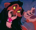
And I said you and I both always thought Aurora's hair verged on green!
Image
User avatar
Disneykid
Diamond Edition
Posts: 4816
Joined: Fri Apr 18, 2003 9:10 am
Location: Wonderland

Post by Disneykid »

Oh, wow, I completely forgot about that. Thanks for reminding me; it's definitely more reassuring. I guess that means the team that did the 2003 restoration looked directly at the cels for reference and probably little else, hence why Aurora's hair is greenish on the DVD and consistently blonde in the upcoming one (and why all the reds are over saturated on the SE; I remember reading that red is one of the hardest colors to reproduce in Technicolor).

This makes me wonder if Lowry's going to go back and color correct for BD some of the restorations that were more cel-based by using this new Technicolor camera (which I don't believe has never been used before on a Disney restoration). The only ones people seem to be complaining about are Cinderella and Peter Pan, so perhaps those relied more on cels than the others. Didn't someone from Lowry say that they continued making adjustments to Cinderella even after the DVD was released? Perhaps they fixed their errors?
User avatar
Disney Duster
Ultimate Collector's Edition
Posts: 14019
Joined: Fri Jun 17, 2005 6:02 am
Gender: Male
Location: America

Sleeping Beauty: Platinum Edition

Post by Disney Duster »

Well, I don't know, in some ways the former restoration does look better than the pale new one. Comparing some online screencaps, maybe Aurora's hair was slightly lighter than during the kiss in the former restoration, but what a jump in lightness for the new one.

Basically, I guess no matter what Disney officially says, I will always have my suspicions until I talk to someone who works there one on one and feel they are being honest. I'd love to talk to Andreas Deja.

But yes, all this Technicolor stuff makes me feel loads better, even though I don't think they looked at the original cels when doing the first restoration, just the original negatives...maybe they did, I don't know. And if they did look at the original negatives the first tiem, I'm pretty sure that's what they're only supposed to look at. Eh, we'll see, we'll see...

What you said about fixing Cinderella after the DVD interests me greatly, of course, but I never heard that. What I did hear is that the movie looked even better after the premiere at the El Capitan, and I may have heard that they continued working on it after it was on the big screen. I did wonder if, because of this, when it was shown to people who worked on the film, like Illene Woods, it looked how it was supposed to. Then, on the DVD, they brightened it (and blonded it and blued it) for the kiddies and little girls.

And errors is right. I caught real for real color errors. Remember that part of the fairy godmother that's supposed to be lighter than the rest of her? Yea, other things like that. I want a DVD version of the old restoration to do my big post showing what's wrong and why, but someday it will come...
Image
User avatar
Disney's Divinity
Ultimate Collector's Edition
Posts: 16239
Joined: Thu Mar 17, 2005 9:26 am
Gender: Male

Post by Disney's Divinity »

You know, I suppose I can't give an accurate opinion on this, as it seems that different computers show the scans differently. From my home computer (which, I think, tends to darken everything; and, no, "lightening" my screen does not change that), the PE looks beautiful. From my school computer (which is probably more trustworthy), the SE looks superior for the most part. Gah. I'll wait for the commercials.

This makes me wonder how differently my banner looks to others. :oops:
Image
Listening to most often lately:
Taylor Swift ~ ~ "The Fate of Ophelia"
Taylor Swift ~ "Eldest Daughter"
Taylor Swift ~ "CANCELLED!"
User avatar
Old Fish Tale
Anniversary Edition
Posts: 1797
Joined: Fri Jan 05, 2007 7:19 am
Location: Portugal

Post by Old Fish Tale »

Has anyone seen this?
User avatar
Ariel'sprince
Platinum Edition
Posts: 3244
Joined: Mon Jan 29, 2007 6:07 am
Location: beyond the meadows of joy and the valley of contentment
Contact:

Post by Ariel'sprince »

I did! but I"m trying to find a bigger poster.
Image
Marky_198
Anniversary Edition
Posts: 1019
Joined: Tue May 01, 2007 11:06 am

Post by Marky_198 »

I'm very excited about this restoration.

I didn't like Cinderella's restoration at all and Sleeping Beauty is my favourite Disney classic so I was very worried.
But I absolutely love this restoration.

It really looks like they stayed true to the original.
The colors are bright and vibrant, but you still can tell it's a movie from the 50's. I have a book with technicolor screenshots and the picture of Philip and Aurora walking down the stairs together looks exactly the same.

The 2003 version looks like an overly bright sequel.
And I think the lines are way too thick.
If you take a look at Aurora walking in the woods on the grass, it doesn't look right in the 2003 version. The new version looks like she's actually walking on the grass. The colors of the fairies, Aurora's hair and the red in Philip's clothes are perfect.

Also, the difference in the Maleficent screenshots is huge. I like the yellow eyes and ball on the stick much better than the green ones.

And in general, I think the 2003 restoration looks cartoonish and dead.
The new restoration actually looks alive. The difference in feeling is huge.

Strange, as in Cinderella it's exactly the opposite.
steven132
Limited Issue
Posts: 69
Joined: Wed Nov 05, 2003 9:55 am

Post by steven132 »

Yeah at the El Capitan on the opening night they are having a pannel with Mary Costa but havent heard who else.
User avatar
Deco King
Gold Classic Collection
Posts: 372
Joined: Thu Sep 30, 2004 5:26 am
Location: Ribchester, Preston, Lancashire, England
Contact:

Post by Deco King »

What a shame Eleaonor Audley and Bill Shirley aren't around anymore as their commentaries would have been great , as the voices of the first really masculine Disney prince and the greatest Disney Villainess Maleficent their contribtions to the movie were incalculable!
To Make Doubly Sure Bring Back Her Heart In This!!
User avatar
Deco King
Gold Classic Collection
Posts: 372
Joined: Thu Sep 30, 2004 5:26 am
Location: Ribchester, Preston, Lancashire, England
Contact:

Eyvind Earles' Art Should Have It's Own Book!!

Post by Deco King »

To tie in with this Platinum Edition there most definitely should be a book entitled something like The Sleeping Beauty Art Of Eyvind Earle as his style was Sleeping Beauty , and without his contribution the movie would have been a much poor work of art!

His stunning conceptual art should be celebrated by it's own volume this would be a real treat for Disney fans!
To Make Doubly Sure Bring Back Her Heart In This!!
Marky_198
Anniversary Edition
Posts: 1019
Joined: Tue May 01, 2007 11:06 am

Post by Marky_198 »

I noticed a strange thing.
In some of the compared screenshots of the 2008 version there's more picture on the left side, compared to the 2003 version, and in others there's more on the right side.
In the first Maleficent screenshot there's clearly more on the left, while in the fairies screenshot there's clearly more picture on the right.
It changes all the time. How can that be?
Is it some kind of pan&scan choice?
Locked