Comparing Home Releases Cover Arts

All topics relating to Disney-branded content.
User avatar
Jules
Diamond Edition
Posts: 4624
Joined: Sun Mar 12, 2006 9:20 am
Gender: Male
Location: Malta, Europe
Contact:

Re: Comparing Home Releases Cover Arts

Post by Jules »

JeanGreyForever wrote:I didn't like how Stitch was on there twice, David featured instead of Nani, and how the top image of David and Stitch was their modern shaded clipart while the below image was heavily pixelated.
I'm a bit late replying to this Jean. I first noticed that when I bought Lilo & Stitch on DVD for the very first time. It was the UK 2-Disc set, which came to the USA quite a few years later in the form of the Big Wave Edition using the same cover art.

The bottom illustration of Lilo and Stitch is not so much pixelated as it is smudged. It seems to be processed using a Photoshop filter, or something similar. Some time ago I came across a similar cover online that had the same drawings but without the filter.

I never liked the effect myself, because it really did seem like whoever designed the cover was restricted to low-res elements and had to use a filter to disguise this. Of course that was not the case.

On an unrelated note, while I enjoy reading everyone's comments I particularly look forward to Marce's analysis, as it's pretty obvious he/she is an artist. :)
User avatar
blackcauldron85
Ultimate Collector's Edition
Posts: 16691
Joined: Sat Jun 17, 2006 7:54 am
Gender: Female
Contact:

Re: Comparing Home Releases Cover Arts

Post by blackcauldron85 »

D82 wrote:I was referring to this edition, but you're right; though it has bonus features like an audio commentary, a making-of featurette or art galleries, it's not labeled a collector's edition. And I was mistaken, that edition was released in Spain. I don't know why I thought the edition I have was from the UK the other day. Maybe because I've put the menu in English more times than in Spanish, as lately I've been watching the films and extras in English more often than not.
Oh, yeah-- I remember seeing that one back in the day. I just re-read this site's review of it, and it wasn't too jam-packed with features. But it has some good ones.
Image
User avatar
JeanGreyForever
Signature Collection
Posts: 5335
Joined: Sun Sep 15, 2013 5:29 pm

Re: Comparing Home Releases Cover Arts

Post by JeanGreyForever »

Jules wrote:
JeanGreyForever wrote:I didn't like how Stitch was on there twice, David featured instead of Nani, and how the top image of David and Stitch was their modern shaded clipart while the below image was heavily pixelated.
I'm a bit late replying to this Jean. I first noticed that when I bought Lilo & Stitch on DVD for the very first time. It was the UK 2-Disc set, which came to the USA quite a few years later in the form of the Big Wave Edition using the same cover art.

The bottom illustration of Lilo and Stitch is not so much pixelated as it is smudged. It seems to be processed using a Photoshop filter, or something similar. Some time ago I came across a similar cover online that had the same drawings but without the filter.

I never liked the effect myself, because it really did seem like whoever designed the cover was restricted to low-res elements and had to use a filter to disguise this. Of course that was not the case.

On an unrelated note, while I enjoy reading everyone's comments I particularly look forward to Marce's analysis, as it's pretty obvious he/she is an artist. :)
Thanks for explaining! It always shocks me that they had years to change this cover for the American release but they kept it intact, smudges and all.
ImageImage
We’re a dyad in the Force. Two that are one.
"I offered you my hand once. You wanted to take it." - Kylo Ren
"I did want to take your hand. Ben's hand." - Rey
User avatar
DisneyBluLife
Gold Classic Collection
Posts: 381
Joined: Sun Oct 14, 2012 10:36 am
Location: Sweden

Re: Comparing Home Releases Cover Arts

Post by DisneyBluLife »

I looked at the theatrical poster of Aristocats and I was wondering who the Oriental cat is? I thought Scat Cat was the leader, and I never heard Disney talk about this "deleted character". He must have been long in production if he is on the poster, but not in the movie.

https://mrtambourineniclas.blogg.se

https://www.amazon.com/Aristocats-Authe ... B082LN4RGN


https://www.amazon.com/postersdepelicul ... B001HC2OTK
User avatar
Farerb
Signature Collection
Posts: 5186
Joined: Sat May 19, 2018 2:09 pm

Re: Comparing Home Releases Cover Arts

Post by Farerb »

He looks like the cat that plays the piano but with different colors. I think it's a mistake made by the person who made the poster. It would not be the only time:
Image
User avatar
Warm Regards
Special Edition
Posts: 857
Joined: Wed May 22, 2013 9:09 pm

Re: Comparing Home Releases Cover Arts

Post by Warm Regards »

DisneyBluLife wrote:I looked at the theatrical poster of Aristocats and I was wondering who the Oriental cat is? I thought Scat Cat was the leader, and I never heard Disney talk about this "deleted character". He must have been long in production if he is on the poster, but not in the movie.

https://mrtambourineniclas.blogg.se

https://www.amazon.com/Aristocats-Authe ... B082LN4RGN


https://www.amazon.com/postersdepelicul ... B001HC2OTK
I've seen Aristocrats way too many times, especially when I was younger. Sometimes I saw it back to back.

All the characters in the poster appear in the movie. The Oriental Cat plays the piano during "Everybody Wants to Be a Cat". (I remember he sung a verse in a dated accent too). In that sequence there's high intensity jazz music playing and the colors pop from red to blue to yellow, making all of the characters look vibrant.

So I believe the poster took that animated scene and tried to translate it into a still image. Result: wrong-colored characters.
User avatar
DisneyBluLife
Gold Classic Collection
Posts: 381
Joined: Sun Oct 14, 2012 10:36 am
Location: Sweden

Re: Comparing Home Releases Cover Arts

Post by DisneyBluLife »

Warm Regards wrote:
DisneyBluLife wrote:I looked at the theatrical poster of Aristocats and I was wondering who the Oriental cat is? I thought Scat Cat was the leader, and I never heard Disney talk about this "deleted character". He must have been long in production if he is on the poster, but not in the movie.

https://mrtambourineniclas.blogg.se

https://www.amazon.com/Aristocats-Authe ... B082LN4RGN


https://www.amazon.com/postersdepelicul ... B001HC2OTK
I've seen Aristocrats way too many times, especially when I was younger. Sometimes I saw it back to back.

All the characters in the poster appear in the movie. The Oriental Cat plays the piano during "Everybody Wants to Be a Cat". (I remember he sung a verse in a dated accent too). In that sequence there's high intensity jazz music playing and the colors pop from red to blue to yellow, making all of the characters look vibrant.

So I believe the poster took that animated scene and tried to translate it into a still image. Result: wrong-colored characters.
Yes, but is he the leader of the band? Like the poster says?
User avatar
Farerb
Signature Collection
Posts: 5186
Joined: Sat May 19, 2018 2:09 pm

Re: Comparing Home Releases Cover Arts

Post by Farerb »

Treasure Planet (with D82's help):

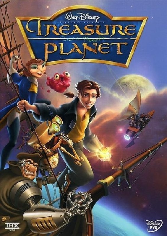
VHS/DVD/Blu-ray:
Image

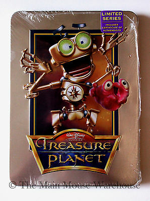
DMC Collectible Tin:
Image

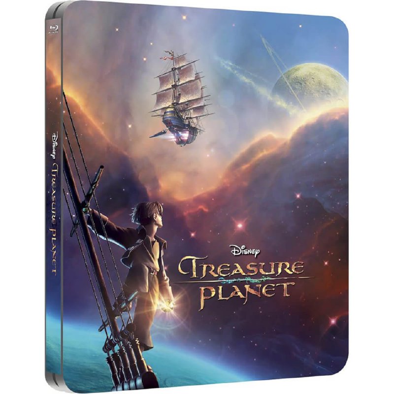
Zavvi Steelbook:
Image

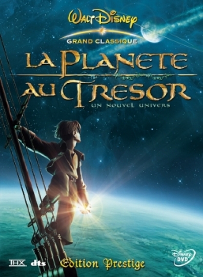
French "Prestige" Edition:
Image

UK Heroes Slipcover:
Image

French Heroes slipcover:
Image

German VHS (Rental Version):
Image

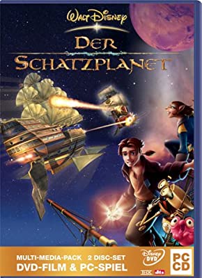
German DVD + PC Game:
Image

Demo Tape:
Image

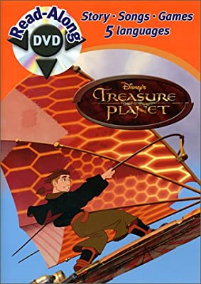
Read-Along DVD:
Image
User avatar
Disney's Divinity
Ultimate Collector's Edition
Posts: 16245
Joined: Thu Mar 17, 2005 9:26 am
Gender: Male

Re: Comparing Home Releases Cover Arts

Post by Disney's Divinity »

1. Zavvi Steelbook ~ I love this poster.
2. French Prestige Edition ~ I almost like this 'night' version better since it feels a little more mysterious.
3. Demo Tape ~ I've never seen this. Other than BEN being the same, I think it's much better. I understand why they would have wanted John Silver to be on there though. And the absence of the little rowboat on the right makes the picture feel less clogged up.
4. Read Along DVD
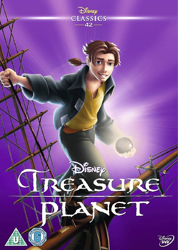
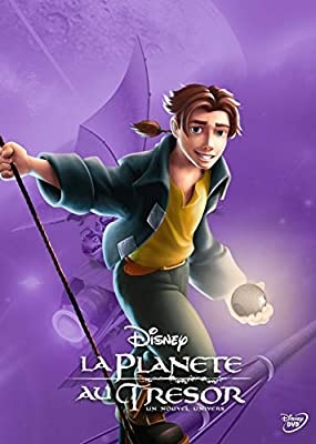
5. French Heroes Cover
6. UK Heroes
7. VHS / DVD / Blu-ray ~ I rated the Heroes covers higher because I like the picture of Jim better than the rest of this cover. Amelia and BEN look... Blergh.
8. German DVD + PC Game ~ Amelia looks better here, but the cut and paste is really rough.
9. German VHS
Image
Listening to most often lately:
Taylor Swift ~ ~ "The Fate of Ophelia"
Taylor Swift ~ "Eldest Daughter"
Taylor Swift ~ "CANCELLED!"
User avatar
JeanGreyForever
Signature Collection
Posts: 5335
Joined: Sun Sep 15, 2013 5:29 pm

Re: Comparing Home Releases Cover Arts

Post by JeanGreyForever »

The main DVD cover is a bit too cluttered for my taste and for some reason it never looked like a Disney cover to me. Maybe it's the art style but looking at this, it feels more like it belongs to Dreamworks.

I love the Zaavi steelbook and French prestige covers. That poster (the two color variants of it anyway) were amazing. France really does seem to get the best covers.

The rental German VHS cover looks bizarre with that ship added on which clashes with the art imo. I like Amelia's pose in the German DVD + PC Game cover though.
ImageImage
We’re a dyad in the Force. Two that are one.
"I offered you my hand once. You wanted to take it." - Kylo Ren
"I did want to take your hand. Ben's hand." - Rey
User avatar
Disney Duster
Ultimate Collector's Edition
Posts: 14031
Joined: Fri Jun 17, 2005 6:02 am
Gender: Male
Location: America

Re: Comparing Home Releases Cover Arts

Post by Disney Duster »

Treasure Planet

1. Zavvi Steelbook - Gorgeous
2. French Prestige Edition
3. VHS/DVD/Blu-ray - I love how it packs it all in from a cool perspective.
4. German VHS (Rental Version)
5. German DVD + PC Game
6. Demo Tape
7. French Heroes slipcover
8. UK Heroes Slipcover
9. Read-Along DVD
10. DMC Collectible Tin
Image
Marce82
Anniversary Edition
Posts: 1475
Joined: Sun Jul 03, 2005 1:48 pm
Location: Los Angeles

Re: Comparing Home Releases Cover Arts

Post by Marce82 »

Hey everyone,

Sorry I'm a little late, I've been busy. You know... going to restaurants, movie theaters and theme parks.... NOT! :)

So first my ranking for the Lilo covers, I will do a separate post for Treasure Planet.

First off, Disney continues with their streak of good quality covers: Lilo's covers are overall REALLY good: generally characters are very on model, good linework and well shaded. Yay for Lilo! So here we go:

1) DVD/VHS: Absolutely beautiful. Partially repurposed still, but beautifully redrawn and shaded. The design is clever, twisting the wave so it can make the title really pop. It's the main family, surfing, Hawaii... all the major elements. They even made the background in the watercolor style, without it clashing with the heavily shaded foreground. One of Disney's best covers ever.

2) Collector France: Ah, I really like this one. Surprisingly minimal for Disney. Cool concept, interesting color choices. The execution could be better... Lilo's hands and head-dress have been added, but the shading doesn't match her face. Stitch's right hand should have been flopped: his thumb is on the wrong side. He is supposed to be doing the same pose as Lilo. Even with the flaws... great cover overall.

3) First Blu ray: it's impressive they could jam so many characters into a cover and make it look fairly harmonious. Characters are generally well drawn and shaded, except for Nani... something is a little off. Her eyes are uneven. And is Pleakley too big in relation to everyone else? My main complaint: this cover gives Stitch the main spot... and I always felt that this film was as much Lilo's as it was Stitch's. In this cover, Lilo is just another supporting character.

4) Big Wave: this one is one of the weaker covers. The choice of a double Stitch and David instead of Nani... strange choices. Some have noticed the odd texture of the bottom half: it is not pixelated, it is not smudged. It has a film grain effect added to it, since it is a re-purposed "fake" promotional still, that Disney often did in the 90s. It's a shame too, cause that still is lovely. But the flat-colors-with-grain really clash with the heavily shaded, glossy look of the top part. The whole thing isn't terrible... but it's among the weaker covers.

5) Special Ed Brazil: it's a cool idea... Stitch having ripped off a piece of the cover. It doesn't read very well. I think it's cause the piece is so shaded and the rest of the cover is so white... nice character poses.

6) 2-movie Brazil: The execution is really nice... good shading, good poses, nice watercolor background. I don't love the composition: the characters being off to the side cause they need to include a bunch of movie titles... kinda kills it for me. Stitch's ear being cut off really creates a visual tension.

7) Second blu ray: I am ranking this low, cause it's a chopped up version of the dvd cover. Well executed. But bland. Specially when compared to the original.

8 ) Collectible tin: just bland. Re-used Lilo. Stitch is a little off, and looks a little too evil. The background is a joke. Meh.

9) Japanese VHS: ok, this one bothers me. Not so much the execution, but the overall concept. This is taken from a very important scene, that is about Lilo and Nani, they breakdown of their relationship and it's link to the breakdown of their homeland. It is NOT about Stitch. Not ok. From a technical standpoint, it is well drawn, but the shading on Lilo makes her look very odd in the face, specially the nose and her left eye.

10) 2 Movie UK: bad. This is a glorified magazine cover. I mean, the execution is perfect, but the concept is pretty bad. If there is one at all.

Overall, great quality. I'm glad, cause this film is darn good.
Marce82
Anniversary Edition
Posts: 1475
Joined: Sun Jul 03, 2005 1:48 pm
Location: Los Angeles

Re: Comparing Home Releases Cover Arts

Post by Marce82 »

So Treasure Planet.... lol.... not a lot of covers here. And they mostly re-use the artwork over and over. And the artwork is reused from the posters!

The odd thing is, I am not a fan of this movie, but I absolutely LOVE the artwork for the posters used in these covers.

Small ranking, but here goes:

1) Zaavi Steelbook: absolutely gorgeous. Amazing looking sky, cool pose.... pretty minimalist. We don't even see Jim's face! What a choice! I admit it works better as a poster than a dvd cover... but it really would appeal to the collector.

2) VHS/dvd/bluray: Great cover. Beautifully rendered characters, exciting choice of background. It manages to have a good composition, even if the characters are a little cluttered.

3) DMC tin: well.... um... there's that Martin Short robot. I guess a fan would buy this cover. It's well drawn. Um.... yeah. Good. Ok. Yay.

Not gonna bother with the rest, cause they are all re-used art.

But kudos to Treasure Planted for the good posters/covers!
User avatar
Disney Duster
Ultimate Collector's Edition
Posts: 14031
Joined: Fri Jun 17, 2005 6:02 am
Gender: Male
Location: America

Re: Comparing Home Releases Cover Arts

Post by Disney Duster »

Marce82, as always I enjoyed reading your rankings, but I would say both Lilo and Stitch's have two left hands in the French Collector's Edition.
Image
User avatar
D82
Signature Collection
Posts: 6311
Joined: Fri Aug 16, 2013 10:07 am
Location: Spain

Re: Comparing Home Releases Cover Arts

Post by D82 »

Marce82 wrote:Sorry I'm a little late, I've been busy. You know... going to restaurants, movie theaters and theme parks.... NOT! :)
:lol: I'm glad you finally found the time to share your rankings. We were looking forward to knowing your thoughts.
Marce82 wrote:3) First Blu ray: it's impressive they could jam so many characters into a cover and make it look fairly harmonious. Characters are generally well drawn and shaded, except for Nani... something is a little off. Her eyes are uneven. And is Pleakley too big in relation to everyone else? My main complaint: this cover gives Stitch the main spot... and I always felt that this film was as much Lilo's as it was Stitch's. In this cover, Lilo is just another supporting character.
I thought it was Nani that was too small, but you're right, it is Pleakley the one who's not the right size. Nani just looks small by comparison. And you're right, Lilo should be as prominent on the cover as Stitch. If Lilo didn't appear in the sequel, then I would understand it, but from what I remember, both are protagonists in the sequel as well.
Marce82 wrote:9) Japanese VHS: ok, this one bothers me. Not so much the execution, but the overall concept. This is taken from a very important scene, that is about Lilo and Nani, they breakdown of their relationship and it's link to the breakdown of their homeland. It is NOT about Stitch. Not ok.
I personally do see a connection between that scene and Stitch. Though in the movie he's not in the hammock like on that cover, he's also part of the scene after all and I think he realizes there what a family is and how alone he feels. But I usually don't like when covers feature things that don't happen in the movie and I completely understand your point of view.
User avatar
D82
Signature Collection
Posts: 6311
Joined: Fri Aug 16, 2013 10:07 am
Location: Spain

Re: Comparing Home Releases Cover Arts

Post by D82 »

Here's my ranking for Treasure Planet. This time, given that there aren't too many covers, I'll also include the Read-Along DVD. I agree with you, Marce82, that there are some that are really good, but yes, it's because they reuse good posters.

1. French "Prestige" Edition: As others have said, both this and the Zavvi Steelbook reuse two similar theatrical posters. Both are great, but I like this one a bit more because the double ship in the Zavvi Steelbook bothers me a little. Though I guess the planet that's under Jim in both covers is also the one with the treasure, so the planets are probably also repeated. The colors of the sky in the steelbook are even more impressive than in the other cover, though.

2. Zavvi Steelbook

3. Demo Tape: I've been going back and forth between the demo tape and the final cover because there are things I prefer from one cover and some from the other, but I finally chose this one, which is closer to the poster, because it looks a bit more professional to me.

4. VHS/DVD/Blu-ray: I actually prefer the fact that, unlike in the demo tape, most of the characters are looking at the camera here and not just some of them. I also prefer the new position of Morph and I like the inclusion of John Silver. However, John Silver should be a bit bigger, in my opinion. He looks smaller than B.E.N. (which is actually not as big as him in the movie), when he's closer to us.

5. UK Heroes Slipcover

6. Read-Along DVD

7. DMC Collectible Tin

8. German VHS (Rental Version): I agree with JeanGreyForever; the ship doesn't seem to belong to the same picture as the rest, plus it doesn't make much sense to include the ship in the first place.

9. German DVD + PC Game: I understand they wanted to show some of the action given that this edition includes a PC game, but in my opinion this cover doesn't make much sense either.

10. French Heroes slipcover: What I don't like about this cover is the rowboat in the background, which is partly covered by Jim. I don't understand its purpose there. It looks like sloppy Photoshop.
User avatar
Farerb
Signature Collection
Posts: 5186
Joined: Sat May 19, 2018 2:09 pm

Re: Comparing Home Releases Cover Arts

Post by Farerb »

The double ship and planet bothered me as well, though I prefer the steelbook's colors.
User avatar
Vlad
Collector's Edition
Posts: 2494
Joined: Mon May 03, 2010 1:58 am

Re: Comparing Home Releases Cover Arts

Post by Vlad »

I have always liked the original DVD cover for Treasure Planet. :) The other ones are okay, but design wise I prefer the original DVD art. :D
Image
"After all, tomorrow is another day!"
User avatar
D82
Signature Collection
Posts: 6311
Joined: Fri Aug 16, 2013 10:07 am
Location: Spain

Re: Comparing Home Releases Cover Arts

Post by D82 »

Here are some pictures of the French Prestige Edition packaging. Apart from the film, it includes the original novel by Robert Louis Stevenson and Disney's live-action adaptation from 1950. There's also a similar edition from the UK that contains the novel as well but a PC game instead of the live-action film, though that one has the same cover as the DVD/VHS and its packaging is far less special.

Image

Image Image

Image

Image

Image


By the way, I've now noticed that the number on the spine of that French edition of Treasure Planet is 68! I didn't know France had a different canon and that they also included the live-action/animation hybrids, the DTV sequels, and even the Pixar movies as classics! In case there's someone else who, like me, didn't know this either, here's a list with all the titles in the French canon. It seems there's some distinction between the real classics and the other movies, though:
2099net wrote:France does label it's films "classique" but labels the classics as "grande classique", so there is still a distinction. They do however number all animated films - so Treasure Planet for example is numbered 68.
Source: https://www.dvdizzy.com/forum/viewtopic ... nce#p57524
User avatar
JeanGreyForever
Signature Collection
Posts: 5335
Joined: Sun Sep 15, 2013 5:29 pm

Re: Comparing Home Releases Cover Arts

Post by JeanGreyForever »

Thanks for posting that! I can always count on you for a special in-depth look at these special editions! I stand by what I said that France has some of the best special editions for any Disney films and I wish I could pick this one up alongside the Atlantis one. It's so neat that they included the original book plus the live-action film (or PC game in the UK).
ImageImage
We’re a dyad in the Force. Two that are one.
"I offered you my hand once. You wanted to take it." - Kylo Ren
"I did want to take your hand. Ben's hand." - Rey
Post Reply