I love the French Collector's Edition DVD cover! Stunning with the orchestra. Same with the French Anthology Edition.
I also always loved the IMAX Fantasia 2000 poster so I'm glad the Australian VHS used that as a cover.
The backgrounds for the Japanese Blu-Ray are a bit cheap looking though.
Comparing Home Releases Cover Arts
-
JeanGreyForever

- Signature Collection
- Posts: 5335
- Joined: Sun Sep 15, 2013 5:29 pm
Re: Comparing Home Releases Cover Arts


We’re a dyad in the Force. Two that are one.
"I offered you my hand once. You wanted to take it." - Kylo Ren
"I did want to take your hand. Ben's hand." - Rey

Re: Comparing Home Releases Cover Arts
My pleasure, farerb. 
In my opinion, most of the covers for Fantasia 2000 are good. Here's my ranking:
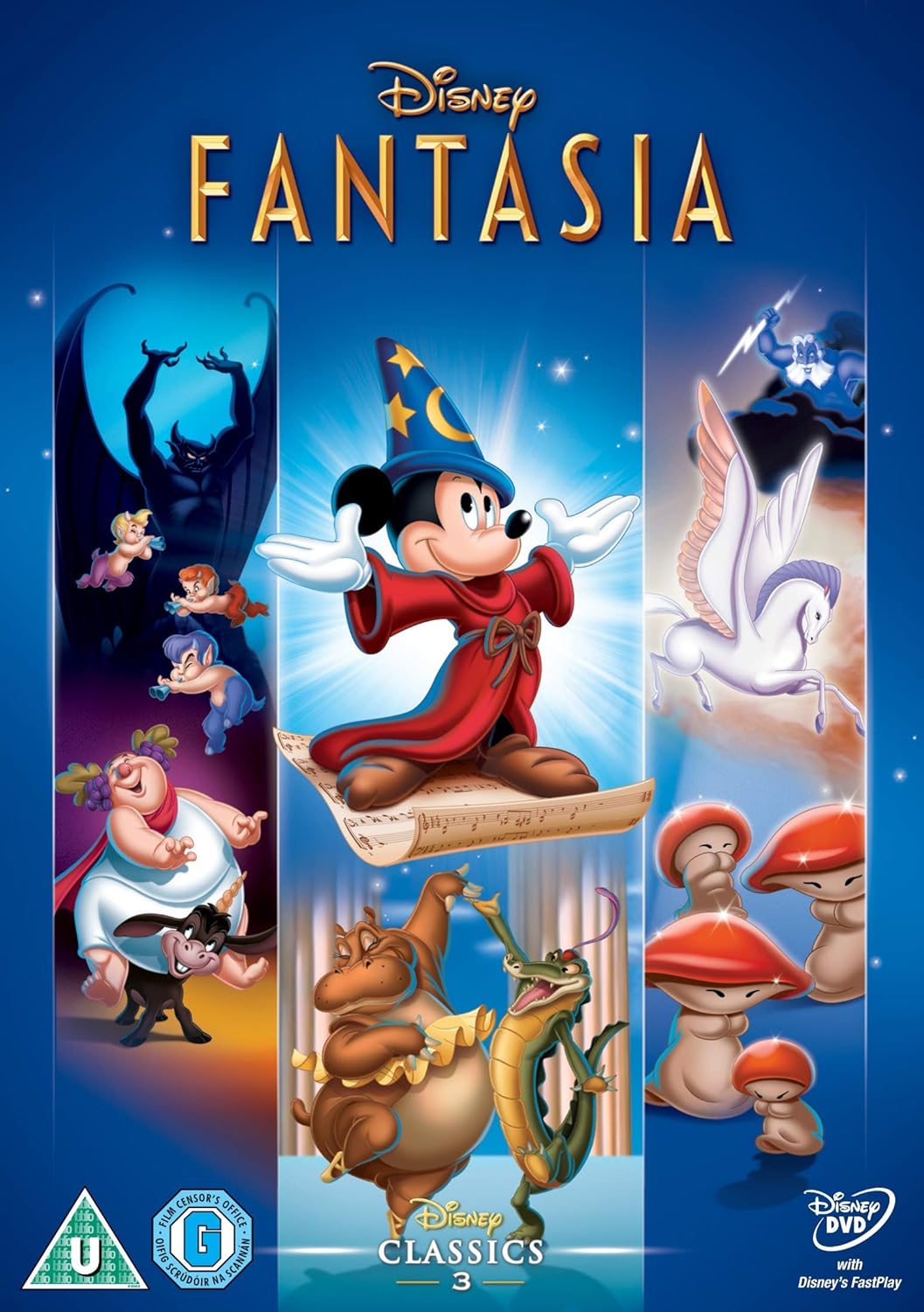
1. DVD-VHS: I think this one's my favorite. I really like the concept. The colorful brush strokes look artistic and a bit abstract, like the film itself. It has always reminded me of a splash of water, but I don't know if that's intentional or not. I also like that all the segments are represented on the cover. The starry background is nice and fitting too, and of course, everything's on-model, because they've used stills from the movie.
2. Australian VHS: The poster reused here is also great. I like that it features the beautiful and original set with the orchestra, and again, all the different segments are represented.
3. Blu-ray: I really like the idea of Mickey "conducting" and all the other characters around him. It's quite well drawn too. Given that it's all supposedly magical, in this case I don't mind that the size of some characters in relation to Mickey doesn't make much sense. The cloud behind Mickey is also a nice touch.
4. French Anthology Edition: To use that iconic shot of Mickey greeting the conductor is a great idea and and also to combine it with the orchestra from the sequel. It's a very elegant cover and perfect for a 2-movie collection.
5. Anthology Collection: This one's also quite classy, but as I said when we were discussing the Fantasia covers, the treble clef/Mickey logo, though a clever idea, doesn't completely work for me.
6. Japanese Blu-ray: I like that the characters from each film are separated here on each side, but their poses work better in the arrangement for the US cover, and as JeanGreayForever pointed out, the background looks a bit cheap, especially the left side.
7. UK DVD-VHS: This one's similar to the DVD/VHS. It's quite nice too and complements the European cover for the original Fantasia released at the same time. However, it's not as good as the cover it's based on and I have a couple of issues with it. Mickey clashes a bit with the rest of the images from the other segments because his art is not from a film still like the others, and the extra diagonal lines on each side don't seem to have any purpose.
8. UK Heroes Slipcover DVD: This one's actually not bad (it's the same pose Mickey has on the Blu-ray and a couple of other covers), but why use only Mickey again for the sequel when he's already in most of the covers for the first film? I'd rather they'd used Donald this time around instead of him. Not only to make the covers more varied, but also to differentiate the film from the first Fantasia.
9. French Heroes Slipcover: I have the same issue with this one, plus like Disney's Divinity mentioned, it looks a bit like a coloring book illustration due to the lack of shading.
10. French 2-Movie Collection
11. UK 2-Movie Collection
In my opinion, most of the covers for Fantasia 2000 are good. Here's my ranking:
1. DVD-VHS: I think this one's my favorite. I really like the concept. The colorful brush strokes look artistic and a bit abstract, like the film itself. It has always reminded me of a splash of water, but I don't know if that's intentional or not. I also like that all the segments are represented on the cover. The starry background is nice and fitting too, and of course, everything's on-model, because they've used stills from the movie.
2. Australian VHS: The poster reused here is also great. I like that it features the beautiful and original set with the orchestra, and again, all the different segments are represented.
3. Blu-ray: I really like the idea of Mickey "conducting" and all the other characters around him. It's quite well drawn too. Given that it's all supposedly magical, in this case I don't mind that the size of some characters in relation to Mickey doesn't make much sense. The cloud behind Mickey is also a nice touch.
4. French Anthology Edition: To use that iconic shot of Mickey greeting the conductor is a great idea and and also to combine it with the orchestra from the sequel. It's a very elegant cover and perfect for a 2-movie collection.
5. Anthology Collection: This one's also quite classy, but as I said when we were discussing the Fantasia covers, the treble clef/Mickey logo, though a clever idea, doesn't completely work for me.
6. Japanese Blu-ray: I like that the characters from each film are separated here on each side, but their poses work better in the arrangement for the US cover, and as JeanGreayForever pointed out, the background looks a bit cheap, especially the left side.
7. UK DVD-VHS: This one's similar to the DVD/VHS. It's quite nice too and complements the European cover for the original Fantasia released at the same time. However, it's not as good as the cover it's based on and I have a couple of issues with it. Mickey clashes a bit with the rest of the images from the other segments because his art is not from a film still like the others, and the extra diagonal lines on each side don't seem to have any purpose.
8. UK Heroes Slipcover DVD: This one's actually not bad (it's the same pose Mickey has on the Blu-ray and a couple of other covers), but why use only Mickey again for the sequel when he's already in most of the covers for the first film? I'd rather they'd used Donald this time around instead of him. Not only to make the covers more varied, but also to differentiate the film from the first Fantasia.
9. French Heroes Slipcover: I have the same issue with this one, plus like Disney's Divinity mentioned, it looks a bit like a coloring book illustration due to the lack of shading.
10. French 2-Movie Collection
11. UK 2-Movie Collection
Re: Comparing Home Releases Cover Arts
Hey everyone,
First off: D82, I generally agree with your comments about the covers. Not sure our rankings will line up, but I can understand all your observations/preferences.
Let me just say first that ALL (but one) of the covers for this movie are great. The overall level of shading, draftsmanship and compositions are wonderful. So I guess this will just come to my more-than-usual subjective preferences. Obviously, the ONE bad cover will be at the bottom of my list:
1) Original VHS/DVD: beautiful... all well chosen stills from the film. The splash motif reminds me of a moment during Beethoven's 5th segment... and like D82 said, it is semi abstract, and it works.
2) US Blu ray: I think this is a wonderful cover. Original art, mostly on-model characters (the sprite is a little off), there are some abstract elements (which fits), there seems to be a cohesive overall design... I think it works perfectly to represent both films.
3) Anthology Collection: wonderful, clever cover. I am only not giving this one a higher position cause it's nos specific to F2000... but it works wonderfully for both. Plus, it feels a little somber for such colorful films.
4) French Anthology: What a great cover! Had never seen it before! I think it reflects both movies well, focusing on the few non-animated moments... and it works. Very classy. Very cool concept. Well executed. Just lovely.
5) UK dvd/vhs: Another great cover. The burgundy choice works very well, it reflects the segments nicely... very unusal choice for Rapsody in Blue! But as D82 said, the Mickey doesn't match very well.... but it's a mild sin. Still works. One question: what are those odd shapes/highlights on the top right corner???
6) Japanese Blu ray: tough to rank this one. Yes, the background on the left looks a little cheap... it recycles most elements from the US cover, but this one tries to keep all elements of the original on the left, and 2000 on the right, but we lose the overall harmony of the layout. Now it feels more like elements set in random spots.
7) Australian VHS: this is a rare instance where I think something works perfectly as a poster, but not as a VHS cover. Because of the scale and distortion, the panels with the segments would be very tiny and hard to make sense of. I don't know... this movie has such nice covers, this one ranks pretty low to me, but it's probably cause the bar has been set so high!
8 ) UK2 movie: this one is ok. A lot of recycled elements, but all well drawn. It does the expected job for a 2 movie set, but nothing original. Still good overall.
9) UK heroes: it's ok. But it works better as a cover for the first movie. But you can appreciate the lovely texture done on the rock pedestal he is standing on!
10) French Heroes Cover: dreadful. Horrible concept, poorly executed. Sloppy.... like a bad, fan made cover. This movie deserves better.
Who knew F2000 had so many covers!
-
DisneyBluLife

- Gold Classic Collection
- Posts: 381
- Joined: Sun Oct 14, 2012 10:36 am
- Location: Sweden
Re: Comparing Home Releases Cover Arts
The cover is wrapped in plasticMarce82 wrote:Hey everyone,
One question: what are those odd shapes/highlights on the top right corner???
!
Re: Comparing Home Releases Cover Arts
AHHAHAHAAHHA.... I feel stupid.
I assumed it was a digital image, not a picture of the actual thing. Darn good quality picture!
I assumed it was a digital image, not a picture of the actual thing. Darn good quality picture!
Re: Comparing Home Releases Cover Arts
I think it reminds me of something from that segment too!Marce82 wrote:1) Original VHS/DVD: beautiful... all well chosen stills from the film. The splash motif reminds me of a moment during Beethoven's 5th segment
That's a good observation. I hadn't thought of the scale of the elements in that cover. I think you can still see what they are, but you're right that it works better as a poster.Marce82 wrote:7) Australian VHS: this is a rare instance where I think something works perfectly as a poster, but not as a VHS cover. Because of the scale and distortion, the panels with the segments would be very tiny and hard to make sense of. I don't know... this movie has such nice covers, this one ranks pretty low to me, but it's probably cause the bar has been set so high!
Yeah, I didn't think it would have so many either! I had never seen the French covers before, for example, or the Australian one.Marce82 wrote:Who knew F2000 had so many covers!
Speaking of that, the interior of the French Anthology Edition is also quite nice. Here are some pictures:


And one question, does anybody know if this is a preliminary cover for the Blu-ray? Or is it just fan art?

Re: Comparing Home Releases Cover Arts
Woah!!! That French set is BEAUTIFUL!!!!
Even the interior stuff is beautifully designed and executed!!
As for that last blu ray.... I think it's legit. I think that was the cover for the Fantasia standalone (not 2000) release in the UK.
Even the interior stuff is beautifully designed and executed!!
As for that last blu ray.... I think it's legit. I think that was the cover for the Fantasia standalone (not 2000) release in the UK.

Re: Comparing Home Releases Cover Arts
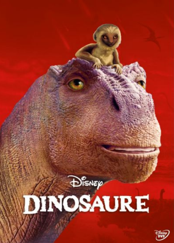
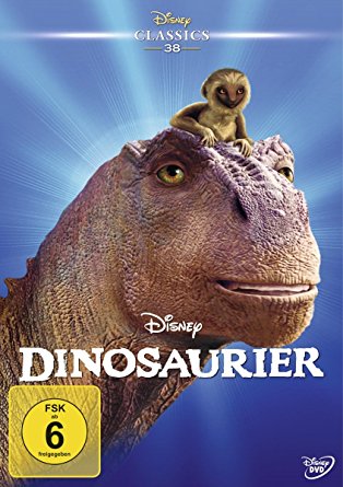
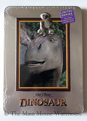
Dinosaur:
Again with the help of D82
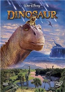
DVD/VHS:
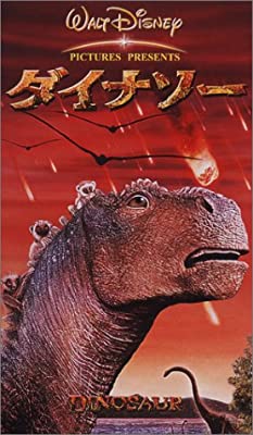
Japanese VHS:
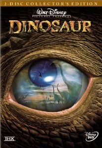
2 Disc Collector's Edition:
French Heroes Cover:
German Heroes Cover:
Steelbook:
Again with the help of D82
DVD/VHS:
Japanese VHS:
2 Disc Collector's Edition:
French Heroes Cover:
German Heroes Cover:
Steelbook:
Re: Comparing Home Releases Cover Arts
They used the same cover as the DVD for the Blu-ray as far as I know:Marce82 wrote:Woah!!! That French set is BEAUTIFUL!!!!
Even the interior stuff is beautifully designed and executed!!
As for that last blu ray.... I think it's legit. I think that was the cover for the Fantasia standalone (not 2000) release in the UK.
-
Disney Duster

- Ultimate Collector's Edition
- Posts: 14161
- Joined: Fri Jun 17, 2005 6:02 am
- Gender: Male
- Location: America
Re: Comparing Home Releases Cover Arts
i don't count Dinosaur as a DAC by the way, but here goes...
Dinosaur:
1. Steelbook - Makes the ugly less ugly somehow.
2. 2 Disc Collector's Edition - Kinda cool-looking.
3. Japanese VHS - Least ugly one, no creepy dino smile and the red is so cool!
4. DVD/VHS - Creepy dino but the attempt at other elements added is ok.
5. French Heroes Cover - Creepy Dino and Ugly CGI but the red background makes it better I guess.
6. German Heroes Cover - It's not right! It's not riiiiiight!!!

Re: Comparing Home Releases Cover Arts
Yeah, it looks legit, but I haven't found any image of a physical Blu-ray with that cover. That's why I thought it could be a preliminary cover.Marce82 wrote:As for that last blu ray.... I think it's legit. I think that was the cover for the Fantasia standalone (not 2000) release in the UK.
Yes, I think that was also the cover for the Blu-ray in the UK.farerb wrote:They used the same cover as the DVD for the Blu-ray as far as I know:
https://i.postimg.cc/T1mW28Qd/Fantasia-UK-DVD-2014.jpg
Re: Comparing Home Releases Cover Arts
Like I said earlier in this thread, Dinosaur is not a film I plan to watch again and I think the only reason it's in the canon is because of Tangled. I don't think the film is awful or anything, just not that interesting.
Anyway regarding the covers, I like the 2 disc Collector's Edition. I think they used a theatrical poster for this.
On the positive side, one good thing with CGI characters is that they can't make them off model on covers.
Anyway regarding the covers, I like the 2 disc Collector's Edition. I think they used a theatrical poster for this.
On the positive side, one good thing with CGI characters is that they can't make them off model on covers.
-
blackcauldron85

- Ultimate Collector's Edition
- Posts: 16717
- Joined: Sat Jun 17, 2006 7:54 am
- Gender: Female
- Contact:
Re: Comparing Home Releases Cover Arts
1. DVD/VHS- I like that it has a lot going on...Aladar and Plio hangining out in the clouds maybe could've been executed better, but the background is really pretty.
2. Collector's Edition- Definitely a neat, classy cover.
3. Steelbook- Embossing!
4. Japanese VHS- Whoa, it does show the excitement/intensity, just like Japanese trailers tend to show things the others don't...but for a cover, I think I prefer smiling Aladar.
5. German Heroes- Boring, but better than the French.
6. French Heroes- I think the red works best with scared Aladar (Japanese cover), so it's not working so well for me.

-
Disney's Divinity

- Ultimate Collector's Edition
- Posts: 16407
- Joined: Thu Mar 17, 2005 9:26 am
- Gender: Male
Re: Comparing Home Releases Cover Arts
1. Collector’s Edition ~ Always preferred this cover.
2. Japanese Cover
3. DVD/VHS ~ The floating heads don't work very well with 3D characters...
4. German Heroes Cover
5. Steelbook
6. French Heroes Cover
2. Japanese Cover
3. DVD/VHS ~ The floating heads don't work very well with 3D characters...
4. German Heroes Cover
5. Steelbook
6. French Heroes Cover

Listening to most often lately:
Christina Aguilera ~ "Cruz"
Sombr ~ "homewrecker"
Megan Moroney ~ "Beautiful Things"
Re: Comparing Home Releases Cover Arts
This time it has been easy for me to rank the covers:
1. 2-Disc Collector's Edition: This one's definitely my favorite. I love the idea of showing some of the important events in the movie reflected in Aladar's eye. It's like it's telling the audience the movie is told through his eyes. Yes, that's right, farerb, they used a theatrical poster for this. Now that I've compared it with the cover, I noticed the position of the eye is different in both pictures. I prefer the framing of the poster; the focus seems more clearly put on the reflection and not so much on the eye itself. At least that's the impression I get.

2. DVD/VHS: I find this one quite nice too. I wish Aladar's face didn't seem to be floating, but that pose with Plio on his head is not bad and I like the horizontal sections with different landscapes/sets of the background. Similar to the reflections in the eye from the previous cover, they also feature key moments from the story. It seems inspired by this other poster.
3. Japanese VHS: This one's not bad either, in my opinion. I like its dramatic tone with the red sky. Though it looks a bit like a collage, especially the silhouettes of those pterodactyls.
4. Steelbook: The still chosen for this cover is not too interesting, but at least it's different from the other covers and the overall design for this collection is simple and classy.
5. German Heroes Cover: This one's just OK, as most heroes covers.
6. French Heroes Cover: I had the French version over the German at first because I found the background here more interesting, but after reading other people's opinions, I think blackcauldron85 is right; Aladar's expression doesn't work with that dramatic background.
1. 2-Disc Collector's Edition: This one's definitely my favorite. I love the idea of showing some of the important events in the movie reflected in Aladar's eye. It's like it's telling the audience the movie is told through his eyes. Yes, that's right, farerb, they used a theatrical poster for this. Now that I've compared it with the cover, I noticed the position of the eye is different in both pictures. I prefer the framing of the poster; the focus seems more clearly put on the reflection and not so much on the eye itself. At least that's the impression I get.
2. DVD/VHS: I find this one quite nice too. I wish Aladar's face didn't seem to be floating, but that pose with Plio on his head is not bad and I like the horizontal sections with different landscapes/sets of the background. Similar to the reflections in the eye from the previous cover, they also feature key moments from the story. It seems inspired by this other poster.
3. Japanese VHS: This one's not bad either, in my opinion. I like its dramatic tone with the red sky. Though it looks a bit like a collage, especially the silhouettes of those pterodactyls.
4. Steelbook: The still chosen for this cover is not too interesting, but at least it's different from the other covers and the overall design for this collection is simple and classy.
5. German Heroes Cover: This one's just OK, as most heroes covers.
6. French Heroes Cover: I had the French version over the German at first because I found the background here more interesting, but after reading other people's opinions, I think blackcauldron85 is right; Aladar's expression doesn't work with that dramatic background.
That's true. The covers for the latest titles from WDAS at least will have the characters on-model.farerb wrote:On the positive side, one good thing with CGI characters is that they can't make them off model on covers.
-
Disney Duster
- Ultimate Collector's Edition
- Posts: 14161
- Joined: Fri Jun 17, 2005 6:02 am
- Gender: Male
- Location: America
Re: Comparing Home Releases Cover Arts
I wanted to quickly rank all the Fantasia 2000 ones because I didn't properly do it.
1. UK DVD/VHS
2. Original DVD/VHS
3.Australian VHS
4. UK Heroes Cover
5. French Heroes Cover
1. UK DVD/VHS
2. Original DVD/VHS
3.Australian VHS
4. UK Heroes Cover
5. French Heroes Cover
Re: Comparing Home Releases Cover Arts
Hi everyone,
So this one will be a tad strange for me. Dinosaur is one of the very few Disney movies I have never seen. Part of it is disinterest, part of it is that I don't consider this one to truly be Disney, since it was not produced by DFA. And yes, I have seen all the package features.
Also, this being the first CGI movie we are covering, there will be no such thing as on or off model, since these are rendered frames of the 3D models used for the film. So we can only judge the concept, layout... maybe execution I guess.
So here we go:
1) Dvd/Vhs: it's an ok cover... generally pleasant. Not sure why they broke it up into 3 "scenes"... the bottom vista, the dinosaur on the cliff, and the large head with the monkey. It's passable, if a little bland.
2) 2Disc Collector: like F2000, I think this one works better as a poster than a cover. In a poster, the reflections on the eyeball would be very visible. Probably not so on a small cover on a shelf at a store. It's still ok, pretty well executed.
3) Steelbook: giving this one an extra point cause at least they used different clip art of the dinosaur! It's bland... I wonder if it's a bland movie and it was intentional
4) German Heroes: Bland, but at least the lighting works. Doesn't say much.
5) Japanese VHS: I hope there is a plot reason to make the sky red... but the coloring on the dinosaurs doesn't match the lighting. It's like a poorly composited photoshop image. Pretty bad.
6) French: Woah. Even worse Photoshop than the Japanese one. Blurry. Poorly cropped. Mismatching lighting.
I don't think I have ever used the word BLAND so much before. Ugh... can't wait for the next one!
-
Disney Duster
- Ultimate Collector's Edition
- Posts: 14161
- Joined: Fri Jun 17, 2005 6:02 am
- Gender: Male
- Location: America
Re: Comparing Home Releases Cover Arts
Lol I love reading your snarky but accurate rankings Marce82.
-
blackcauldron85
- Ultimate Collector's Edition
- Posts: 16717
- Joined: Sat Jun 17, 2006 7:54 am
- Gender: Female
- Contact:
Re: Comparing Home Releases Cover Arts
Yeah, the sky does get red: https://youtu.be/jRYy8WO-Bpk?t=76Marce82 wrote: I hope there is a plot reason to make the sky red... but the coloring on the dinosaurs doesn't match the lighting. It's like a poorly composited photoshop image. Pretty bad.
Re: Comparing Home Releases Cover Arts
hey there, Disney Duster! I'm only snarky when warranted!
I'm also the first one to give praise.... I said both for Tarzan and F2000 how impressed I was with the overall quality of the covers...
I'm also the first one to give praise.... I said both for Tarzan and F2000 how impressed I was with the overall quality of the covers...