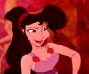
Pocahontas looks like a transvestite on that cover. ARGHH! Why couldn't they just have gone with something more like the previous cover, the French cover, or even the bland UK cover. The U.S. version looks like a Fisher Price coloring book cover for 3-year-olds.
If nothing else, they should release two different covers. One for collectors and one for the families. If they can do that for T.V. Guide and magazine covers, it shouldn't be that much trouble to make several versions of the sleeve.
Pocahontas Cover Art!
Why would they do something like that? Honestly, it's not a very bright idea as 1) It makes no sense whatsoever and 2) would increase the cost of the movie as they would have to raise the cost of production to produce the 2 different covers.Lady wrote:Pocahontas looks like a transvestite on that cover. ARGHH! Why couldn't they just have gone with something more like the previous cover, the French cover, or even the bland UK cover. The U.S. version looks like a Fisher Price coloring book cover for 3-year-olds.
If nothing else, they should release two different covers. One for collectors and one for the families. If they can do that for T.V. Guide and magazine covers, it shouldn't be that much trouble to make several versions of the sleeve.
Let's not focus on the covers too much, it's ultimately the content that counts and the cover does just that, cover
Cheers!
Jayden!
Jay+Den- University Lovers
At least one good thing came out of my Criminal Law in Context class! Thanks Maeve!
Jayden!
Jay+Den- University Lovers
At least one good thing came out of my Criminal Law in Context class! Thanks Maeve!
-
Prince Eric

- Anniversary Edition
- Posts: 1235
- Joined: Sat Sep 20, 2003 9:27 am
Actually, what you said really doesn't make any sense. There would be NO cost to producing extra covers. First of all, all they would have to do would be to make new cover art, maybe higher that UD member who came up with those super cool covers of Beauty and the Beast and Aladdin. Anyway, if they produce, say 2 million covers, they would just make half and half, no extra cost, no production whatsoever.Jayden wrote:Why would they do something like that? Honestly, it's not a very bright idea as 1) It makes no sense whatsoever and 2) would increase the cost of the movie as they would have to raise the cost of production to produce the 2 different covers.Lady wrote:Pocahontas looks like a transvestite on that cover. ARGHH! Why couldn't they just have gone with something more like the previous cover, the French cover, or even the bland UK cover. The U.S. version looks like a Fisher Price coloring book cover for 3-year-olds.
If nothing else, they should release two different covers. One for collectors and one for the families. If they can do that for T.V. Guide and magazine covers, it shouldn't be that much trouble to make several versions of the sleeve.
Let's not focus on the covers too much, it's ultimately the content that counts and the cover does just that, cover
However, I do like the cover art, thought. Anything is better than the Sleeping Beauty disaster.
-
singerguy04
- Collector's Edition
- Posts: 2591
- Joined: Wed Feb 09, 2005 4:40 pm
- Location: The Land of Lincoln
personally i thought she looked like a fish.... anyways, i didn't like the mary poppins cover either until i saw the box and it was all shiny, i hope the pocahontas box is the same! it'd be awesome if it is! If i were in control of the cover design this is what i'd do....
~I'd move the title down so that it was centered
~I'd have Pocahontas standing above the title (all that would be showing would be from her stomach up) with the wind blowing her hair to the right, sort of in front of her face as well... the basic pocahontas image.
~The background would be a light blue color with mist
~Below the title and to the right there would be the scene where she saves John Smith from death with her father standing over them... the background here would be the firey red and orange sky.
~ On the bottom left would be Ratcliff and his pug (who's name escapes me) looking sinister.
~The tiltle would be the same except i'd have Meko on the right side of the sign and flit on the other.
that's what i'd do anyways... i so wanna work for disney, lol!