Snow White Original Colors
Posted: Mon Aug 05, 2013 12:45 pm
Today I received the book "The fairest one of all", The Making of Walt Disney's Snow White and the Seven Dwarfs.
It's an incredible (320 pages) book with lots of information and original pictures.
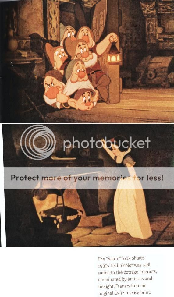
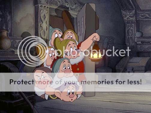
There is a whole chapter about the colors and the intended dark, realistic visuals.
"Like every other aspect of producing Snow White, the film's color had received Walt's careful attention. He had been producing cartoons in Technicolor since 1932, and he had very definite ideas about the use of color in his feature.
At the movies the night before, he had seen a recent Harman-Ising short, To Spring- a cartoon patterned on the Silly Symphonies. Walt was unimpressed. "They got colors everywhere and it looks cheap. There is nothing subtle about it at all. It's just poster-like. A lot of people think that's what a cartoon should have"
The critical stage of the process was photography, in which this artistic vision was committed to film. As each finished scene emerged from the lab, Walt and his team studied it minutely. When the film was released to theaters, Technicolor release prints were subjected to a similar level of scrunity. The prints were inspected for color balance and regularly monitored for wear. It was this film, produced with such rigorous attention to detail, that so entranced audiences around the world in 1937-38.
Unfortunately, other audiences over the next century would see a somewhat different version of Snow White.
(then 2 pages about the trouble they had with computers, removing the pigeons eyes, contrasts, darkness, details, structures etc).
At the restoration attempt in 1993, they invited artists who worked on the film in the 1930, to view the work in progress. Ollie Johnston , echoing Walt's words six decades earlier, thought that " the stuff they showed me had too much contrast. I felt it looked too poster-ish. I wanted to get back to a subtle quality. It looked almost medicinal, it was so clean, the whites were too pure".
Johnston's words underscore an important point: technicians of each generation have manipulated the film's color according to the standards of their own time. Perceptions of the role of color, especially in animation were very different in the 1980's and '90's than they had been in the 1930's, and the Cinesite technicians had had no intention of distorting the film's color balance; they were simply conforming to what was then accepted practice.
It's an incredible (320 pages) book with lots of information and original pictures.
There is a whole chapter about the colors and the intended dark, realistic visuals.
"Like every other aspect of producing Snow White, the film's color had received Walt's careful attention. He had been producing cartoons in Technicolor since 1932, and he had very definite ideas about the use of color in his feature.
At the movies the night before, he had seen a recent Harman-Ising short, To Spring- a cartoon patterned on the Silly Symphonies. Walt was unimpressed. "They got colors everywhere and it looks cheap. There is nothing subtle about it at all. It's just poster-like. A lot of people think that's what a cartoon should have"
The critical stage of the process was photography, in which this artistic vision was committed to film. As each finished scene emerged from the lab, Walt and his team studied it minutely. When the film was released to theaters, Technicolor release prints were subjected to a similar level of scrunity. The prints were inspected for color balance and regularly monitored for wear. It was this film, produced with such rigorous attention to detail, that so entranced audiences around the world in 1937-38.
Unfortunately, other audiences over the next century would see a somewhat different version of Snow White.
(then 2 pages about the trouble they had with computers, removing the pigeons eyes, contrasts, darkness, details, structures etc).
At the restoration attempt in 1993, they invited artists who worked on the film in the 1930, to view the work in progress. Ollie Johnston , echoing Walt's words six decades earlier, thought that " the stuff they showed me had too much contrast. I felt it looked too poster-ish. I wanted to get back to a subtle quality. It looked almost medicinal, it was so clean, the whites were too pure".
Johnston's words underscore an important point: technicians of each generation have manipulated the film's color according to the standards of their own time. Perceptions of the role of color, especially in animation were very different in the 1980's and '90's than they had been in the 1930's, and the Cinesite technicians had had no intention of distorting the film's color balance; they were simply conforming to what was then accepted practice.