Page 1 of 5
COVER ART (The Best & The Worst)
Posted: Mon Oct 02, 2006 12:01 pm
by RebelPrince1986
In your opinion, what are the best and the worst of disney's cover art. Only DVD.
In my opinion the worst are:
Hercules GC: The huge Herc face/terribly animated pegasus holding the characters etc...

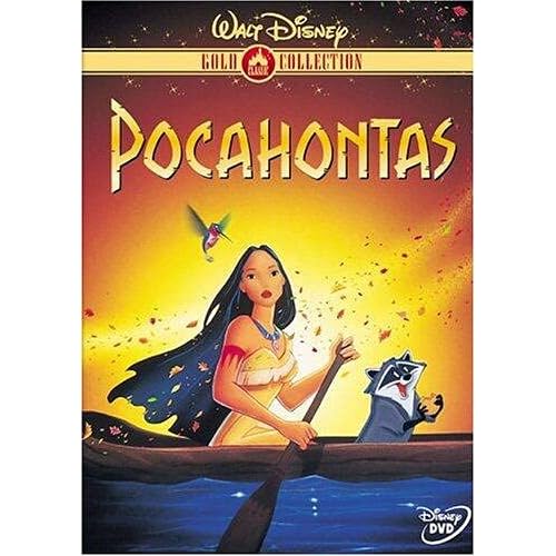
Pocahontas 10th: The dark green frame around it is not cute

Finding Nemo: You would think the turtle was the main character by looking at the cover art. Marlin and Dory are so small they look like the secondary characters and Nemo (the title character) is nowhere to be found

Toy Story 10th: The '10th Anniversary Edition' is larger than the title and Buzz is half cut off

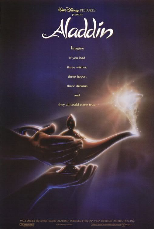
Aladdin PE: One of my all time favorite animated movies. Terrible animation on the cover art.

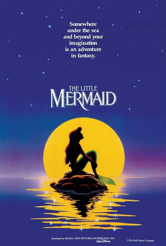
Plus Chicken Little, Dumbo BTE and the top half of The Little Mermaid PE
And the best are (once again in my opinion):
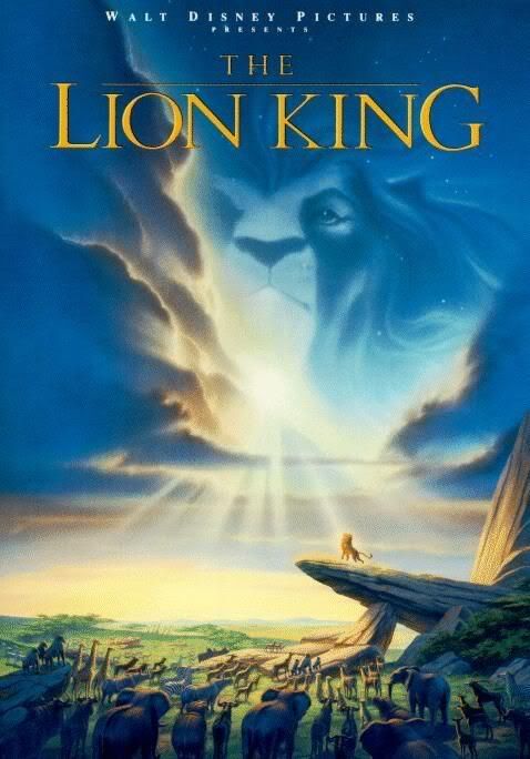
The Lion King PE: I think this is my favorite artwork of all. The orange is so beautiful and the animation (especially of Simba) is beautiful.

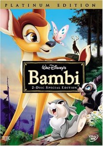
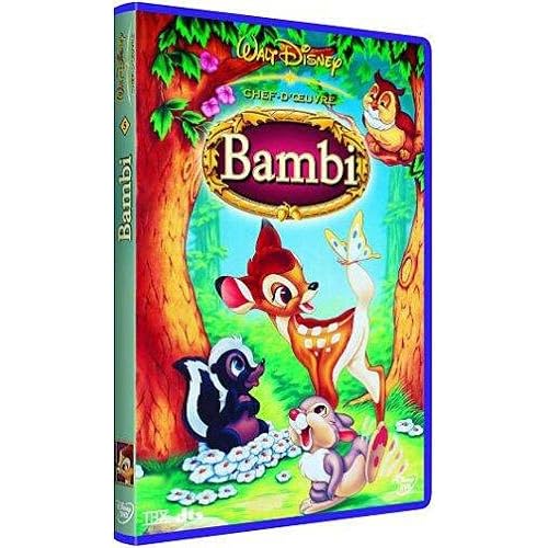
Bambi PE: Once again, beautiful animation and colouration.
Robin Hood MWE: I love the way this one looks. I don't know what it is about it, but it is beautiful art.

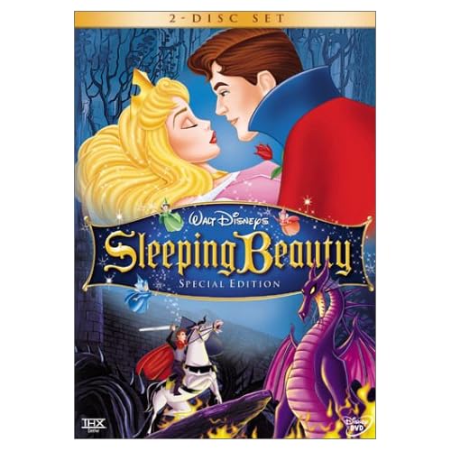
Others I really like: Tarzan CE, Sleeping Beauty SE, Alice In Wonderland ME and Treasure Planet
What do you think?!
Posted: Mon Oct 02, 2006 12:23 pm
by numba1lostboy
I totally clicked this thread because I read the word 'coverart' and I thought the Peter Pan PE cover was finally here. I was sadly mistaken...
But may as well put my two cents in:
BEST (in no particular order)
Beauty And The Beast PE
Cinderella PE and Masterpiece VHS
Lion King PE
Pocahontas GC (love that picture)
POTC: Curse Of The Black Pearl
ALL of the old Classic/Masterpiece Collection VHS covers
WORST
National Treasure (needs more of the cast)
POTC: Dead Man's Chest (that silver border is hideous)
Cars (too busy)
Parent Trap (1998) Double Trouble Edition
Posted: Mon Oct 02, 2006 1:09 pm
by Dottie
Best:
French BatB cover
Lion King
Lady and the Tramp (France)
Winnie the Pooh 25th anniversary
The Muppet show season 1
TLM PE (Japan)
Worst:
Peter Pan GC
Brother Bear
Dumbo Big Top Edition
High School Musical
Pinocchio GC
Hercules
Posted: Mon Oct 02, 2006 2:46 pm
by singerguy04
I like the look of all the digipacks in europe more than any of the cover art we have here in R1. especically the french Sleeping Beauty and Beauty and the Beast covers. why can't we get that? i'm going to say reasons why, for all of my worsts because that adds to the discussion. i don't see a need in stating i think this is great bc blah blah blah, because i'd be saying pretty much the same thing over and over.
Anyways, back to R1...
Best:
Alice in Wonderland ME
Bambi PE
The Lion King PE
Tarzan SE
Mulan SE
Robin Hood MWE
The Little Mermaid PE
Beauty and the Beast PE
Worst:
All Gold Collection Titles (too boring, and simple)
Pocahontas 10th Anniversary (she looks like a fish)
Aladdin PE (is that supposed to be aladdin?)
Lady and the Tramp PE (The Tramp is WAY off color)
The Emperor's New Groove NGE (so boring, and unimaginative)
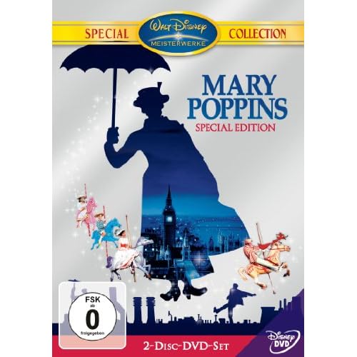
Mary Poppins 40th Anniversary (WTF went wrong here, i can't even begin to list everything i hate about it)
Posted: Mon Oct 02, 2006 2:51 pm
by Kyle
quick thing: thers no such thing as animation on cover art. animation means it consists of multiple frames to show movment.
I dont agree about aladdin, I love the cover art for the most part. it probably could have been less busy, and drawn a bit beter, but its nowhere near being one of the worst covers.
my picks for worst covers would be toy story 1 and 2. especially 2, becasue that red they got going on looks very crappy. for both of these moves its obvious they just slapped on some random character art and called it a day.
its especailly dissapointing when the early cover art for the same set with the brushed metal style looked infinately beter.
the platinum edition of the little mermaid looks like it was rushed too. they used mostly old clip art. I was hoping for something more original, uniqe.
not to mention Ariel's face looks off model. the eye on the left is too far to the left, and her right cheek (from our perspecive) is too large.
Posted: Mon Oct 02, 2006 6:06 pm
by anger is pointless
the little mermaid platinum edcition -its beautiful i love it
pocahontas - the cover shown on the first post its beautiful
robin hood most wanted - i like it but its to crowded
oliver and company- the cover with jenny holding oliver-its perfect
Posted: Mon Oct 02, 2006 6:59 pm
by Kenai
I really dig the Robin Hood MWE one. That's incredibly awesome art.
Posted: Mon Oct 02, 2006 7:46 pm
by MickeyMousePal
BEST
Snow White and the Seven Dwarfs: PE
Bambi: PE
Cinderella:PE
Lady and the Tramp: PE
Beauty and the Beast: PE
Aladdin: PE
The Lion King: PE
Sleeping Beauty: SE
The Little Mermaid: PE
The Many Adventures of Winnie the Pooh: 20th AE
The Rescuers
The Great Mouse Detective
Oliver & Company:GC
Tarzan: CE
Tarzan
Brother Bear: SE
The Black Cauldron:CE
The Little Mermaid: LI
The Rescuers Down Under: GC
Pocahontas: GC
Pocahontas: 10AE
Lilo & Stitch
The Emperor's New Groove: CE
Atlantis: The Lost Empire: CE
Lady and the Tramp: LI
One Hundred and One Dalmatians: LI
The Jungle Book: LI
Robin Hood: GC
Robin Hood: Most Wanted Edition
The Fox and the Hound: GC
The Fox and the Hound: 25AE
Saludos Amigos: GC
The Three Caballeros: GC
Fun and Fancy Free:GC
Melody Time:GC
Peter Pan: SE
Pinocchio: GE
Fantasia 60th Anniversary Edition
Dumbo 60th Anniversary Edition
Toy Story: 10th AE
Toy Story 2: SE
The Incredibles: CE
A Bugs Life: CE
Monsters, Inc.: CE
Finding Nemo: CE
WORST
Fantasia Anthology
Alice in Wonderland: ME
Dumbo Big Top Edition
Alice in Wonderland: GC
Treasure Planet
Home on the Range
Chicken Little
The Emperor's New Groove: SE
Hercules: GC
Mulan: GC
Fantasia 2000
The Adventures of Ichabod and Mr. Toad:GC
The Hunchback of Notre Dame
The Aristocats: GC
The Sword in the Stone: GC
Make Mine Music:GE
Pixar's Cars
A Bug's Life GC
Cover Art
Posted: Mon Oct 02, 2006 10:02 pm
by bprovost27
Yes. there is no animation on cover art. Thank you whoever said that. it was bothering me.
any way!

It's funny that someone else noticed the eye thing with Ariel, my friend was trying to explain the same thing to me, however i counldn't see it.
I personally really love this cover art. What did you mean by old clip art, i've never seen any of these pics before.
I really hate the way Pocohantas' face looks in the A.E. and i wish the Logo was in the center. Great DVD and Movie, hate the cover art.
Posted: Mon Oct 02, 2006 10:07 pm
by bprovost27
Kyle wrote:quick thing: thers no such thing as animation on cover art. animation means it consists of multiple frames to show movment.
I dont agree about aladdin, I love the cover art for the most part. it probably could have been less busy, and drawn a bit beter, but its nowhere near being one of the worst covers.
my picks for worst covers would be toy story 1 and 2. especially 2, becasue that red they got going on looks very crappy. for both of these moves its obvious they just slapped on some random character art and called it a day.
its especailly dissapointing when the early cover art for the same set with the brushed metal style looked infinately beter.
the platinum edition of the little mermaid looks like it was rushed too. they used mostly old clip art. I was hoping for something more original, uniqe.
not to mention Ariel's face looks off model. the eye on the left is too far to the left, and her right cheek (from our perspecive) is too large.
This is who i was trying to quote about TLM cover.

Posted: Tue Oct 03, 2006 12:23 am
by RebelPrince1986
Kyle wrote:quick thing: thers no such thing as animation on cover art. animation means it consists of multiple frames to show movment.
I dont agree about aladdin, I love the cover art for the most part. it probably could have been less busy, and drawn a bit beter, but its nowhere near being one of the worst covers.
my picks for worst covers would be toy story 1 and 2. especially 2, becasue that red they got going on looks very crappy. for both of these moves its obvious they just slapped on some random character art and called it a day.
its especailly dissapointing when the early cover art for the same set with the brushed metal style looked infinately beter.
the platinum edition of the little mermaid looks like it was rushed too. they used mostly old clip art. I was hoping for something more original, uniqe.
not to mention Ariel's face looks off model. the eye on the left is too far to the left, and her right cheek (from our perspecive) is too large.
i am sorry for saying animation instead of artwork, i didn't realize it was such a big deal, but i don't think it is necessary to be rude about it.
and also the whole point of this thread is to see who likes and dislikes which covers. i don't have to like the same ones as you and you don't have to like the same ones as me.
maybe you should consider how the things you say will come across before you say them, this was just supposed to be a fun thread, nothing more, nothing less, i don't think you need to come pick apart what people say.
Posted: Tue Oct 03, 2006 12:26 am
by RebelPrince1986
Kyle wrote:quick thing: thers no such thing as animation on cover art. animation means it consists of multiple frames to show movment.
I dont agree about aladdin, I love the cover art for the most part. it probably could have been less busy, and drawn a bit beter, but its nowhere near being one of the worst covers.
my picks for worst covers would be toy story 1 and 2. especially 2, becasue that red they got going on looks very crappy. for both of these moves its obvious they just slapped on some random character art and called it a day.
its especailly dissapointing when the early cover art for the same set with the brushed metal style looked infinately beter.
the platinum edition of the little mermaid looks like it was rushed too. they used mostly old clip art. I was hoping for something more original, uniqe.
not to mention Ariel's face looks off model. the eye on the left is too far to the left, and her right cheek (from our perspecive) is too large.
i am sorry for saying animation instead of artwork, i didn't realize it was such a big deal, but i don't think it is necessary to be rude about it.
and also the whole point of this thread is to see who likes and dislikes which covers. i don't have to like the same ones as you and you don't have to like the same ones as me.
i couldn't help but notice that you had the most negative post on this entire thread... only posting the worst ones and picking them apart just like you picked apart the fact that i said "animation." maybe you should cheer up and not be so negative!!
maybe you should consider how the things you say will come across before you say them, this was just supposed to be a fun thread, nothing more, nothing less, i don't think you need to come pick apart what people say.
Posted: Tue Oct 03, 2006 12:31 am
by RebelPrince1986
Kyle wrote:quick thing: thers no such thing as animation on cover art. animation means it consists of multiple frames to show movment.
I dont agree about aladdin, I love the cover art for the most part. it probably could have been less busy, and drawn a bit beter, but its nowhere near being one of the worst covers.
my picks for worst covers would be toy story 1 and 2. especially 2, becasue that red they got going on looks very crappy. for both of these moves its obvious they just slapped on some random character art and called it a day.
its especailly dissapointing when the early cover art for the same set with the brushed metal style looked infinately beter.
the platinum edition of the little mermaid looks like it was rushed too. they used mostly old clip art. I was hoping for something more original, uniqe.
not to mention Ariel's face looks off model. the eye on the left is too far to the left, and her right cheek (from our perspecive) is too large.
i am sorry for saying animation instead of artwork, i didn't realize it was such a big deal, but i don't think it is necessary to be rude about it.
and also the whole point of this thread is to see who likes and dislikes which covers. i don't have to like the same ones as you and you don't have to like the same ones as me.
i couldn't help but notice that you had the most negative post on this entire thread... only posting the worst ones and picking them apart just like you picked apart the fact that i said "animation." maybe you should cheer up and not be so negative!!
maybe you should consider how the things you say will come across before you say them, this was just supposed to be a fun thread, nothing more, nothing less, i don't think you need to come pick apart what people say.
Posted: Tue Oct 03, 2006 12:43 am
by RebelPrince1986
Kyle wrote:quick thing: thers no such thing as animation on cover art. animation means it consists of multiple frames to show movment.
I dont agree about aladdin, I love the cover art for the most part. it probably could have been less busy, and drawn a bit beter, but its nowhere near being one of the worst covers.
my picks for worst covers would be toy story 1 and 2. especially 2, becasue that red they got going on looks very crappy. for both of these moves its obvious they just slapped on some random character art and called it a day.
its especailly dissapointing when the early cover art for the same set with the brushed metal style looked infinately beter.
the platinum edition of the little mermaid looks like it was rushed too. they used mostly old clip art. I was hoping for something more original, uniqe.
not to mention Ariel's face looks off model. the eye on the left is too far to the left, and her right cheek (from our perspecive) is too large.
i am sorry for saying animation instead of artwork, i didn't realize it was such a big deal, but i don't think it is necessary to be rude about it.
and also the whole point of this thread is to see who likes and dislikes which covers. i don't have to like the same ones as you and you don't have to like the same ones as me.
i couldn't help but notice that you had the most negative post on this entire thread... only posting the worst ones and picking them apart just like you picked apart the fact that i said "animation." maybe you should cheer up and not be so negative!!
maybe you should consider how the things you say will come across before you say them, this was just supposed to be a fun thread, nothing more, nothing less, i don't think you need to come pick apart what people say.
Posted: Tue Oct 03, 2006 2:07 am
by Scamander
@RebelPrince1986: Ooops... what's happened there?

Back to topic...
The worst cover art:
The german Lady and teh tramp cover art... nothing more to say, I guess!

yeahh... you're right! Much more worse than the R1 DVD (and btw... just a Re-Releasing of the DVD which came out 2000)

I like the R1 more but I hate generally the Disney "Big-Head with bad transition"-covers.
Home on the range
Beauty and the beast PE
Beauty and the Beast - The enchanted Christmas SE
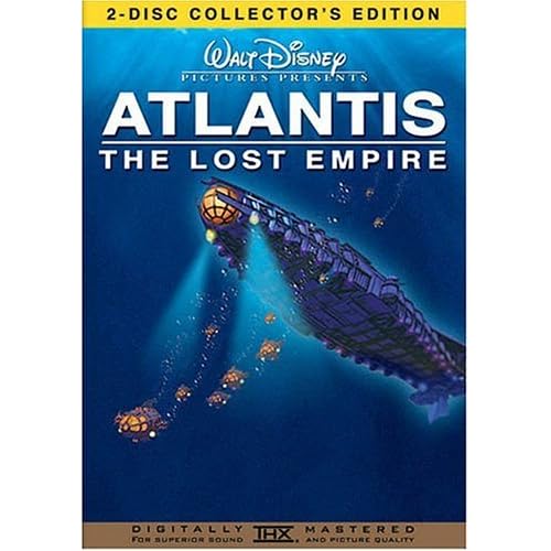
Atlantis CE- The font is so cheap
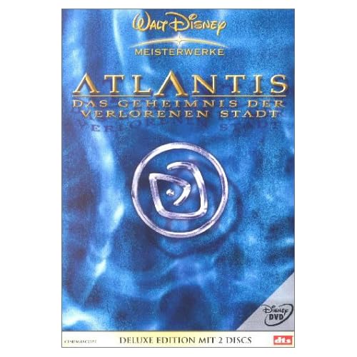
german Atlantis cover- it's ok, but the picture were better for a slipcase
The worst french cover I know!
The best cover art:
I love it so much

The german cover art is also good

But I prefer the french one
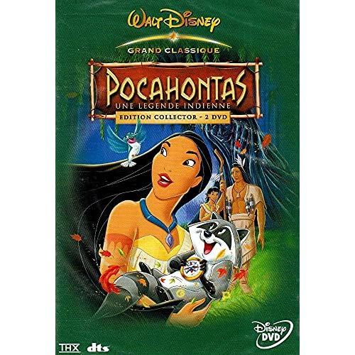
The french Pocahontas cover is so great... Wish I had it!

The german BatB Deluxe Edition- My favourite cover of all!

Yeahh... also a big head I know, but I like it much more than the others!
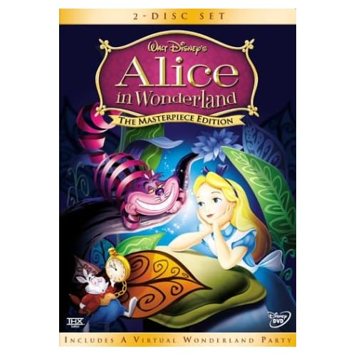
The best Alice cover which exists- but thank goodness the german one is the same!
Posted: Tue Oct 03, 2006 2:22 am
by KubrickFan
The best:
- Beauty and the Beast digipack
- Robin Hood
- The Lion King
The worst:
- Lilo and Stitch SE (don't know if it's just the dutch cover, but the artwork of Lilo and Stitch on the bottom of the cover look terribly copy/pasted with photoshop or something.)
- Hunchback of Notre Dame.
And I still think that the posters that were created for the adults should be used as covers:
The Hunchback Of Notre Dame
The Little Mermaid
The Lion King
Aladdin
These look simply amazing.
Posted: Tue Oct 03, 2006 7:12 am
by Dottie
I like the German LatT cover art. It's better than the R1, in my opinion.
Posted: Tue Oct 03, 2006 7:12 am
by myr_heille
i always thought that pocahontas gold was really pretty.
Posted: Tue Oct 03, 2006 10:07 am
by Scamander
singerguy04 wrote:Mary Poppins 40th Anniversary (WTF went wrong here, i can't even begin to list everything i hate about it)
I like it, but I like the german one a little bit more...