Page 1 of 2
Toy Story 2 DVD: Woody's Roundup Edition??
Posted: Sun Nov 13, 2005 6:47 pm
by SofaKing381222
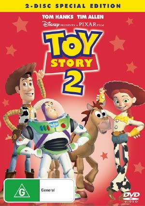
DavisDVD.com has posted cover art for the Toy Story 2 DVD due Dce 26. Here it is, below; That has got to be the worst DVD Special Edition "tag" I have ever seen. I do like the colors on this one much better! The red is darker and the characters are less pink.

Posted: Sun Nov 13, 2005 6:51 pm
by Timon/Pumbaa fan
WOW! That Woody's Round Up logo made the ugliest DVD cover even uglier!

Posted: Sun Nov 13, 2005 6:56 pm
by Pasta67
As if that cover wasn't crowded enough already.

I sure hope that changes before the DVD comes out.
That gets a big
from me.
Posted: Sun Nov 13, 2005 7:00 pm
by Loomis
Timon/Pumba fan wrote:WOW! That Woody's Round Up logo made the ugliest DVD cover even uglier!
Well, it isn't really that obtrustive. I like the fact that the logo has a "theme" rather than just being a big yellow banner across the top or something.
If you want to see obstrusive, check out our (Aussie - Region 4) new ratings logos (bottom left hand corner):
<center>
</center>
Posted: Sun Nov 13, 2005 7:10 pm
by magicalwands
Very interesting. No one has no idea what this is about? Hmm...I wonder if this will differ from the regular edition. Maybe "Woody's Roundup Edition" is a limited edition type thing.
Posted: Sun Nov 13, 2005 7:52 pm
by brownie
I actually don't think the cover is that ugly..although red wouldn't be my choice for a Toy Story 2 color. There doesn't seem to be much red in the movie.
And I don't really think "Woody's Round-up Edition" is a great name..I prefer the typical "Special" and "Platinum" editions.
Posted: Sun Nov 13, 2005 8:24 pm
by Escapay
Geez, why don't they just call it "Shameless Double-Dip" Edition!
Of course, it's not a Double-Dip for many of us who didn't get the UTB, but still, if they're gonna slap on useless labels, might as well be one with more snark than "Woody's Round Up Edition". Is Disney going the Paramount route with these custom edition titles? I've got the perfect one... Song of the South: For Real, This Is Not The Bootleg Edition!
Escapay
Posted: Sun Nov 13, 2005 8:27 pm
by Lucylover1986
I hate it too. I can dream it'll hopefully just be a sticker on the outer package or something. You don't need both 2-Disc Special Edition & Woody's Roundup Edition on the front of the package. Just stick with the SE title.
Posted: Sun Nov 13, 2005 9:47 pm
by MickeyMousePal
Hey, Disney why don't you add Rex, Ham and Mr. Potato Head on the cover too.
What's the point of putting Woody's Round Up Edition that logo looks horrible!!!!
Call it Most crowded Edition ever.
Posted: Mon Nov 14, 2005 6:29 am
by Riki
I'd prefer something like this.

Posted: Mon Nov 14, 2005 7:24 am
by dvdjunkie
I must be in the minority here, because I think that it is a great cover. It tells you the title of the movie, it shows the main characters, and what edition you are getting. Where does it say Widescreen or Foolscreen Edition?
I don't know what you expect........this is far from ugly. Wanna see ugly, check out the Mulan II cover art, or some of the earlier Disney DVD titles. It think this fits right in with the release of "Toy Story".
Lighten up, this is far from ugly!! I like it, and especially the 'Woody's Roundup Edition' Logo, it fits what the movie is all about.
Posted: Mon Nov 14, 2005 10:08 am
by ichabod
Loomis wrote:If you want to see obstrusive, check out our (Aussie - Region 4) new ratings logos (bottom left hand corner):
Thanks, for pointing out where it is. I almost missed it

Posted: Mon Nov 14, 2005 11:20 am
by Escapay
dvdjunkie wrote:Where does it say Widescreen or Foolscreen Edition?
If the first Toy Story is any indication of this edition, Toy Story 2 will most likely be Widescreen only (yippee!)
IMO, but the whole "Woody's Roundup Edition" is so misplaced and doesn't fit the theme of the cover as a whole. It's to the left and stands out almost as an afterthought. If they were gonna label it "Woody's Roundup Edition", they might as well have centered it (perhaps over Buzz and Bullseye's legs) or stick it where the "2-Disc Special Edition" Banner is. Having it too the side makes it look like one of those promotional stickers they put on the plastic covering (you know, the stuff that says "Win a cruise to Antarctica, see details inside!"), as opposed to something actually on the cover.
The one thing I truly dislike though, for the entire cover, is the red. Maybe because it's being released the day after Christmas, but that red just does not look good for the cover. Maybe it's just me, though...
Escapay
Posted: Mon Nov 14, 2005 1:21 pm
by Enchantress
I'm not a huge fan of any of the TS covers, the originals seem better to me. 'Woody's round up edition'....wha? i don't dislike it because its weird...i dislike it because it means nothing

Posted: Mon Nov 14, 2005 1:54 pm
by Loomis
ichabod wrote:Loomis wrote:If you want to see obstrusive, check out our (Aussie - Region 4) new ratings logos (bottom left hand corner):
Thanks, for pointing out where it is. I almost missed it
It's kind of obscure

That's pretty much standard for all new releases now too. People are up in arms about it, but I don't know.
The point is to inform the public. I get so many people complaining that "this film was suitable" or "why was there no warning about the language in this film" at the library, until I point out "Sir/Ma'am - it says on the cover "High Level Sex Scenes & Coarse Language - Restricted to 15+" - what did you think your 4 year old would get out of it?"
At least these new big ones give people something more obvious to ignore.
Posted: Mon Nov 14, 2005 2:09 pm
by dvdjunkie
Ignore it they will. It seems the more obvious something is, the less people see it.
When I was manager of a movie theater in Sacramento, people were always asking how much it was to get in or what time did the movie start or what time does the matinee get out..................I took some of the petty cash and went out and bought a cork board that was two by three feet in size and then bought new changeable lettering in bright colors and my staff and I made up this really neat board that had all the answers to those questions.
It didn't solve a thing, it seems more people were asking the same dumb questions. When we pointed out the board, they would say "Oh, I am sorry I didn't see it!".................cuz you didn't look........stupidooo!!!!!
'nuff said.
Posted: Mon Nov 14, 2005 3:28 pm
by Timon/Pumbaa fan
dvdjunkie wrote: Where does it say Widescreen or Foolscreen Edition?
I don't know what you expect........this is far from ugly. Wanna see ugly, check out the Mulan II cover art, or some of the earlier Disney DVD titles. It think this fits right in with the release of "Toy Story".
Well considering it's called "Fullscreen", I don't think you'll find the word "Foolscreen" anywhere!
As for the cover, there is way too much red and it way too crowded! It's different for something like Mulan 2 because it's supposed to be cheap, but Toy Story 2 is one of the greatest movies ever made, not to mention the best reviewed movie EVER! So certainly it deserves a better cover!
But after what Loomis showed us, I'm glad I don't live in Australia!
Posted: Mon Nov 14, 2005 3:50 pm
by Alan
Riki wrote:I'd prefer something like this.
Ha, thats pretty funny, but I hope you seriously wouldn't prefer that. I like the cover disney is doing now, I certaintly don't think its crowded.
Posted: Mon Nov 14, 2005 6:02 pm
by orestes.
I think the cover is okay. I like the red background a lot although the first time I saw it I thought the stars were snowflakes.

It could do without the 'Woody's Roundup Edition' though.
As for being too crowded... meh... Disney has done worse.
Posted: Mon Nov 14, 2005 6:11 pm
by That1GuyPictures
I wish that they would have gone with the cool slick silver titanium look that the ultimate toy box had, and the original cover art for Toy Story 1 was made out of. This cover just looks way too childish, and the red color is almost the exact same style as The Incredibles. I'd prefer to have a little more color on my shelf. I'd like to see Pixar/Disney do something cool like they did on A Bug's Life where they have different covers of the same movie...that was a neat idea.