Page 45 of 80
Re: Comparing Home Releases Cover Arts
Posted: Sat Mar 14, 2020 10:21 am
by Disney's Divinity
D82 wrote: In my case, I didn't watch many live-action films from Disney as a child because they weren't as easy to find here in Spain as the animated ones. The most popular of them like Mary Poppins and Bedknobs and Broomsticks have always been available, but some of the lesser-known ones have probably never been released here on VHS, especially the old ones.
I'm not surprised by that. I think even in the U.S., many of their older live-action films are hard to come by. Although maybe that's no longer the case with Disney+. I know many of them were not available on Netflix back when.
Re: Comparing Home Releases Cover Arts
Posted: Sat Mar 14, 2020 4:51 pm
by JeanGreyForever
Disney Duster wrote:Wow, Rose is...yikes.
Rose's tweets give me a good laugh at least when she tells everybody to vote Democrat, only one minute later to say she will never vote Democrat. That is the definition of deranged.
Re: Comparing Home Releases Cover Arts
Posted: Sat Mar 14, 2020 10:18 pm
by Disney Duster
That really is lol.
Re: Comparing Home Releases Cover Arts
Posted: Sun Mar 15, 2020 4:04 am
by Marce82
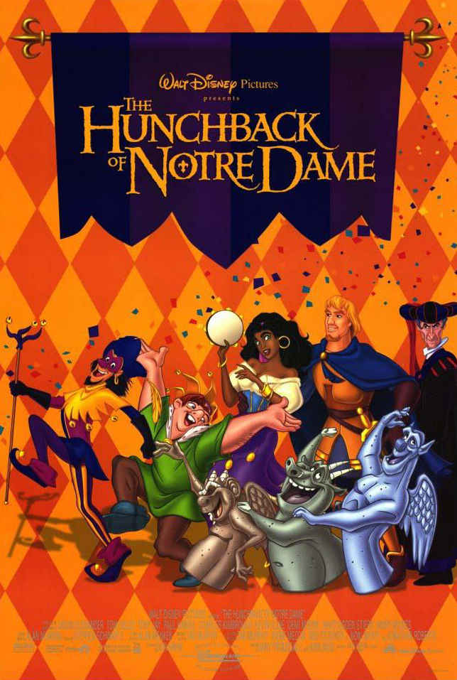
Going back to the Hunchback covers for a moment...
It's just surprising how rarely you see the cathedral on the covers. It feels like such an important element of the film, almost like another character, and a very central one at that. I get it: it's hard and time consuming to draw and paint Notre Dame... but darn.... they can just reuse one of the renderings from the film itself!
Or they could go the Oliver and Co route: one of the covers has an actual photograph of New York in the back (with a filter)... they could have done the same here if necessary.
Re: Comparing Home Releases Cover Arts
Posted: Sun Mar 15, 2020 8:10 am
by Disney's Divinity
True, but at least the Blu-ray / laserdisc show the bells. I don't mind that the gargoyles are added on the Blu-ray. They are inevitably a part of this film, even if I don't care for them. I don't think they look that off, but they've always been ugly characters to me, sort of like Olaf's design is ugly.

I'm actually surprised
Hunchback and
Pocahontas had as many covers as they did. I thought the covers would really dry up post-TLK, but not the case for those two. Maybe
Hercules will be the one it starts with... I think they re-used the same cover several times, sadly. Of course Mulan and Tarzan should have many covers, too, now I'm think of it.
Re: Comparing Home Releases Cover Arts
Posted: Sun Mar 15, 2020 1:40 pm
by DC Fan
I really like when they add Clopin to The Hunchback of Notre Dame covers.
Yes, he´s not a prominent character by any means but the fact that he´s the narrator plus he being a jester (perfect fit) he´s a character to be acknowledged.
Also, it´s a very satisfying feeling that he is the one that starts the movie and, while watching the story, one completely forgets about him so when he come´s back "closes" the story.
If I was Disney I wouldn´t have made him prominent in terms of merchandise (as said, not a regular character or a sidekick) but would have him show every now and then. For instance, in these days of collectibles, I´d made him the rare/mystery character. That way he´d feel special and the one character people would always have in their minds.
Re: Comparing Home Releases Cover Arts
Posted: Sun Mar 15, 2020 3:39 pm
by JeanGreyForever
He wasn't on any of the covers though. I always felt this poster would have made a good cover and it features him along with the rest of the main cast. From what I remember, this is the interior artwork of the UK Steelbook which I own.
Re: Comparing Home Releases Cover Arts
Posted: Sun Mar 15, 2020 4:30 pm
by JeanGreyForever
So I just came across this and I had to share it. It's a fan-made poster so it's definitely not an official Disney cover by any means, but it's so well-done that I wish Disney made something similar to this. It's too bad they aren't more adventurous with their covers. And it features Clopin
DC Fan.
 https://www.deviantart.com/joannacreate ... -741221685
Re: Comparing Home Releases Cover Arts
Posted: Sun Mar 15, 2020 4:49 pm
by blackcauldron85
^ That's super nice!! I wish Quasi (+ Esmeralda) smiled. That was my issue w/ the non-Feast of Fools Pop. He's thought of as a tragic figure, but he has happy moments and he's such a hopeful guy!
Re: Comparing Home Releases Cover Arts
Posted: Sun Mar 15, 2020 6:38 pm
by Marce82
Hey JeanGreyForever,
Oh, that is very cool fan art. Im not sure it would be well suited for a cover... but maybe for a collectible book... it's a little too artsy for a cover (as in, not commercial enough), and the character hierarchy is a little off... the mother and archdeacon are more prominent than Quasi...
But yes, very cool
Re: Comparing Home Releases Cover Arts
Posted: Sun Mar 15, 2020 10:25 pm
by Disney Duster
I think Clopin should have as much merchandise as any other character! I love him!
JeanGreyForever, that fan-art would make a great cover if it was better drawn and had better hierarchy like Marce82 said! It's really cool and also beautiful! Beauty and the Beast could have a similar idea, too.
Re: Comparing Home Releases Cover Arts
Posted: Mon Mar 16, 2020 7:23 am
by JeanGreyForever
blackcauldron85 wrote:^ That's super nice!! I wish Quasi (+ Esmeralda) smiled. That was my issue w/ the non-Feast of Fools Pop. He's thought of as a tragic figure, but he has happy moments and he's such a hopeful guy!
That's why I'm so glad that the one tin packaging cover of him in the Festival of Fools outfit has him smiling.
Marce82 wrote:Hey JeanGreyForever,
Oh, that is very cool fan art. Im not sure it would be well suited for a cover... but maybe for a collectible book... it's a little too artsy for a cover (as in, not commercial enough), and the character hierarchy is a little off... the mother and archdeacon are more prominent than Quasi...
But yes, very cool
I can't imagine Disney would ever use it as a cover for retail but it would work as an exclusive slipcover or steelbook cover. I don't particularly have an issue with Quasi's mother and the Archdeacon being so prominent because Quasi is still in the middle and still the star of the show.
Disney Duster wrote:I think Clopin should have as much merchandise as any other character! I love him!
JeanGreyForever, that fan-art would make a great cover if it was better drawn and had better hierarchy like Marce82 said! It's really cool and also beautiful! Beauty and the Beast could have a similar idea, too.
Yes, I'd love to see a stained glass version of BATB like that. Even if they just took the final one from the film and used that as a cover.
Re: Comparing Home Releases Cover Arts
Posted: Mon Mar 16, 2020 8:23 am
by rodis
One of my favorite DAC, a stunning achievement. Seeing it in theatres as an 11-year old kid, I was in absolute awe by the majestic artwork, powerful songs and overall grandiosity of the film. I remember my cousin and I cracking up so hard during the festival of fools piece.
As for the covers:
1. US Laserdisc - such a fitting artwork for the theme of the film. The muted, organic colors fit the film better than the revised Blu ray cover.
2. Blu ray - beautiful. I could do without the gargoyles (what is going on with Laverne's arms?)
3. French steelbook - This is a tie with 2nd place. The pinkish sky is gorgeous, giving the cover an epic quality.
4. DVD - nice layout and colors.
The rest is OK at best.
Re: Comparing Home Releases Cover Arts
Posted: Mon Mar 16, 2020 11:36 am
by Disney's Divinity
rodis wrote:
2. Blu ray - beautiful. I could do without the gargoyles (what is going on with Laverne's arms?)
I believe the gargoyles are all throwing confetti.
Re: Comparing Home Releases Cover Arts
Posted: Mon Mar 16, 2020 4:32 pm
by Marce82
Hey Rodis,
Good insights!
About Laverne's arms on the blu ray cover.... when I ranked the covers myself, I chose not to dissect the addition of the gargoyles. Pretty much everything about them is wrong... the rendering, anatomy, poses, placement.... everything is off. I try to look past them when I look at that cover.
Re: Comparing Home Releases Cover Arts
Posted: Tue Mar 17, 2020 4:58 pm
by universALLove
Does anyone else know the names of any of the cover art illustrators? In addition to Eric Heintz...
http://www.ericheintzimaging.com/illustration
Who has done a lot of the platinum and diamond covers.
Re: Comparing Home Releases Cover Arts
Posted: Wed Mar 18, 2020 1:18 am
by DisneyBluLife
Michael Hobson mostly did concept art for theatrical posters during the 80s, 90s and 2000s. Mostly unpublished, but he did this sketch for this Oliver and company poster.
https://www.comicartfans.com/GalleryPie ... ce=1119924
Re: Comparing Home Releases Cover Arts
Posted: Thu Mar 19, 2020 1:11 pm
by Farerb
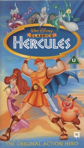
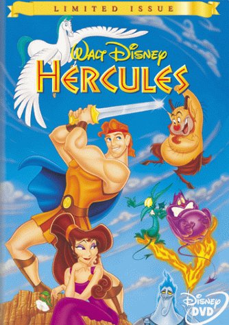
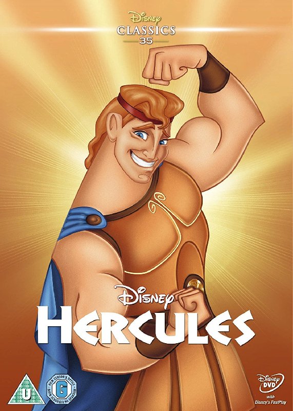
Hercules:
UK VHS:
Japanese VHS:

Limited Issue DVD:
Gold Collection DVD:

Heroes Cover:
Villains Cover:

Blu-ray:

Re: Comparing Home Releases Cover Arts
Posted: Thu Mar 19, 2020 1:31 pm
by DisneyBluLife
Re: Comparing Home Releases Cover Arts
Posted: Thu Mar 19, 2020 4:39 pm
by JeanGreyForever
I never realized that the Blu-Ray cover was the Japanese VHS cover basically. I like the blue border a lot in the Japanese version. As for the UK VHS, I think it's really well done even if it's missing Pegasus.
The Limited Edition DVD cover was okay but Hercules' sword seemed really short in length and Meg's dress was way too dark for my taste. At least the characters resembled themselves though.
I never cared much for the Gold Edition DVD cover. Herc is way too big and takes up way too much space and the rest of the characters are way too small. The image of Greece isn't really that iconic from the film anyway to warrant being used on the cover. Should have used Mount Olympus as the backdrop imo.
Hercules looks awful on those European VHS covers that DisneyBluLife posted. He looks like an old man from some cheap cartoon and it would turn me away completely from watching this film. Meg's eyebrows should be darker so she looks off as well, especially considering how distinctive her eyebrows are.
There's also the UK Zaavi Steelbook but it's pretty much the same clipart we've seen over and over.
