Ok.... so my ranking for BATB will get a little controversial... most of them are pretty poorly drawn, but here we go!
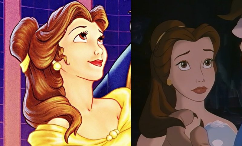
1) Classics VHS: not only is this my number one, but this is quite possibly (in my opinion) the best cover Disney has ever released. The composition is great, the poses reflect the mood of each character, the rendering reflects the textures (look at the fur!), the lighting sources are clear (moonlight and candle) and well depicted.... Belle's dress looks GOLD, not yellow. EVERY character is on model, including the beast. This is the ONLY cover where he is on model! Fareb, Belle's face, isn't weird: it is tilted upward, which is very hard to draw, and they did it perfectly here. And she doesn't have an Adam's apple: she is thin and stretching her neck, so some of her throat muscles show. The only flaw... which I understand: Cogsworth doesn't have a left arm. And why: because his arms are gold, and his left arm would have created a weird shape behind Lumiere, who is also gold. So I forgive

2) VHS UK: same as above. I get why some like the font here better... but for this movie and Aladdin, the font for the title was different in the movie vs the merchandising. So Im ok with the VHS having the merchandising font. Plus, the movie font worked in red and grey... not so great in yellow.
3) Japanese Laserdisc: It makes for a great poster, but a so-so cover. I mean... it's tasteful, but not sure it sells the movie to someone who doesn't already love it.
4) Best Buy Steelbook: this one is beautiful... tho recycled from the poster and an image from the film. The minus: this will only sell to people who LOVE the movie already. Can you picture a parent looking for BATB at a store... no way they would be able to tell this is it. It doesn't even have the title in the front!
5) WIP Laserdisc: I really like the inclusion of the rough sketches, it really fits the product. And I like the gold detailing.
6) WIP VHS: I don't love it, but I hope the sketch of the characters is the actual rough sketch, but I doubt it. Cool concept though. The excessive white space is pointless.
7) Target Digibook: it's a cool concept... and good poses. Extra points for showing the beast's body, which is hard to draw. Belle looks passable.... BUT HER SKIRT. There is a logic to it, people! It looks insane here. And poorly rendered, it looks like a yellow blob.
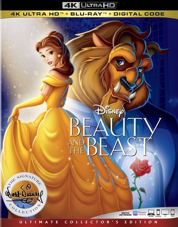
8 ) Signature 4K: this one would be lower, but I give them extra points because they did a decent job with Belle's face. They clearly don't understand the logic for her skirt.... the beast is SUPER off model, and it's a plain bad drawing. There is no attempt of scale or perspective here.
9) 3D Blu Germany: nice idea... but it's a little too subtle for this movie. And it feels more like a live action poster. I won't comment on the limited edition version... that's barely a cover.
10) Collector's UK: Nice concept, but hard to see if the drawing is any good. And I don't think it would stand out on a shelf with other dvds.
11) German Deluxe: Nice image, but it doesn't feel or look like DISNEY'S BATB. The characters look different, the rose window makes it feel like a cathedral... roman pillars???
12) Diamond edition w Book: this works a little better than the Diamond blu ray, cause they have removed the crazy composition and perspective from the equation. But all my other complaints stand, see below.
13) Diamond bluray/3D: I like the ballroom. Everything else is bad. Perspective is ridiculous, composition is weird, all characters are (REALLY!) off model, except Mrs.Potts and Chip. What the heck are the enchanted objects standing on??? Belle's skirt doesn't look like an Austrain Curtain (which it's supposed to be), but like a fluffy duvet. NO!
14) Platinum Edition: Most of the elements here are recycled from the VHS cover, only they were traced over by a bad artist who thinks they can make up for poor drawing with excessive rendering. Belle has no jawline, and her eyes are bulging out of her skull. The beast is no longer furry, it is molded in wax. Ugh.
15) Diamond DVD: hard to place this one. All characters are off model except Maurice... maybe Mrs.Potts. Lumiere looks flat out grotesque. This composition makes it look like a straight-to-dvd movie: "Belle! And her many friends...". Gaston's arms look short, and like there isn't enough space for his torso. I do like the inclusion of the castle... but why is it right next to the town??? The annoying thing is, I have seen the original drawing of the beast for this cover... and it looks good. They messed it up when they colored/rendered it.
