Page 29 of 80
Re: Comparing Home Releases Cover Arts
Posted: Wed Feb 12, 2020 11:28 pm
by Disney Duster
Marce82 wrote:In the original poster, it makes a little more sense: all characters are looking at Ariel, and expressing something toward her. Eric is DEF into her in that original poster! Ariel, in turn, is looking at the audience. I remember this more an art history class: this is what is called an interlocutor figure. It was often used in the renaissance to draw in the onlooker into the scene (there are often people in old paintings looking at the onlooker) Yay the original poster!
When you said the renaissance, I thought you meant the Disney renaissance The Little Mermaid is from, lol, then I realized you mean art and science history renaissance. I am not a fan of Ariel not looking at Eric, but hey, your factoid is interesting and maybe it makes it a better poster for many more people.
D82 wrote:7. Target Digipack: I really like the idea for this one, but the execution (especially for the bottom half) is not very good. The final artwork is not much better in my opinion. I wish they had made the top half a separate drawing instead of drilling Ariel's rock to show the other characters and the palace.
What did you mean make the top half a seperate drawing? It all has to run into each other somehow on the cover, doesn't it? A lot of times they have the top half fade into the bottom half.
Re: Comparing Home Releases Cover Arts
Posted: Wed Feb 12, 2020 11:39 pm
by D82
Disney Duster wrote:What did you mean make the top half a seperate drawing? It all has to run into each other somehow on the cover, doesn't it? A lot of times they have the top half fade into the bottom half.
Yes, that's what I meant, a separate drawing that faded into the other one. Sorry, I should've explained it better, but I didn't remember the word "fade" in English.
Re: Comparing Home Releases Cover Arts
Posted: Thu Feb 13, 2020 2:37 am
by Marce82
Hey Disney Duster: believe me, the thought crossed my mind, but I was too lazy to clarify that is was the ACTUAL renaissance, not the disney one. I thought people would figure it out

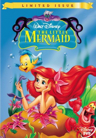
Speaking of which, note that Sebastian is looking at the camera in the limited issue dvd... same concept.
Hey D82... one thing I disagree with regarding your preference: the spanish cover vs the american limited issue dvd: Sebastian isn't off-scale in the American version, he is just closer to camera (we don't see his feet to suggest otherwise). In the Spanish version we do see his feet, but it's over that bent-flap thing in the corner... which makes it look like the slapped him on there at the last minute. Couldn't he have been BEHIND the flap?
Also, the American version is more zoomed out, so we see more landscape and Ariel's fish tail.
As for the black-on-white title... this movie is super colorful. Nothing about it suggests that color combination...
Re: Comparing Home Releases Cover Arts
Posted: Thu Feb 13, 2020 3:04 am
by Farerb
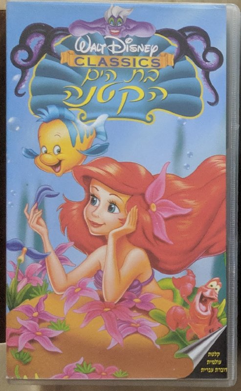
In the Hebrew VHS, he is behind and the title is in its original color:
Re: Comparing Home Releases Cover Arts
Posted: Thu Feb 13, 2020 10:11 am
by Disney's Divinity
D82 wrote:I'll only rank my top 7 covers:
1. Limited Issue DVD: I didn't have a VHS player until 1992 and at first we just rented the movies, so I never owned the Classics VHS of
The Little Mermaid. The first time I was able to get it was with this cover, so that probably influences my decision a bit, but I always loved this artwork. It's quite simple, but Ariel and the others are drawn very well, probably because it's based on a theatrical poster. I don't like the golden frame of the Masterpiece Collection, that's why I chose the Limited Issue. But I prefer the equivalent of this cover for Spain (below right) to both, because Sebastian has a more proportionate size on it and, like
Disney's Divinity, I prefer the logo with a white background.

I understand why others like these covers. Ariel is beautiful, her picking the flower is a stand-out moment, and I love the dancing Sebastian picture. It's really just the Ursula drawing that ruins it for me, but I know Ursula isn't as important to others as me and can overlook that; I admit it's a wonderful idea to have her over top of the logo, if she had simply looked better. I agree, that the Spanish version is
much better (while still imperfect for me). One, because, as you said, the shell is white, but also because they bring the picture of Ariel forward so there isn't as much empty space on the left and they make Sebastian a little bit more size-appropriate beside Ariel. And everything is given a blue tinge that suits it well, imo. It looks less garish and cheap than the image on the left.
D82 wrote:I always thought she was being shy there because of Eric and that's why she had her hand in that position, but now I think it's very likely that it's what you said.
Yes, it was just a thought while examining all the covers again for this thread, and I can't unsee it now. It may just not be done the best way it could have been. It's sort of like the Diamond DVD's Ursula looks as if she's blowing a kiss, but it's so horribly done, you really don't know for sure
what she's supposed to be doing. Others are free to disagree, they have their opinion and I have mine. *shrug* I don't believe that's being argumentative.
D82 wrote:3. Japanese VHS: I agree with the defects others have pointed out about this one too, but Ariel looks quite accurate and I really like her pose here too. For that alone, I prefer it to the rest of covers left.
I think Ariel is the best part of it. I wish they'd made it more like the picture you posted (where they imitate the end of "Under the Sea" except with Ariel not having swam off).
Re: Comparing Home Releases Cover Arts
Posted: Thu Feb 13, 2020 12:56 pm
by D82
Marce82 wrote:Hey D82... one thing I disagree with regarding your preference: the spanish cover vs the american limited issue dvd: Sebastian isn't off-scale in the American version, he is just closer to camera (we don't see his feet to suggest otherwise).
Yes, I knew that. What I meant is that I don't like that he's so big on the cover. I'd prefer he was closer to Ariel and Flounder. But Sebastian's size is an issue in other covers, like the Japanese VHS where he's huge.
Marce82 wrote:Also, the American version is more zoomed out, so we see more landscape and Ariel's fish tail.
I actually prefer the zoomed in version of the Spanish cover.
Marce82 wrote:As for the black-on-white title... this movie is super colorful. Nothing about it suggests that color combination...
I guess the title looks black because it's a scanned image, but it's actually dark blue and it shines. Here's a photo of the logo from my copy of the VHS:

Re: Comparing Home Releases Cover Arts
Posted: Thu Feb 13, 2020 1:48 pm
by Disney's Divinity
Oh, so it shimmers. I think the only Disney VHS cover my family had that did that was The Black Cauldron one.
Re: Comparing Home Releases Cover Arts
Posted: Thu Feb 13, 2020 2:17 pm
by Farerb
Another thing to notice is that Ariel's bangs should go from left to right so the Japanese VHS and the Spanish DVD probably mirrored the clip arts. And unfortunately Lorelay Bove drew that wrong for the front cover of the Legacy Collection.
Re: Comparing Home Releases Cover Arts
Posted: Thu Feb 13, 2020 2:35 pm
by JeanGreyForever
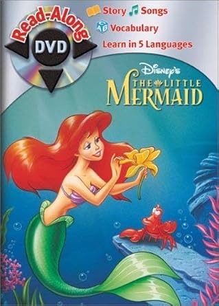
This isn't the movie but TLM did have a Read-Along DVD.
Re: Comparing Home Releases Cover Arts
Posted: Thu Feb 13, 2020 2:39 pm
by JeanGreyForever
And I really wish the original theatrical poster had been used as a cover rather than an altered, knock-off version.
 https://www.instagram.com/p/BvIJM5nnSOI/
Re: Comparing Home Releases Cover Arts
Posted: Thu Feb 13, 2020 4:11 pm
by blackcauldron85
^ That cover's perfect, but I don't think Disney would reuse it, right? None of the newer covers have the spires on them...oh, Disney.

Re: Comparing Home Releases Cover Arts
Posted: Thu Feb 13, 2020 4:13 pm
by universALLove
Oh my gosh I so would’ve loved that as the 4k cover.
Re: Comparing Home Releases Cover Arts
Posted: Thu Feb 13, 2020 7:35 pm
by Disney's Divinity
blackcauldron85 wrote:^ That cover's perfect, but I don't think Disney would reuse it, right? None of the newer covers have the spires on them...oh, Disney.
I hadn't even considered that controversy over the VHS cover, but perhaps that's the reason...

That must be why the only time the castle will ever appear on the cover since then is if it's far, far, far in the distance.
I used to think that if
The Little Mermaid had received a Box Set for the Platinum release (if they hadn't done away with them post-
Cinderella) that the cover would most likely be of Atlantica's palace--perhaps with Ursula's lair on the back cover. Sort of the way the Cave of Wonders is on
Aladdin's box set. It would've been gorgeous, but perhaps they would've never done that if someone behind-the-scenes intentionally decided to avoid using the palace because of that old controversy.
Re: Comparing Home Releases Cover Arts
Posted: Thu Feb 13, 2020 8:32 pm
by D82
Disney's Divinity wrote:I understand why others like these covers. Ariel is beautiful, her picking the flower is a stand-out moment, and I love the dancing Sebastian picture. It's really just the Ursula drawing that ruins it for me, but I know Ursula isn't as important to others as me and can overlook that; I admit it's a wonderful idea to have her over top of the logo, if she had simply looked better.
I agree that Ursula doesn't look too good there. For me, it doesn't ruin the whole cover, but I understand it does for you given that it's your favorite character in the movie.
Disney's Divinity wrote:Others are free to disagree, they have their opinion and I have mine. *shrug* I don't believe that's being argumentative.
No, it isn't. What happens on the Internet is that many times the opinions you write seem much more serious to the people who read them than you had intended. That's why arguments start so easily. Sometimes I notice that what I wrote sounds like I'm angrier or my opinion is stronger than it really is, but I don't know how to soften it so it won't be misunderstood. I believe if we were talking face to face, these arguments wouldn't happen so frequently.
Disney's Divinity wrote:Oh, so it shimmers. I think the only Disney VHS cover my family had that did that was The Black Cauldron one.
In Spain there were several that had that effect. I remember these ones, but maybe there were more:


JeanGreyForever wrote:And I really wish the original theatrical poster had been used as a cover rather than an altered, knock-off version.
I agree. That cover you posted would've been perfect. The Panini sticker album did use that poster as a cover, but without Triton, Ursula and the palace, which would also still make for a nice home video cover in my opinion.

Re: Comparing Home Releases Cover Arts
Posted: Thu Feb 13, 2020 9:32 pm
by JeanGreyForever
D82 wrote:
JeanGreyForever wrote:And I really wish the original theatrical poster had been used as a cover rather than an altered, knock-off version.
I agree. That cover you posted would've been perfect. The Panini sticker album did use that poster as a cover, but without Triton, Ursula and the palace, which would also still make for a nice home video cover in my opinion.
Even that works really well all by itself!
blackcauldron85 wrote:^ That cover's perfect, but I don't think Disney would reuse it, right? None of the newer covers have the spires on them...oh, Disney.
The Target digipack has the castle in the background but it's so small and far-off that you can't really see the spires. However, I see plenty of TLM merchandise featuring the palace so I doubt Disney has boycotted it.
Re: Comparing Home Releases Cover Arts
Posted: Thu Feb 13, 2020 10:40 pm
by Disney Duster
D82 wrote:Disney Duster wrote:What did you mean make the top half a seperate drawing? It all has to run into each other somehow on the cover, doesn't it? A lot of times they have the top half fade into the bottom half.
Yes, that's what I meant, a separate drawing that faded into the other one. Sorry, I should've explained it better, but I didn't remember the word "fade" in English.
Oh, ok, that's alright. I would have wished for something like two seperate drawings that fade, too.
Marce82 wrote:Hey Disney Duster: believe me, the thought crossed my mind, but I was too lazy to clarify that is was the ACTUAL renaissance, not the disney one. I thought people would figure it out
Speaking of which, note that Sebastian is looking at the camera in the limited issue dvd... same concept.
I thought the concept was the main character didn't look at the camera and everyone looked at the main character? I'm confused lol.
Re: Comparing Home Releases Cover Arts
Posted: Thu Feb 13, 2020 11:03 pm
by rodis
My favorite movie!
1. Classics VHS - I'm being overwhelmed with nostalgia as I look at it. Some of my best childhood memories. I for one think Ariel and Eric look nothing like themselves in the original poster... revised VHS cover is gorgeous.
2. Diamond Edition 3D - a great intimate and beautifully done poster. I love it.
3. Platinum Edition - my god how I've waited for this one to come out! Ariel is somewhat off model but nothing dramatic. The layout is great, showing both the surface and under the sea (no pun intended), beautiful vibrant colors. Love it.
3. Masterpiece Edition - I preferred the Classics one but it's still a beautiful cover depicts an iconic moment in the film.
4. Diamond Standard Edition - character design looks stylized, a bit angular even, but it's still pretty. The background looks too empty though.
Re: Comparing Home Releases Cover Arts
Posted: Thu Feb 13, 2020 11:22 pm
by Farerb
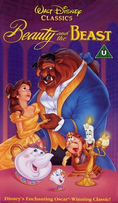
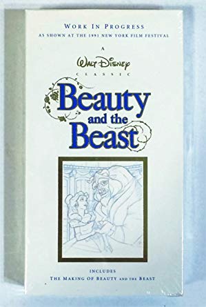
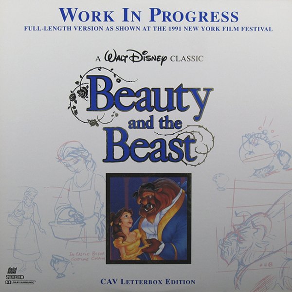
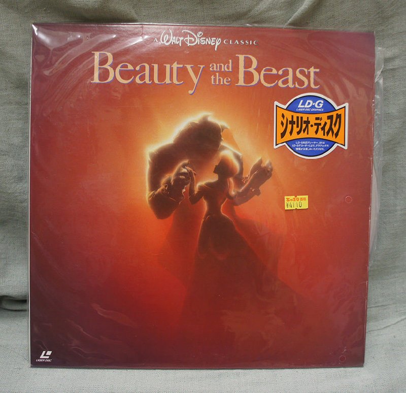
Beauty and the Beast:
Classics VHS:
VHS (UK):
WIP VHS:
WIP Laserdisc:
Japanese Laserdisc:
Platinum Edition:
Collector's Edition (UK):
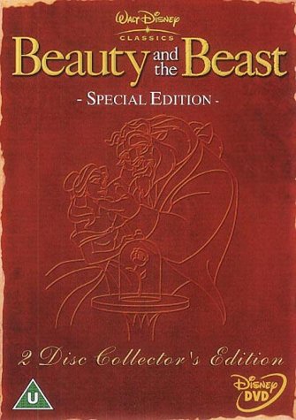
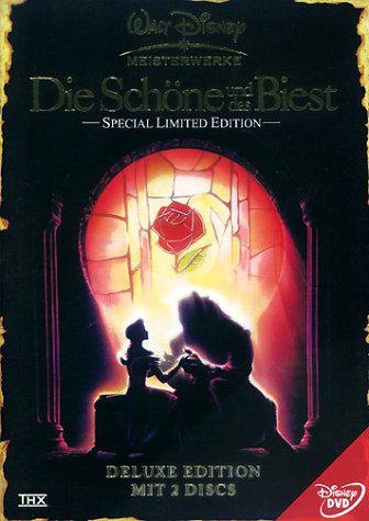
Deluxe DVD (Germany):
Diamond Edition DVD:
Diamond Edition Blu-ray:
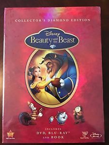
Diamond Edition with a Book:
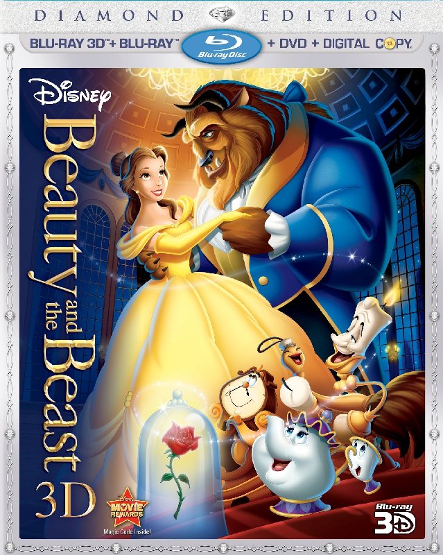
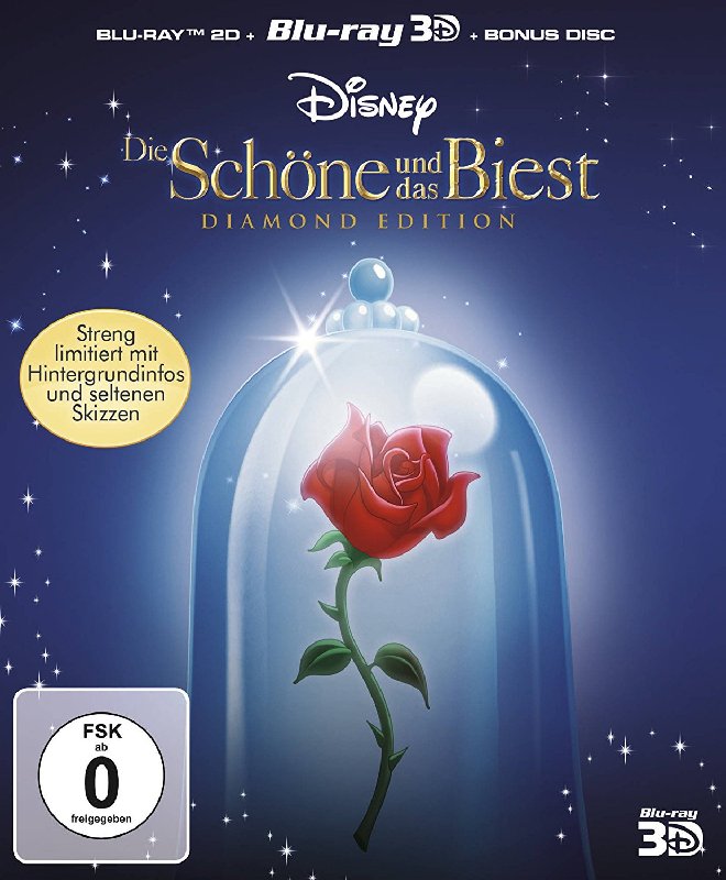
Diamond Edition 3D:
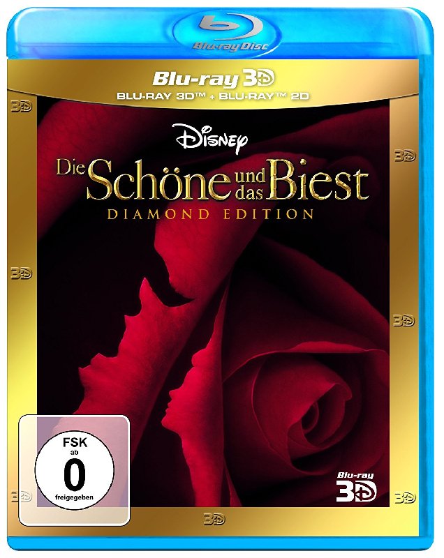
Diamond Edition 3D (Germany):
Diamond Edition 3D Limited Edition (Germany):
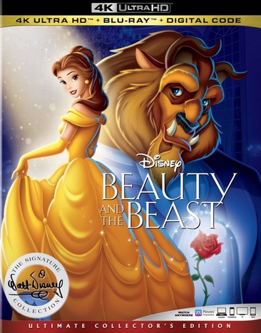
Signature Collection 4K UHD:
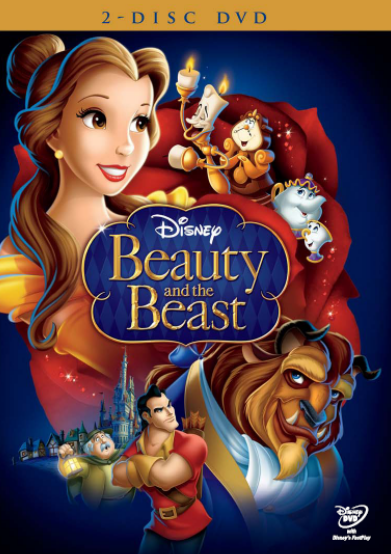
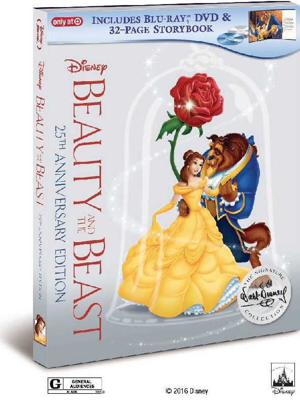
Target Digibook:
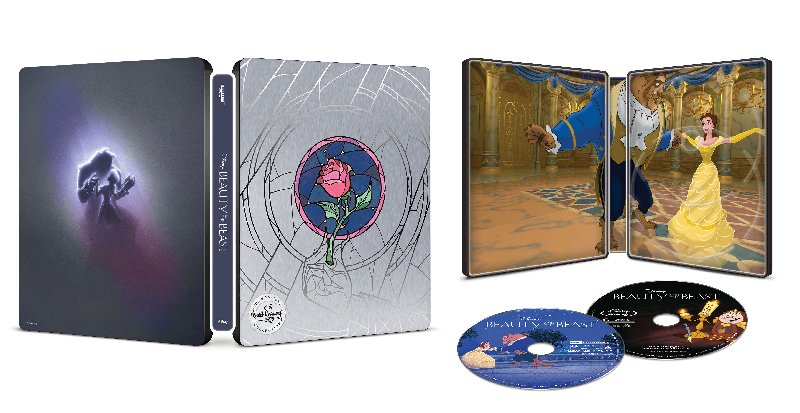
Best Buy Steelbook:
Re: Comparing Home Releases Cover Arts
Posted: Thu Feb 13, 2020 11:22 pm
by Farerb
First I will say that I don't know why they never made Belle on model on these covers. Why was it so hard to draw her?!?
1. Best Buy Steelbook - I might be hyped for this and that's why I ranked it so high, but personally I always loved the original theatrical poster and having it in a black-purple color scheme is even better than the red (I'm antagonized by the color red in relation to this film because of the Blu-ray restoration). I also like the stained glass that has been taken straight from the film. The only improvement I would have made is switching between the back and the front.
2. Japanese Laserdisc - Again the original theatrical poster. You can't go wrong with that.
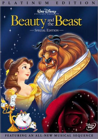
3. Platinum Edition - At first you might think it's the same as the VHS cover, but they made some improvements to the characters. The Beast has more contrast and Belle looks more feminine (she doesn't have that masculine neck like in the VHS). The only thing that bothers me is that Cogsworth got snubbed.
4. WIP Laserdisc - I like the drawings surrounding the picture. It's very fitting since it's the WIP verson.
5. VHS (UK) - You might think that's the same as the US VHS, but the font here is better, it's the font used in the title in the film itself and I like that it's written in one line instead of two. The "Walt Disney Classic" is also written better. I find Belle here to be drawn terribly though, her face is weird and she has an extremely masculine neck, she has an Adam's apple in her neck!
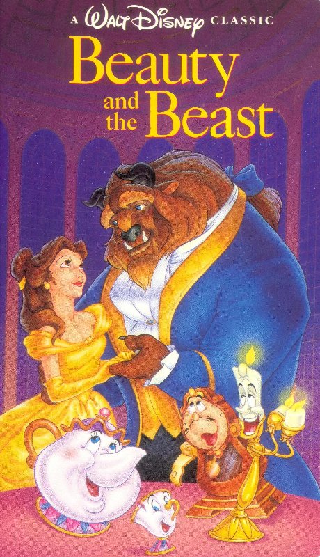
6. VHS (US) - See above.
7. Diamond Edition 3D (Germany) - Another theatrical poster that was used on one of the soundtracks. I like it but not as much as the others above.
8. Signature Collection - Weird concept but the characters are drawn relatively well. I think they might did that because they didn't want another cover where the characters look at one another.
9. Collector's Edition DVD (UK) - Not a fan of the red. I might have liked that concept it they used blue or purple instead.
10. Deluxe Edition DVD (Germany) - I always had issues with this cover, which is another theatrical poster. I know Belle's sitting on a chair or something, but it looks more like her dress is in a weird rectangle shape.
11. Diamond Edition 3D Limited Edition (Germany) - I thought I'd put it higher but I guess I find it too simple for my taste.
12. Target Digibook - I like the way the characters are drawn, but I don't like that they are locked in with the giant rose. I also don't really like the way they drew Belle's dress here, with the twirl - it looks like she's holding the back of the dress but her hand still go to the right. It's kind of twisted.
13. WIP VHS - Unlike the Laserdisc, this one doesn't have the drawings and I don't see the point of an empty white frame around the image.
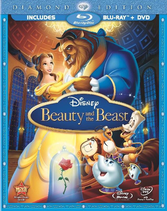
So I'm gonna say that I really despise the Diamond Edition covers. All the characters are extremely off model in an unflattering way. It makes the film look cheap, like it's one of the Disney knock offs. And I don't understand why Belle is looking at the ceiling.
Here's how I rank them:
14. Diamond Edition 3D - Only because it's actually lenticular.
15. Diamond Edition Blu-ray - I don't like how the title hides Belle and the Beast.
16. Diamond Edition with book - Another empty background, only this time it's red, which is worse.
17. Diamond Edition DVD - WTF is this mess?!? Not only do the characters look awful, but it also look extremely crowded and inelegant unlike the rest of the covers and I really despise that Belle's hair goes in both her shoulders.
Re: Comparing Home Releases Cover Arts
Posted: Thu Feb 13, 2020 11:47 pm
by D82
Wow, what a large and complete list of covers, farerb! It's going to be difficult to pick our favorites.