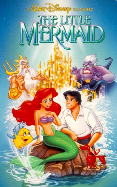
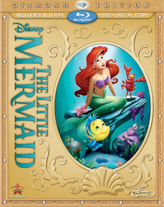
1. Classics VHS ~ I’m not crazy about Ariel’s face, but I love everything else about this. Ursula, Triton, the sparkling palace, Flounder, Sebastian. I love the placement of everything with Ursula and Triton faced in the direction of Ariel and Eric respectively--Ursula trying to use Ariel, Triton trying to stop her love of humans--the castle between the two representing the fight over property essentially (Ariel, Atlantica, and the trident are all commodities leveraged back-and-forth between them). The dynamic between Triton and Ursula plays a big role in why I love the film, too, and I've always liked the way this picture gets the story across so well, with the older generation playing a different game and on another level than the other characters with both of them attempting to control Ariel, who is a force unto herself. Ariel has always looked a bit too Barbie bimbo for me here, but it's not horrible--and definitely better than how she looks on many of the other covers. I wonder if the reason they chose to have her hand up where her neck is was to gesture towards her voice, as if she were about to sing.
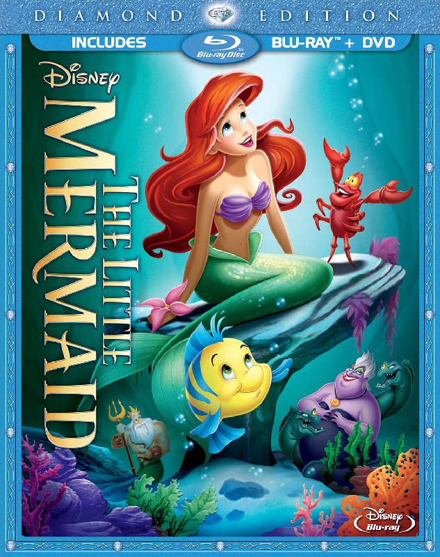
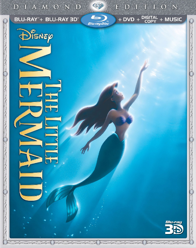
2. Diamond Edition 3D Blu-ray ~ Of course everyone loves this re-used poster. This is also the only Diamond cover for TLM I don’t hate. It's a gorgeous image, but my ideal cover would always include Ursula, Triton, and Sebastian. *shrug*
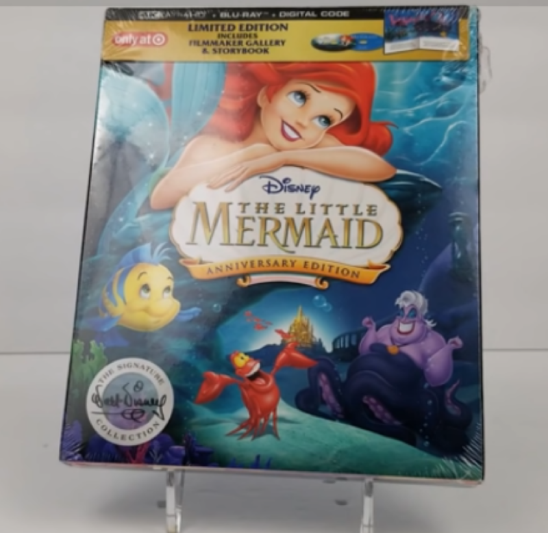
3. Target Digipak ~ I love this one. I know it re-uses a great deal and Ariel doesn’t look perfect, but I love how everything’s placed. Ariel’s tail, Flounder, and the grotto are beautiful. I love seeing the palace in the distance. And they may have used slightly altered clipart for Ursula, but at least it’s not an ugly picture of her like every other cover she appears on that I ranked below the Signature Collection.
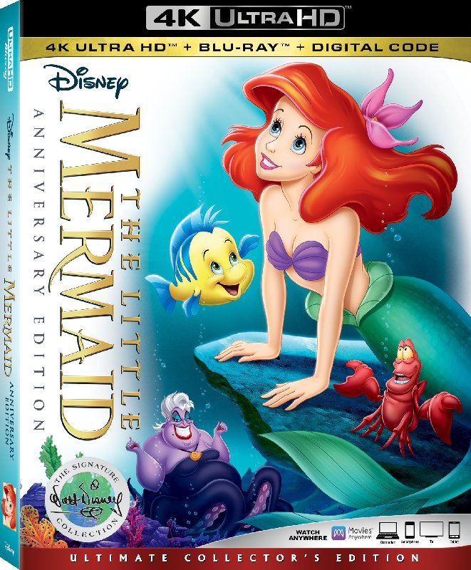
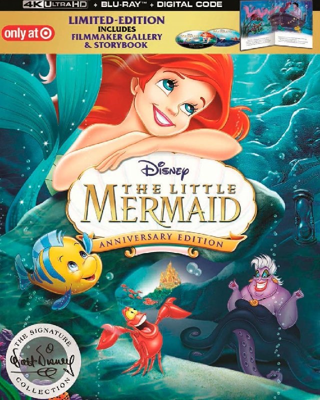
4. Signature Collection ~ Imperfect, but eh. I like the colors for everything--the ONLY time Ursula's colors are completely right for her earrings and makeup without forgetting the beauty mark either. Sebastian is perfect. Ariel and Ursula aren't so bad they ruin it for me.
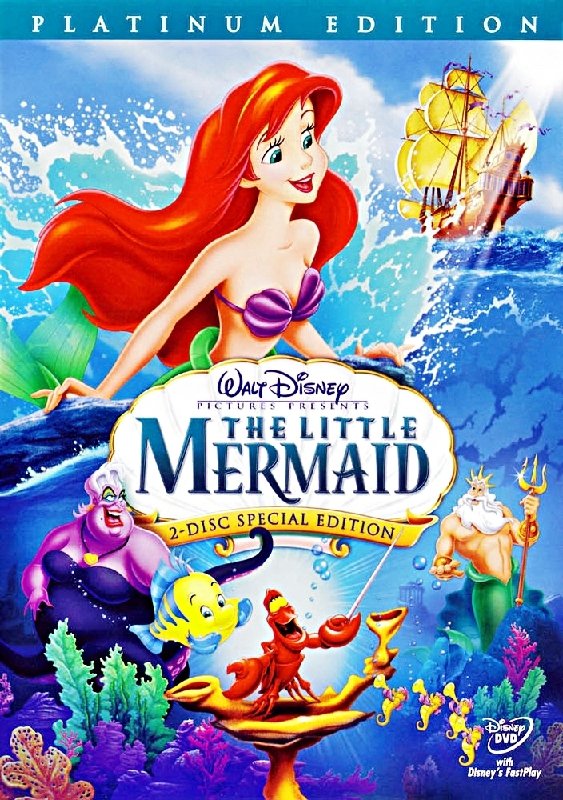
5. Platinum ~ I liked that Triton clipart, and that they tried to re-create the moment on the rock. Also that they incorporated a ship into it, too. I know Ursula is ugly and all, but she's a little
too repulsive on this one... It doesn't look like her. Random thought, but I always thought Ariel's right eye was a little too far to the left.
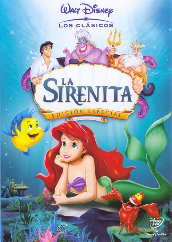
6. Spanish DVD ~ I like the pictures for Eric and Triton. The Ursula clipart and the re-used Sebastian from the Classics cover are fine, too. Ariel's face doesn't look quite like her to me. Still, it's not too bad.
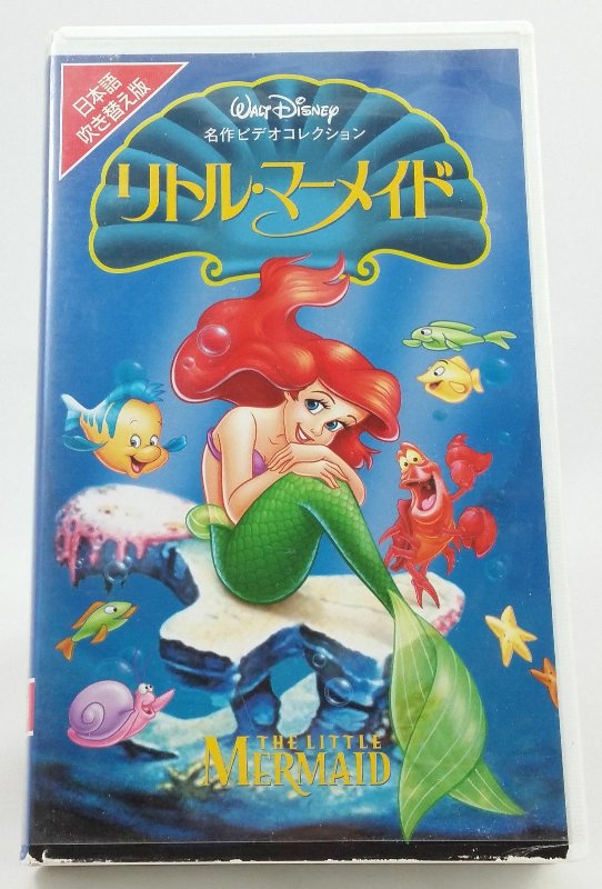
7. Japanese VHS ~ I like Ariel's pose and that they show the scales just like on the Classics VHS and the lithograph used for the Masterpiece VHS and Limited Issue DVD. I also like that they used the rock from the love me-love me not scene and "Under the Sea." Still, the characters are way out of proportion next to one another. It would be a good idea if they'd really executed it, but it seems sort of lazy and slapdash.
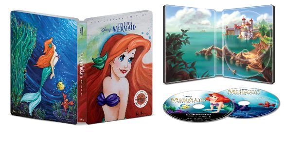
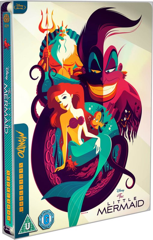
8. Best Buy Steelbook ~ The back is okay--not perfect, but okay. Hate the front.
9. Diamond Edition Blu-ray (Ellipse) ~ Triton is probably the only character that I don’t think looks bad on this cover. Well, F&J are alright. The pose for Flounder is really dumb. My least favorite part about all the original Diamond covers is the poor attempt at scales. The light / sheen on the tail and Ariel's hair on all these original Diamond covers is ugly for me. I don't like the Diamond line's covers in general though. I like the logo on the ellipse cover best because it's a blue-green color.
10. Diamond Edition Blu-ray
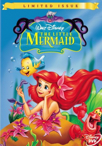
11. Limited Issue DVD
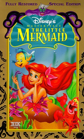
12. Masterpiece VHS ~ I love the lithograph / poster this and the Limited Issue DVD cover are taken from (always loved the dancing Sebastian clipart), but I hate these covers. Ursula looks horrible; it's a nice concept to have her at the top with her tentacles (a poor imitation of the lithograph), but her face, hands, and the ugly green eyeshadow are just horrible. I don’t know how they took such a beautiful picture and cut it down to something as ugly as these two covers. The white shell on the Platinum and Digipak work better than blue, in part because the logo is dark blue on the white shell. Something about the blue shell and the almost neon green logo on top of it looks really cheap to me. EDIT: Looking more at Ursula at the top, it's funny because her tentacles do a bit of a disappearing act. The tentacle on either side that loops up the highest and then bends down behind the other isn't colored where it should be behind the other tentacle Instead you have gold background where there should be tentacle.

The left side is the worst one, because you probably shouldn't be seeing any gold at all right there. I do think the tentacles are at least better drawn than her face/arms aside from that screwup.
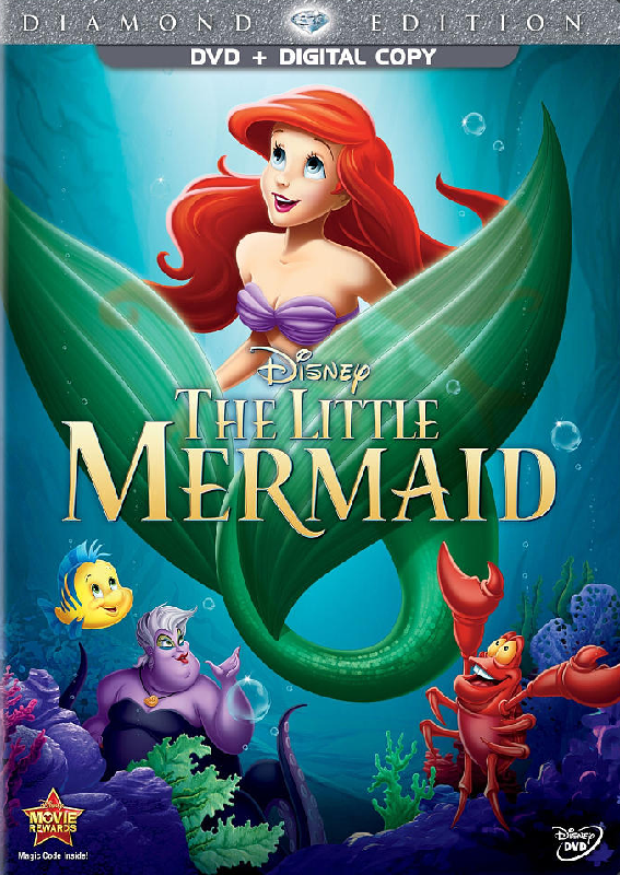
13. Diamond Edition DVD ~ Awful.
The top 6 are the only ones I think are good, and I'd say I only
really like the top 4. EDIT: I was just looking at them again and the funny thing is, I'd say Triton is the only character that (even though he isn't on every cover) doesn't look ugly or off on any of the covers--although his eyes are a little eye-poppy on the Spanish cover.

I almost think that picture of him must've used his appearance on the lithograph that the Limited Issue DVD and Masterpiece VHS covers lift from as reference, with the trident switched to the opposite side.
