Page 27 of 66
Posted: Tue Apr 01, 2008 12:29 pm
by lord-of-sith
I hope they come out with some cool new Maleficent merchandise! *crosses fingers* I'd be some happy!
Posted: Tue Apr 01, 2008 12:33 pm
by Ariel'sprince
Simba Toys made an Ursula doll when The Little Mermaid PE came,Maleficent is so popular that I"m sure she"ll get some merchandise,too

.
Posted: Fri Apr 04, 2008 8:50 pm
by jrboy
From Amazon.com

Posted: Fri Apr 04, 2008 9:54 pm
by diego14_1992
it's beautiful!!!! 
and it's all better in blue, tooo bad it's the same cover art and doesn't have the
platinum edition logo
Posted: Fri Apr 04, 2008 10:13 pm
by Sailor Eric
jrboy wrote:From Amazon.com
I don´t like the cover!!! The art is beautiful, but I like the purplish background with all the swirls and sparkle that appeared in one of the posters shown earlier on this post. I think I´ll cry! lol I´ll cross my fingers for the purplish cover!!!!
Posted: Fri Apr 04, 2008 11:55 pm
by JDCB1986
I really like that they used the same art, but switched it to Blue for the Bluray (I wonder if this could be a theme we start seeing on the animated classics... Pinocchio with a prominently Red background on DVD... Blue on Bluray ? ? Being a huge fan of the cover art, I think it would be cool to see slightly different covers for Bluray release be a common thing we start seeing ! !)... Now if only they could shrink the oversized DISNEY BLURAY logo on the bottom right corner.
Posted: Sat Apr 05, 2008 12:12 am
by SleepingBeautyAurora
I like the cover, its definitely better then the Special Edition cover. I agree that the Disney Blu-ray logo is to big and I don't like the Disney Movie Rewards logo either. I like both the blue and purple colours but I prefer the blue. I can't wait till October!
Posted: Sat Apr 05, 2008 7:27 am
by Ariel'sprince
Actually it does says Platinum and even have a speical box:

Wha.. why is this blue? this is werid and ruine

(and no,it's not funny because it's
Blu-ray) the purple is perfact,and why the same thing? oh well

.
Posted: Sat Apr 05, 2008 12:07 pm
by PrincePhillipFan
Personally, I love the cover for the blu-ray, and think it's really pretty. But I guess I'm just biased and side with Merryweather with blue being my favorite color.
Although personally, I really don't care what the cover may look like as long as it has all those special features mentioned in the release. I can't wait to see the deleted songs and sequences and the alternate opening.
Posted: Sat Apr 05, 2008 12:16 pm
by Ariel'sprince
I guess you're right and the bonus features are the importent thing-Not the cover,it's just a picture after all.
I"m not saying it's not pretty (well,the cliparts are amazing again but the DVD one is better).
I liked that it looks like a book
.
Posted: Sat Apr 05, 2008 2:28 pm
by Atlantica
It is is point though isnt it; why are we even fussed about what the cover art is? It should be the content we should be thinking of. Why does cover art get us in such a state ?
For me, I think its because we all individually want the best for our Animated Classics. I mean, I get really irritated evey time I look at my Little Mermaid I + II Platinum Edition boxset, as Ariel is not featured on the spine, as Aladdin, Cinderella, Peter Pan and 101 Dalmations were. And thats just stupid; I should be thrilled that Mermaid was finially released on DVD !
I'm not sure about the blue .. .. how many different covers of this DVD have we had now!? Seems like loads !
Posted: Sat Apr 05, 2008 3:05 pm
by Flanger-Hanger
I like the cover, and more importantly we get to see what the "Disney Blu-Ray logo looks like. Wish it was smaller though and I wish the "Disney Movie Club Exclusive thing would just be a sticker. It's so tacky.
Sleeping Beauty: Platinum Edition
Posted: Sat Apr 05, 2008 9:52 pm
by Disney Duster
I don't care if it's not as important as the bonus features, the cover is more art of my favorite characters and settings, just like deleted scenes and still galleries show more art of my favorite characters and settings.
I'll tell you what, though I still think I would prefer any of the French new art covers, the blue border has made me almost accept this cover. Okay, what does everyone think of this?: Under Phillip and Aurora is still the forest of thorns, but the castle is in the center distant). The three faires are rushing down to Phillip's aid in colored light on the left (where the castle was), Phillip is still where he was, except rearing Sampson's reigns because in front of him, on the left, is Maleficent in fairy form, melded by flames with her dragon form, rising on the left side (near Phillip up above). I may draw this sometime. This way, both sides have magic effects filling up empty space, and we get to see fairy Maleficent.
Anyway, to make it like all the other Platinums (including the DVD cover fro this release), it should say "Platinum" and "Edition' on either side of the little blue circle up top, without the '2-Disc".
Also, did anyone notice one bad thing about chnaging it all to blue? The purple smoke around the dragon that was correct as purple because the smoke is purple in the film has been turned to blue!
Posted: Sun Apr 06, 2008 6:46 am
by Flanger-Hanger
Good eye, Dusty I didn't notice that at first! I still think it's alright with the border, but I would have taken one of those French covers any day. Does anyone know which one got picked? And dusty where are the other cover designs for Cinderella's platinum, you (or someone) said that they had a choice like the French did with Sleeping Beauty.
Re: Sleeping Beauty: Platinum Edition
Posted: Sun Apr 06, 2008 6:59 am
by Ariel'sprince
No,Disney Duster,the fairies aren't helping Phillip,they're looking at Aurora,make the cover bigger here and see it:
http://disneyshopping.go.com/webapp/wcs ... ryId=14431
Sleeping Beauty: Platinum Edition
Posted: Sun Apr 06, 2008 4:40 pm
by Disney Duster
Yay, Flam-Ham prefers the French covers like me. I do not know which cover the French chose, or if they're still getting a different cover at all, but it's always possible they chose the cover that was only a re-arrangement of the 2002 cover no one liked, which we now have re-drawn as our official cover.
As for the Cinderella covers, here they are:
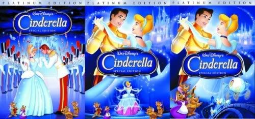
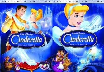
I like the tiny transformation image in the second one, and wouldn't have minded that cover just because I love that image and scene so much. Due to compliants from me and other members that we see more of the Prince than Cinderella on her own Platinum cover, I made my version with transforming in Disney dust Cindy, though I did it crappily:
 Ariel'sprince
, the fairies may be looking at Phillip and Aurora, but a stream of their magic fairy dust is going down to Phillip. It's like when they used magic on his sword. I wish the magic would touch the sword on the cover.
Posted: Sun Apr 06, 2008 5:47 pm
by Flanger-Hanger
Those covers are neat. I like how they put zero effort in the first one and just took the 1987 re-release poster and slapped on the new logo. Yours is the best actually, I would have just put the Fairy Godmother to the left of Cindy and have the castle on the right bigger.
Posted: Sun Apr 06, 2008 6:38 pm
by Disneykid
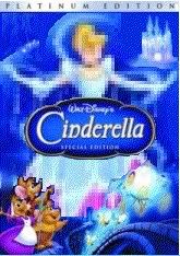
My only problem with that Cinderella image is that the transformation is backwards. It's showing her transform from the top down (look at the remains of the pink dress at the bottom). The image with her and the slipper was and still is my favorite of the bunch. Not only is she the most dominant there and holding the film's central icon, but she's actually the most on-model out of all the covers ever made for the film on home video. Only her colors are wrong, and we know that Disney would've at least fixed the hair color as they did with the final one.
As for Sleeping Beauty, I prefer the purple color scheme over the blue, but I have to admit the Blu-Ray border makes it look a bit fancier. I'm still disappointed that they never went with any of the French covers. Let's see which of those they choose for France's edition (the green one with Maleficent was my favorite of that set).
Re: Sleeping Beauty: Platinum Edition
Posted: Mon Apr 07, 2008 10:06 am
by Ariel'sprince
Disney Duster wrote:
Ariel'sprince, the fairies may be looking at Phillip and Aurora, but a stream of their magic fairy dust is going down to Phillip. It's like when they used magic on his sword. I wish the magic would touch the sword on the cover.
Maybe they're just helping get the caslte.
Maybe they should cut Malficent and Phillip going to the castle and leave it like the PE book cover,or maybe just sleeping Aurora with the other character below.
Those Cinderella cover are beautiful!

my favorite is Cinderella with the slipper
but I love the final cover,Why Prince Charming looks like he has lipstick?.
In the 2nd cover it looks like the spell is painting her pink dress into the ballgown.
Re: Sleeping Beauty: Platinum Edition
Posted: Mon Apr 07, 2008 2:42 pm
by JDCB1986
Disney Duster wrote:Yay, Flam-Ham prefers the French covers like me. I do not know which cover the French chose, or if they're still getting a different cover at all, but it's always possible they chose the cover that was only a re-arrangement of the 2002 cover no one liked, which we now have re-drawn as our official cover.
As for the Cinderella covers, here they are:
I like the tiny transformation image in the second one, and wouldn't have minded that cover just because I love that image and scene so much. Due to compliants from me and other members that we see more of the Prince than Cinderella on her own Platinum cover, I made my version with transforming in Disney dust Cindy, though I did it crappily:
Ariel'sprince, the fairies may be looking at Phillip and Aurora, but a stream of their magic fairy dust is going down to Phillip. It's like when they used magic on his sword. I wish the magic would touch the sword on the cover.
I think the whole direction they took with the cinderella cover was wrong...
She's way off model... the colours are wrong in a lot of places...
It's far too blue...
My all-time favourite Disney film... one of the worst covers in my opinion.