Page 18 of 40
Posted: Fri Jul 06, 2012 6:35 am
by Scamander
Mooky wrote:Scamander, this may be a silly question, but why is the German title of the film Cinderella? Shouldn't it be Aschenputtel?
Yeah, this is kinda odd. When the film was released in Germany in 1951, the title was indeed "Aschenputtel" though in the German dub they still called her Cinderella. This confused the audience (especially the children), so Disney decided to change the intro text of the film in the late 80s to explain, that Aschenputtel is called Cinderella in this film, because it's her name in the US.
Later in the 90s, they dropped Aschenputtel completely and changed the German title of the movie to Cinderella- probably because of the huge pop cultural influence of Disney and due to the fact, that nowadays the title "Cinderella" is well-known and more popular than the original in Germany.
Posted: Fri Jul 06, 2012 6:52 am
by Toky
No slipcover and dvd combo for Cinderella? :O Disney doesn't even deserve to own it's own classics anymore, bleegh....

while other companies treat their classics like something really special, Disney doesn't even bother anymore....They should spent some more money on new John Carters etc
Posted: Fri Jul 06, 2012 7:37 am
by Marce82
Wow... that is really interesting about the German title change...
I don't know of any other country that does that.
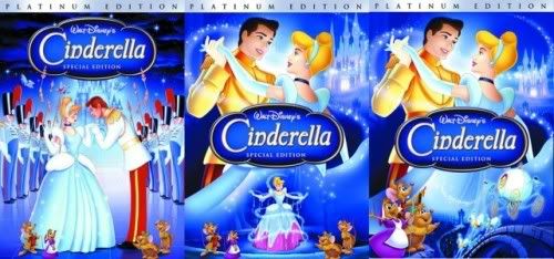
Back to critiquing the cover art...
On the BD cover: why is there no space between the mice's eyes?? And oddly enough, why are the fairy's so far apart? (and weirdly shaped)
On the DVD cover: they are the mice's eyes so weirdly shaped??? Plus, Gus dilated pupils make him look high...
Posted: Fri Jul 06, 2012 9:47 pm
by Disney Duster
The Germans made their covers better! Except on the Blu-ray they should move the castle out of the way of the title, lower towards the coach and trees, even if they have to remove the trees for it.
Altanticaunderthesea, yea, those are trees, not roots or "veins" lol! They took the background of Cinderella's garden (the wide view when she runs to the bench and cries) and put the castle "in the distance" behind the trees. Also, they didn't tip her face forward for the DVD cover, it's a completely new drawing.
Sicoe, oh, you mean the transformation in general, not just Cinderella transforming, because she isn't the one transforming on the 80's cover (which is my favorite cover to this day!). And I don't remember her transforming on a UK cover, or do you mean this one?:

Well she's kind of in her transformation "pose" and she has the same transforming magic fairy dust, so, I see what you mean but to me it's more like she ran down the steps and looked at her remaining glass slipper. For me, the reason the 2012 DVD cover is so exciting is because it's the closest to her actual transformation I've ever seen on a cover, aside from the middle one of these covers:
If that version of the transformation was the one in the 2012 DVD cover, I would die so amazingly happy. And if they had a better title box design...and maybe moved it to the top of the page instead of covering her.
Marce, yea, you have good points on Cinderella and the others on both covers, except I don't think any of the eyes on the Blu-ray cover are bad, and I actually like the little change they made to her sleeves, and if you watch the film closely, her sleeves fluctuate a little bit in how they are drawn, I know this very very well (though I must admit they never quite look like how they do on the Blu-ray but I just plain like it and think it fits somehow).
Posted: Sat Jul 07, 2012 12:14 am
by tsom
Disney Duster wrote:
As Cinderella's number one fan here
Umm...that's not true. Lol
Posted: Sat Jul 07, 2012 1:17 am
by Disney Duster
Um...but you like Ever After more than Walt Disney's Cinderella, so yes it is.

Posted: Sat Jul 07, 2012 7:55 am
by Vlad
Sicoe, oh, you mean the transformation in general, not just Cinderella transforming, because she isn't the one transforming on the 80's cover (which is my favorite cover to this day!). And I don't remember her transforming on a UK cover, or do you mean this one?:
Well she's kind of in her transformation "pose" and she has the same transforming magic fairy dust, so, I see what you mean but to me it's more like she ran down the steps and looked at her remaining glass slipper. For me, the reason the 2012 DVD cover is so exciting is because it's the closest to her actual transformation I've ever seen on a cover, aside from the middle one of these covers:
If that version of the transformation was the one in the 2012 DVD cover, I would die so amazingly happy. And if they had a better title box design...and maybe moved it to the top of the page instead of covering her.
Well, to me (in the UK cover) she has the same pose she has in the film when her dress is being transformed. That cover is the most accurate of them all. Her dress is silver, not blue, and her hair is not blonde, but has an orange-ish tint

Also, I do like the 2012 DVD as well, but I have to agree with you, I don't like the new logo, it's not nearly as stilish as the one used on the PE DVD, which is quite sad really. Instead of making a new and crappy one, they should have used the old one. Or at least, put the glass slipper on the background of the new logo, and that would make it look a lot better, don't you agree,
Disney Duster?
Posted: Sat Jul 07, 2012 8:12 am
by Vlad
SWillie! wrote:Scamander wrote:
Did you look at her face? oO
Haha I was gonna say the same thing. It may not be the worst Cinderella we've seen, but it's definitely not on model. Unless you count the Princess merchandise level of "on model".
Well, she looks like in the movie to me.
Posted: Sat Jul 07, 2012 11:40 am
by 271286
Sicoe6256 wrote:If that version of the transformation was the one in the 2012 DVD cover, I would die so amazingly happy. And if they had a better title box design...and maybe moved it to the top of the page instead of covering her.
Wow, you're right. That's a great picture... Don't like the cover as a whole, but the transformation bit is good... Do we have it in better quality?
Posted: Sat Jul 07, 2012 11:51 am
by Mooky
Scamander wrote:Mooky wrote:Scamander, this may be a silly question, but why is the German title of the film Cinderella? Shouldn't it be Aschenputtel?
Yeah, this is kinda odd. When the film was released in Germany in 1951, the title was indeed "Aschenputtel" though in the German dub they still called her Cinderella. This confused the audience (especially the children), so Disney decided to change the intro text of the film in the late 80s to explain, that Aschenputtel is called Cinderella in this film, because it's her name in the US.
Later in the 90s, they dropped Aschenputtel completely and changed the German title of the movie to Cinderella- probably because of the huge pop cultural influence of Disney and due to the fact, that nowadays the title "Cinderella" is well-known and more popular than the original in Germany.
That really is odd (why would they call the character 'Cinderella' in the first place?), but it is still a very interesting story nonetheless. Thank you for explaining!
Posted: Sat Jul 07, 2012 4:34 pm
by Atlantica
I don't think I like it when a character is featured twice on a cover....there is no need.
I am dreading the day they have Ariel both as a mermaid and as a human on a re-release cover....
Posted: Sat Jul 07, 2012 5:55 pm
by Disney Duster
Sicoe6256 wrote:Well, to me (in the UK cover) she has the same pose she has in the film when her dress is being transformed. That cover is the most accurate of them all. Her dress is silver, not blue, and her hair is not blonde, but has an orange-ish tint
It does look like it's supposed to be that pose but the pose itself doesn't count for me, you know, I guess I just love the transformation scene too much, I need more lol! Her hair is right but her dress is actually more like white with blue shadows and in other images I've seen it's actually like a very light almost sorta not really silverish blue. lol I like to get descriptive.
Sicoe6256 wrote:Also, I do like the 2012 DVD as well, but I have to agree with you, I don't like the new logo, it's not nearly as stilish as the one used on the PE DVD, which is quite sad really. Instead of making a new and crappy one, they should have used the old one. Or at least, put the glass slipper on the background of the new logo, and that would make it look a lot better, don't you agree, Disney Duster?
Actually, even though I would like that, they created an even better logo, the most beautiful one I have ever seen, for the stoyrbook/discholder that's in the 2012 jewelry box gift set coming out. Here's a picture of the book with the, to me, amazing logo they should use on the DVD:
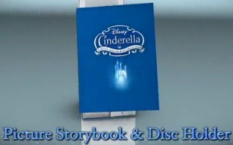
271286 wrote:Wow, you're right. That's a great picture... Don't like the cover as a whole, but the transformation bit is good... Do we have it in better quality?
He, you quoted Sico but I was the one who talked about the picture. Anyway, I so, so, so wish I had a better quality picture but I don't! It was taken from a survey where people could vote on the Cinderella cover they liked best.
I did zoom in it when I made my own version of the Platinum Edition cover I wish we had gotten:
atlanticaunderthesea wrote:I don't think I like it when a character is featured twice on a cover....there is no need.
I am dreading the day they have Ariel both as a mermaid and as a human on a re-release cover....
I like it sometimes. There's a way you can do it right. Like if you make it look like there's multiple scenes on a cover, instead of just characters all in a group photo lol. I would actually like a cover with Ariel as both a mermaid and a human on it, but that's me.
Posted: Sun Jul 08, 2012 10:34 am
by Atlantica
Really ? I just find it irritating ! Maybe thats just me then ?

It irritates me as it just looks like random clipart plonked together without any care.
I love the cover with her in her tattered pink dress gazing at the pumpkin being created .... that is the VHS from my childhood, and nothing has really come close since, for me at least.
Posted: Sun Jul 08, 2012 1:34 pm
by Marce82
I agree about the 80's cover. It depicts a scene, not just floating stuff... characters are on model, and its magical without it being too girlie.
I have to say the PE cover comes in a close second... in my opinion, one of the best PE covers... nice design and everyone is on-model!
Posted: Sun Jul 08, 2012 3:41 pm
by Disney Duster
We agree exactly on the 80's cover Atlantica, but I think sometimes it's possible to have multiple characters on a cover look right. Like these Sleeping Beauty Platinum Edition covers that some online survey let people vote on (which included the one we did):
Removed the pictures, for Disney to keep their preliminary covers that aren't meant to be seen by everyone for various reasons somewhat under wraps!
Posted: Sun Jul 08, 2012 3:59 pm
by Marce82
Hey DisneyDuster,
Great covers! Where did you get the clip art for them??? They look WAY better than what ended up being the cover...
Posted: Tue Jul 10, 2012 10:05 pm
by Disney Duster
A long time ago someone posted that some French Disney site had a survey web site visitors could partake in and vote on which cover for the Sleeping Beauy Platinum Edition they liked better. Unfortunately maybe it is the last one which won. My favorite is the 4th one followed by the 2nd one and then the 3rd one. Here they all are.
Removed the pictures, for Disney to keep their preliminary covers that aren't meant to be seen by everyone for various reasons somewhat under wraps!
Posted: Tue Jul 10, 2012 11:46 pm
by ajmrowland
Green would've been a departure.
Posted: Wed Jul 11, 2012 3:01 am
by Marce82
Nice covers!
I like 2 and 4....
Hey, DisneyDuster...do you have higher res versions of them?
Posted: Wed Jul 11, 2012 5:16 am
by Toky
Love the third, hopefully they will re-use it for the diamond edition