Page 17 of 80
Re: Comparing Home Releases Cover Arts
Posted: Fri Dec 06, 2019 12:27 pm
by Disney's Divinity
universALLove wrote:What do you think of the Diamonds? (Besides the U.S. which everyone seems to hate because of the oval border).
I was trying to do that "if you don't have anything nice to say, say nothing it all" thing.

I actually don't mind the ovals, it's everything else I usually hate about the Diamond covers. They look like the covers for coloring books rather than Blu-ray/DVDs.
Re: Comparing Home Releases Cover Arts
Posted: Fri Dec 06, 2019 9:40 pm
by D82
Well, this time I'll try to rank all the covers:
1. VHS. It has a nice composition and the characters are more or less on model. Also, like the film itself, it's quite cheerful.
2. Japanese VHS. As
universALLove pointed out, they used a theatrical poster for that one and it's quite well drawn, though I wish they had used
this other poster instead, which is similar but includes more of the main characters.
3. DMC Exclusive Blu-ray. That image was on the back of one of the VHSs, but it also makes for a good cover. As others have said, it's simple but beautiful.
4. UK Platinum Collector's Edition DVD. That one is also simple and elegant. By the way, if anyone's interested
here are photos of another UK set they made with the VHS.
5. UK Zavvi Exclusive Mondo Steelbook. It's not the one that better represents the movie, but the idea is quite clever.
6. Platinum Edition: It's not bad, though some characters could've been drawn better.
7. Diamond Edition UK Steelbook. I think that one was previously used as a VHS cover in some countries. The characters could look better, but at least the background is nice and I like how Kaa is coiled around the logo.
8. Diamond Edition Blu-ray. I actually prefer the US version with the oval. It's clear that the drawing was designed to fit that shape, so it works better on that cover in my opinion. It's a bit uninspired though, and Mowli doesn't look like himself. I don't know if it's that I'm more critical with human characters than with animal ones, but in my opinion Mowli isn't completely accurate on in hardly any cover while the rest of characters are much more on-model most of the times.
9. Diamond Edition DVD. It's curious that they recycled the poses of Mowli and Baloo from a
poster for The Jungle Book 2 with this one. I would've preferred that Shere Khan, Kaa and King Louie weren't on it; they don't seem to belong to the same picture. They should probably be a bit bigger, given that they're in the foreground, plus I don't like their placement on the cover.
Re: Comparing Home Releases Cover Arts
Posted: Fri Dec 06, 2019 9:50 pm
by D82
Disney's Divinity wrote:I wish more of the covers featured Bagheera, since he was always my favorite character.
My personal favorite is Baloo, but I love Bagheera too and I actually identify more with him. I don't understand why King Louie is featured in most covers but not him. He's almost as important as Baloo and certainly more than Louie.
JeanGreyForever wrote:There's also this preliminary Platinum Edition cover. It always amazes me how much of the Diamond Edition artwork basically came from unused versions of the Platinum Editions.
I don't know if it's just me, but I can't see the image. Would it be possible for you to find a link to it or something? I would really appreciate it.
Re: Comparing Home Releases Cover Arts
Posted: Fri Dec 06, 2019 10:03 pm
by JeanGreyForever
D82 wrote:JeanGreyForever wrote:There's also this preliminary Platinum Edition cover. It always amazes me how much of the Diamond Edition artwork basically came from unused versions of the Platinum Editions.
I don't know if it's just me, but I can't see the image. Could it be possible for you to find a link to it or something? I would really appreciate it.
I noticed that the image link stopped working as well. I found the original on page 14 of The Jungle Book Platinum thread if you scroll all the way down on this link.
viewtopic.php?f=1&t=19078&hilit=jungle+ ... &start=260
The image was working fine when I posted it but it stopped as of a few hours ago. Funny coincidence since it was also working fine in The Jungle Book thread when I first encountered it a few days ago and saved so I could post here when it was The Jungle Book's week for covers. I unfortunately haven't been able to find the same image online. Basically it was just the Diamond Edition cover (the full image, not just the oval) but the movie's logo was in the middle above Mowgli and said 40th Anniversary. Baloo was the only clipart that was different but the rest was basically identical.
Sorry about that.

Maybe somebody else who was here from that time will be able to find the image.
Re: Comparing Home Releases Cover Arts
Posted: Fri Dec 06, 2019 10:13 pm
by D82
Don't worry, JeanGreyForever. And thank you for making the effort of trying to find it and for the description! Thanks to that and the blurry image, I think I can picture what it looked like.
Re: Comparing Home Releases Cover Arts
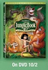
Posted: Fri Dec 06, 2019 10:25 pm
by blackcauldron85
I'm really confused as to what pic isn't showing up for you all. It's not the one that says "On DVD 10/2" that JeanGreyForever posted, right?
Re: Comparing Home Releases Cover Arts
Posted: Fri Dec 06, 2019 10:31 pm
by JeanGreyForever
blackcauldron85 wrote:I'm really confused as to what pic isn't showing up for you all. It's not the one that says "On DVD 10/2" that JeanGreyForever posted, right?
It is that very same image and I've posted it here again to confirm.
The link was working for me when I posted it last night but as of today, it hasn't worked for at least me and D82. What do you see?
Re: Comparing Home Releases Cover Arts
Posted: Sat Dec 07, 2019 8:34 am
by blackcauldron85
I see that image on all those posts in this thread, and that other thread link that was posted...that's why I'm not sure if there was a link to a larger version that I'm missing...
[And I always lurk in this thread; I like seeing all the covers, but don't have much to say about them...]
*edit* Sorry it's fuzzy but here's the image on my Imgur (the forum can't determine the dimensions of the image so it won't post the actual image...):
https://imgur.com/a/MREcfSU
Re: Comparing Home Releases Cover Arts
Posted: Sat Dec 07, 2019 2:36 pm
by JeanGreyForever
I just realized that I can see the image on my phone which is also from where I posted it. For some reason, I can't see the image on my computer and the same must apply to D82. Luckily the link you posted works for me blackcauldron85 so thank you so much!
Re: Comparing Home Releases Cover Arts
Posted: Sat Dec 07, 2019 7:30 pm
by D82
Yes, thanks
blackcauldron85! The link you posted also works for me. I checked it on my phone and you're right,
JeanGreyForever, I can see the original image there too. How weird.
I guess our computers don't have some software or something needed to see that kind of images.
Though it's a bit unbalanced, I actually prefer the composition there than on the recycled version they used for the Diamond Edition. However, the final Platinum cover is better in my opinion.
While I was also (unsuccessfully) trying to find the image I couldn't see, I found some others apparently related to the Platinum Edition as well that I thought might be interesting to post. I'm not sure if they're also preliminary versions of the Platinum cover, other covers or just fan art. Does anyone know?
 Source: https://www.amazon.es/Jungle-Book-Anniv ... B01I07174C
 Source: https://www.snapdeal.com/product/the-ju ... ion/126660
 Source: https://www.fulcrumgallery.com/The-Jung ... 611770.htm
 Source: https://www.hemantonline.com/the-jungle ... ition-1967
Re: Comparing Home Releases Cover Arts
Posted: Sat Dec 07, 2019 11:26 pm
by JeanGreyForever
I'm glad it worked for you on your phone after all!
And thank you for posting those preliminary Platinum Edition covers. You're right that they were early versions, not fanart. I saw most of them in the Platinum Jungle Book thread but the ones posted there had dead links or were of such low-quality that I didn't see the point in posting them again here so I'm glad you find higher-res versions.
Re: Comparing Home Releases Cover Arts
Posted: Sun Dec 08, 2019 6:30 pm
by Disney's Divinity
I like all those pictures you posted, D82, whether it turns out they were fanart or not. Especially the second one. I like Bagheera in the top corner and Louie looks really good on that one.
Re: Comparing Home Releases Cover Arts
Posted: Sun Dec 08, 2019 10:31 pm
by D82
JeanGreyForever wrote:And thank you for posting those preliminary Platinum Edition covers. You're right that they were early versions, not fanart. I saw most of them in the Platinum Jungle Book thread but the ones posted there had dead links or were of such low-quality that I didn't see the point in posting them again here so I'm glad you find higher-res versions.
You're welcome. And thanks for confirming that!
Disney's Divinity wrote:I like all those pictures you posted, D82, whether it turns out they were fanart or not. Especially the second one. I like Bagheera in the top corner and Louie looks really good on that one.
The second one is the one I like the most too, but in my case because Mowli looks much better than in the final cover (except for the right eye which doesn't seem to look in the right direction).
Re: Comparing Home Releases Cover Arts
Posted: Tue Dec 10, 2019 7:55 pm
by Marce82
Ok, so time for me to rate TJB.... none of them are terrible, but none of them are great either. Why is Mowgli off model in every single cover? And D82, have you been going through my notes???

So here we go:
1) DMC Exclusive. Simple... wonderful background and scale. Represents the movie well, showing the relationship between Mowgli and Balloo, but the slight threat from Kaa in the corner. Balloo is a little off... I get a 3/4 view is more interesting for his face, but it makes no sense here. He should be in profile, looking directly at Mowgli.
2) Classic VHS: This is a toss up between my number 1 and number 2. This a great example of a cover that features a lot of characters, but they all make sense in the space. Someone sat down and thought this one out before they drew it; they didn't just slap on characters randomly. It also captures the tone of the film very well: playful. Why, oh why is Mowgli off model???
3) Japanese VHS: less points for recycling a poster, extra points for picking a good poster to recycle. Balloo looks GREAT here. Mowgli ALMOST does.
4) UK Platinum collector: a little too simplistic, well executed. It's trying to make this one look a little too refined, and this movie is very down-to-earth.
5) Diamond Edition dvd: shame about this one. If they had just had Mowgli and Balloo it would have been pretty good. I especially like the depth in the background. But did some executive demand more characters at the last minute and they just slapped the villains in the front?? They look terrible. They kill the whole composition.
6) Platinum edition: a little cluttered. Mowgli looks high, and like he is not making eye contact with Balloo. And look at the way they are holding hands!! Awkward.... almost as awkward as that tiny Bagheera. There is just too much going on in this cover.
7) Diamond Edition blu: hate that oval. none of the characters look right, and because of the lack of space + number of characters... it just looks like a clutter.

UK Platinum: same as the American one, but now everything is cluttered and the added background looks pretty bad. Doesn't feel like jungle, just feels like leaves.
9) UK Diamond Steelbook: oh, I have seen this one before. The characters look terrible in this one, except for Shere Khan, who looks ok. And where is Bagheera?? You have every minor character but not one of the major ones? The background looks really nice, but I feel like the characters don't match stylistically or lighting wise.
I won't even bother with the Zavvi. I don't think these pieces were intended to be covers.
Re: Comparing Home Releases Cover Arts
Posted: Thu Dec 12, 2019 10:17 pm
by Farerb
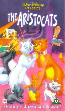
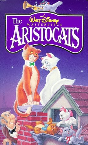
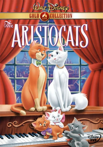
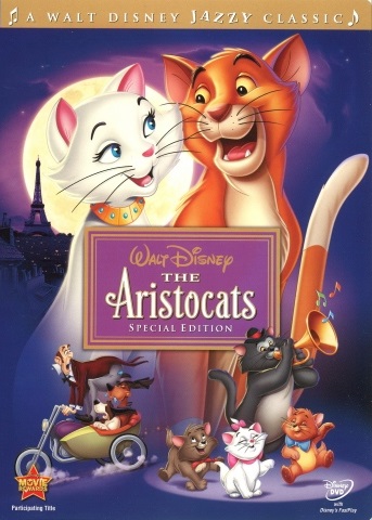
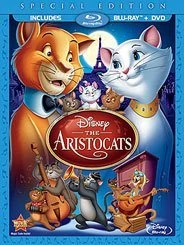
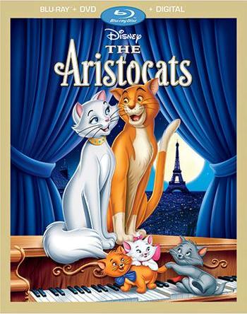
The Aristocats:
Classics VHS (UK):
Masterpiece VHS:
Gold Collection DVD:
Special Edition DVD:
Blu-ray:
DMC Exclusive Blu-ray:
Re: Comparing Home Releases Cover Arts
Posted: Thu Dec 12, 2019 10:32 pm
by Disney Duster
I like the Masterpiece VHS the best. Why is it called, "A Walt Disney Masterpiece"? I guess because Walt died just before it came out? It's kinda sad. I just love all the main characters out on the rooftop beneath a purple sky. Edgar's weird hiding there, but oh well, lol. My next favorite is the DMC Exclusive. Great composition, very classy. It's odd the curtains are blue there, but red on the Gold Collection. Which is correct? My third favorite is the Special Edition. Great life in the characters and I like how cool they look in the purple space with the lighting and shading.
Re: Comparing Home Releases Cover Arts
Posted: Thu Dec 12, 2019 11:06 pm
by Disney's Divinity
The Masterpiece VHS and Gold Collection DVD covers are my favorites. I don't like Duchess' face/expression on most of these although none of the covers are really horrible except the Classics VHS.
Re: Comparing Home Releases Cover Arts
Posted: Fri Dec 13, 2019 1:01 am
by JeanGreyForever
I always loved the Gold Collection cover the most followed by the Masterpiece VHS cover. The rest are pretty generic.
Re: Comparing Home Releases Cover Arts
Posted: Sat Dec 14, 2019 10:48 pm
by D82
Here are some more
Aristocats covers:
Spanish VHS:

UK steelbook:

DMC Exclusive Collector's Edition:


Marce82 wrote:And D82, have you been going through my notes???
It's true. We agreed on many things this time. By the way, I hadn't noticed Baloo looked a bit off on the DMC Exclusive. You're right, his face would've made more sense in profile.
Disney Duster wrote:It's odd the curtains are blue there, but red on the Gold Collection. Which is correct?
None of them. They're actually green, as you can see
in this clip. And the window is not behind the piano in the movie.
Re: Comparing Home Releases Cover Arts
Posted: Sat Dec 14, 2019 11:29 pm
by JeanGreyForever