Page 16 of 98
Posted: Sat Mar 06, 2010 10:17 am
by ajmrowland
That's nice! It really does look like it could be 2D.
Posted: Sat Mar 06, 2010 10:21 am
by blackcauldron85
She's so pretty!!! <3
")
Thanks for sharing!
Posted: Sat Mar 06, 2010 10:21 am
by Candy-Bonita95

Her eyes!
I hope that's just an exaggeration.
Posted: Sat Mar 06, 2010 10:27 am
by Mooky
Well, hello there Ariel with blonde wig and green contacts!
But seriously, I really like that pic. *That one* actually looks like it's painted. Or maybe even like a puppet. Now if only the whole movie looked like that... Her eyes are huge though (and yes, I know big, round eyes is a typical Disney thing, but Rapunzel's are freakishly huge).
Posted: Sat Mar 06, 2010 10:46 am
by Old Fish Tale
She's so pretty! Thanks!
Posted: Sat Mar 06, 2010 11:04 am
by miklc
Wow that pictures beautiful, but wow she does have a striking resemblance to Ariel! (Not that, that's a bad thing!)
Posted: Sat Mar 06, 2010 11:08 am
by UmbrellaFish
When I first saw that, I honestly thought it was a drawing. Although, that just might be because of the quality of the scan, so I'll wait before I go gaga over that. But those eyes! Wow, very 90s Princess-y.
Posted: Sat Mar 06, 2010 11:15 am
by Prince Kido
Don't worry Candy-Bonita95, this picture is NOT an image from the movie but just a marketing pose which is off-model.
Posted: Sat Mar 06, 2010 11:50 am
by robster16
Very interesting! Can't wait to see an actual movie still of Rapunzel, fully rendered and on model then

Posted: Sat Mar 06, 2010 11:36 pm
by Elladorine
This is an
edit I did of
the pic MALEFIKO shared with us . . .

Mostly because I wanted to see what she looked like with smaller eyes.

I also attempted to paint over the text since it was a bit . . . distracting.
Posted: Sat Mar 06, 2010 11:37 pm
by ajmrowland
Well, Hello Beautiful!
Posted: Sun Mar 07, 2010 12:01 am
by SWillie!
Wow you did a REALLY nice job of painting over the text!!
Posted: Sun Mar 07, 2010 12:24 am
by SillySymphony
Thank you
enigmawing, it looks so much nicer now. She's so pretty.
Posted: Sun Mar 07, 2010 1:55 am
by Elladorine
Glad you like.
I really hope her eyes will end up being a bit smaller like that.
Oh, I was playing with the logo too so it wouldn't look so plain if and when I wanted to add it to something . . .
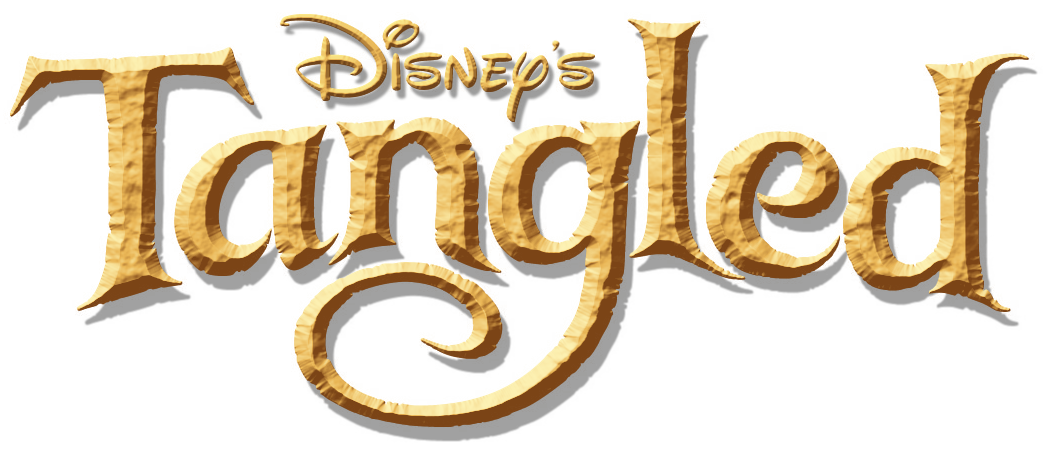
It bothered me that the original says just "Disney" so I added the 's to it.

Posted: Sun Mar 07, 2010 2:48 am
by Sotiris
The logo looks great enigmawing! Btw, it's gonna be just "Disney" instead of "Walt Disney Pictures" on top of all their new movies, not just for Tangled.
A recent example is for Alice in Wonderland, that just says "Disney" on top of the logo in all the promotional materials.
Posted: Sun Mar 07, 2010 5:09 am
by supertalies
Oooh...pretty...
Me like

So it really
does look like a painting.
Rapunzel
Posted: Sun Mar 07, 2010 9:58 am
by Disney Duster
I think I agree wuth everyone here, that picture looks great, painted and everything, except for the too big eyes! Though I never liked the big eyes of the Renaissance princesses...but this is very much Glen Keane's girl!
Does this painted looking picture also remind anyone of another painting of a beautiful princess...?
This one?
And this needs to get changed back to "Rapunzel", because it's look more classic and more like those classic hand-painted original title-keeping Disney fairy tales every time...
Robster16, anything on what's been happening with the ptition or LA Times?
Posted: Sun Mar 07, 2010 12:52 pm
by Elladorine
sotiris2006 wrote:The logo looks great enigmawing! Btw, it's gonna be just "Disney" instead of "Walt Disney Pictures" on top of all their new movies, not just for Tangled.
A recent example is for Alice in Wonderland, that just says "Disney" on top of the logo in all the promotional materials.
Thanks.
I figured the case was something like that, seems there was a discussion here a while back about the differences between labeling films/posters/covers/etc. with Disney vs. Disney's vs. Walt Disney Pictures.
Personally I think it looks really weird to just plop only the Disney name above the film title and be done with it.

Or maybe it's just the grammar police in me.
Posted: Sun Mar 07, 2010 1:02 pm
by Siren
I like your design of her better enigma! I think her eyes are just too big. Even anime characters think her eyes are too big.

Posted: Sun Mar 07, 2010 4:00 pm
by robster16
I did my own redesign of the face. I made the eyes even smaller and less stretched so the pupils would be more round and lowered her eyebrows, then gave the picture some much needed contrast and some slight color correction:
