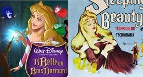
ESCAPAY I just capitalized your name to find it through all this, why is it that the pan & scan version of
Sleeping Beauty shows more on the top and bottom? And then why wouldn't widescreen try to fill up as much space as it can by having the little bit of top and bottom pan & scan has? We all want as much picture a possible.
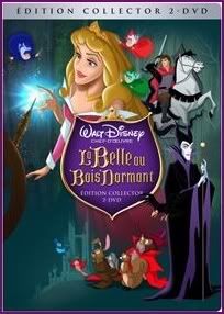
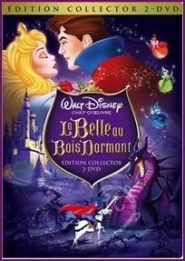
Disney Villain, it may be that Disney is doing things because of what we avid fans said on here, but I don't think you can expect Disney to change everything. They can't please everyone, though the most we ask for is things drawn and colored correctly, which we shouldn't need to ask for. But these are the French covers for the French voters, and it's up to them now. Maybe they'll listen to you still, but it is weird that these covers are for French voters and was found in a French forum if they were reading what we said on this English forum. Still, it's all very cool, especially the fact that you asked for Maleficent transforming above the title and that's
exactly what we got... Hehe, it looks like they'll never listen to us about Aurora in blue, though! Your book cover is our only hope.
I like your idea to fix the 1st cover with Maleficent looming over Aurora, and I suppose it would make more sense to have Phillip in Maleficent's place, riding toward the castle. The only thing I'm not sure of is the animals in the lower right corner. That would break the cover into four sections, and I don't like that. I'd rather have it more like it is, with the characters sweeping from top right to lower middle (roughly).
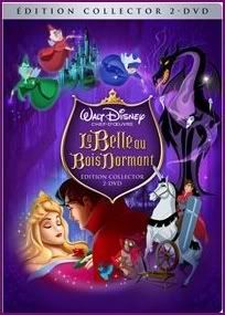
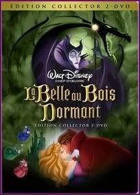
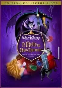
I love the 2nd cover to death, and I feel the characters are indeed floating around, but not slapped on, just...magically floating! It also follows a sweeping arc, as does the 5th one, my favorite. I think purple smoke on the 3rd one could ruin what they were going for, which was to make a background that looks like one from the film, color and all. Then again, attempts to make it feel like the film is slightly stopped with the absence of the correct yellow on the dragon or the correct blue on Aurora.
Now, I definately don't like having the 5th cover lose Phillip on Samson to make way for a bigger Phillip on Aurora (hehe!). No wonder you want that, it makes it look even more similar to the 3rd one, just with a purple background! And then the covers won't really be different at all. I like the arc that sweeps from the transformation to the kiss, and perhaps the only problem with Phillip I have is that he's not facing forward, but I suppose he could be charging to battle the dragon instead of riding to rescue Aurora. The 5th cover's my favorite because it has the coolness we love from the 3rd with more story packed in, via Phillip riding, the woods in the background, and the forest of thorns around the bottom (look closely). Besides, Phillip is featured more and does more than Aurora in the movie. If you really have a problem with him being there twice, why not just remove him from the kissing scene? I wouldn't mind that (I think, I'd have to see it).
I don't mind having the 3rd cover for Blu-ray and the 5th for DVD, that's not a bad idea. I would probably buy both anyway! You never know what's gonna happen to Blu-ray...
Thank you for telling me about the book! I suspected it was a Read-Aloud-Storybook, the little gold bar at the bottom is on all the Read-Aloud-Storybooks. Your explanation made perfect sense, and in fact I have noticed Disney re-releases the same books with new covers (sort of what they do with DVDs...). I've bought Disney books just for the new cover before, I may with this one, too (but I wish Disney would put new art on the inside, too)! The cover's obviously beautiful, but I don't like the composition. Ah well, it's just the book! But something scares, me, something that I suspected for a long time - Flora's gold colors are pink! It's clear on the large book cover, and I'm wondering about it for the DVD covers! They do that all the time. The only way they could get away with it woud be if it's dark enough on the cover, because in the dark, Flora's gold does turn light pink...kinda. I'm still not satisfied with that, though.
I'm happy about everything you said about
Cinderella. Now, I am very happy and excited for the covers
Sleeping Beauty has, but I must say this makes me really excited for what
Cinderella's cover(s I hope!) will look like! But I'm not expecting Disney to have voters decide the covers all the time, and we did get to see
Cinderella's multiple covers for the Platinum, but I'm greedy. Since
Sleeping Beauty is the first movie people care about for Blu-ray oops I mean Platinum Edition animated classic for Blu-ray, maybe they are just doing the voting for this special one, and the cover chosen will choose the way the rest of the PE Blu-ray covers look. That sounds about right if Disney wants the covers to look uniform, but I will still hope and dream!
Ariel'sprince, aw sorry about your merchandise wishes unfulfilled, maybe someday, when you're older and can travel! Anyway, I wanted to tell you I
do like your avatar and signature, except I think the avatar should keep Phillip out of it and focus all on Aurora (if you can).
AladdinfromAgrabah, I agree that I would like to see something new and different, but with the title of the film
Sleeping Beauty, I think it's okay having her sleep all the time. Still, it'd be nice to have one of her performing one of her few actions. Hehe, I liked how you said the covers are mostly old art in a classy way, how true. I also noticed and liked the different angle of Aurora sleeping. And if you meant these look like mock ups because they look unfinished or quickly put together, I see that and think the chosen cover will be "fixed".
KubrickFan and
Mickeyfan1990,