Page 13 of 75
Posted: Mon Apr 21, 2008 11:57 am
by Sotiris
Thanks Ariel's Prince

I want to see of picture of Tiana in another pose where we can have a better look of her face. And i want too see how the prince looks like also.
Posted: Mon Apr 21, 2008 1:37 pm
by jeremy88
WoW, she's beautiful! The newer one looks more realistic, and more cleaned up. Plus her dress looks much like a classic Disney Princess...yup she definitely fits in with the rest of that clique of Disney chicks lol.
I'm now even MORE excited for The Princess and the Frog

:) Still hoping this isn't the last 2-D film though...

:(
Posted: Mon Apr 21, 2008 2:51 pm
by PeterPanfan
I prefer the newer picture, but it looks like Tiana lost some of her child-like qualities.
Posted: Mon Apr 21, 2008 3:14 pm
by Simba3
I really love the new art work, I think she looks gorgeous. But, as someone else mentioned, she might look a bit to modern for the 1920's. So, I think the original draft is more time appropriate, but I really love the look of the revised one much better. She's beautiful!
Posted: Mon Apr 21, 2008 5:23 pm
by Sotiris
Omg! New logo:
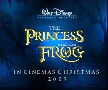
It is the same with the original logo but with the new title and the new font. I prefer this one than the purple-green one. What do you think?
Posted: Mon Apr 21, 2008 5:27 pm
by Simba3
I really like it, I think the font script is great. The more I see/hear about this movie, the more and more excited I get!! I hope this movie turns out to be great, and is a HUGE success for Disney!
Posted: Mon Apr 21, 2008 6:21 pm
by Jules
One word:
FAKE!
That thing is fanmade.
1. The 'Walt Disney' script is clearly typed out. Note how the 'W' is slightly elevated in comparison to the rest of the name.
2. It seems Disney are no longer using the 'Walt Disney Pictures Presents' banner for their animated films. Look at all the upcoming (and official) logos. They just bear the words 'Walt Disney Pictures'.
3. If that came out of Disney US, they never would have written 'cinemas'. They normally opt for the word 'theatres'.
4. Why wouldn't Disney have presented this in that very important announcement two weeks ago?
5. If the above doesn't convince you, take another look at the picture. Does it seriously look professional to you? It's very well made, but there are tell-tale signs. Look at the words 'THE' and 'and the'. Their layout is not quite right, and they lack consistency. Not really what I would expect from an official title logo for a film.
Posted: Mon Apr 21, 2008 6:34 pm
by PeterPanfan
Yes, and the font looks like it was posted on it seperatly.
Posted: Mon Apr 21, 2008 7:08 pm
by Sotiris
Posted: Mon Apr 21, 2008 7:13 pm
by Jules
So?

Posted: Mon Apr 21, 2008 7:52 pm
by Simba3
Fake or not, I still like the font for the title, which appears to be the same, or very similar to the logos we HAVE seen already.
Posted: Mon Apr 21, 2008 8:49 pm
by Vermin Friends
Julian Carter wrote:One word:
FAKE!
That thing is fanmade.
1. The 'Walt Disney' script is clearly typed out. Note how the 'W' is slightly elevated in comparison to the rest of the name.
2. It seems Disney are no longer using the 'Walt Disney Pictures Presents' banner for their animated films. Look at all the upcoming (and official) logos. They just bear the words 'Walt Disney Pictures'.
3. If that came out of Disney US, they never would have written 'cinemas'. They normally opt for the word 'theaters'.
4. Why wouldn't Disney have presented this in that very important announcement two weeks ago?
5. If the above doesn't convince you, take another look at the picture. Does it seriously look professional to you? It's very well made, but there are tell-tale signs. Look at the words 'THE' and 'and the'. Their layout is not quite right, and they lack consistency. Not really what I would expect from an official title logo for a film.
Agreed, especially on #5.
The spacing on the last line is very unprofessional, as well. I think it looks even more uncredible because it was reuploaded, and the quality was lowered. Plus, the site that
sotiris2006 found it at is a Spanish fan board. Someone could've easily made it for "visual purposes", with the new logo that was released two weeks ago, and the old title card that was released as "The Frog Princess".
Posted: Mon Apr 21, 2008 9:12 pm
by Disney's Divinity
Not only is it fake and repetitive, it's ugly at that. Seriously, not all would-be "classics" and princess films need gold writing. Rapunzel, Enchanted and now The Princess and the Frog? Beauty and the Beast, The Little Mermaid and Aladdin all had different colors that suited their films, not simply gold lettering. No, I like the original much better (as well as the colors) and hope very much that it stays the same.
Posted: Mon Apr 21, 2008 10:49 pm
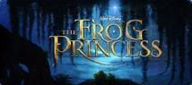
by yukitora
Isn't it just the old "THE FROG PRINCESS" logo rearranged and with "THE" and "and the" added between?
Obviously fanmade.
Posted: Tue Apr 22, 2008 4:32 am
by Sotiris
Vermin Friends wrote: Plus, the site that sotiris2006 found it at is a Spanish fan board. Someone could've easily made it for "visual purposes", with the new logo that was released two weeks ago, and the old title card that was released as "The Frog Princess".
But that logo was on an older post before the "arrival" of the new logo. So how did they know which font wouldthey use? Anw, it could be an older logo before the they revealed the new one.
Posted: Tue Apr 22, 2008 4:45 am
by Sotiris
Yet another Comparison:
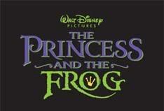
Logos: Old, new and (probably) fake
Posted: Tue Apr 22, 2008 5:45 am
by steve
The first logo looks so beautiful! I love the gold. The green and purple of the revised title looks tacky to me - surely this will be recolored closer to release, no?
Posted: Tue Apr 22, 2008 5:54 am
by steve
But, as someone else mentioned, she might look a bit to modern for the 1920's.
Her revised dress is
not too modern. The 1920s wasn't that long ago! Remember Don Bluth's
Anastasia? That film was set in 1926 and she wore a very similar dress, and for all the historical inaccuracies in that film, costume design wasn't one of them.
Posted: Tue Apr 22, 2008 10:21 pm
by Disney's Divinity
Well, Anastasia took place in Russia/Paris, not New Orleans. Still, I very seriously doubt the general audience cares too much about history; they would be easily satisfied by this design.
Posted: Sat May 03, 2008 6:06 pm
by Sotiris
New pic:

And this is definitely not a fake

Courtesy of Disney Central Plaza