Page 2 of 2
Posted: Sat Mar 03, 2007 2:39 pm
by Jules
Disneykid wrote:I'm guessing that's the new logo for feature animation that's debuting with Meet the Robinsons. It's very classy looking, but I find it ironic how feature animation gets a more low-key, mature logo than the live-action films do. I hope the image of Mickey changes to portray different Disney characters, otherwise it'll look a tad dull. It makes me wonder if "When You Wish Upon A Star" will be played over this like with everything else.
I was thinking like you, DisneyKid, that this must be the new logo to go with MTR.
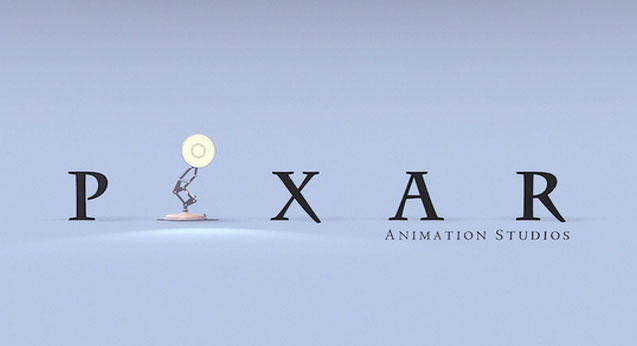
But, note that this is not a Walt Disney Pictures logo. I assume that since Disney now own Pixar, they need to show the public which films are produced by them, and which by Pixar. Just like in the Pixar films you first get a Walt Disney Pictures logo, and
then then Pixar Animation Studios logo, I expect that for MTR there should first be the Walt Disney Pictures logo, and then this, to signify that MTR is made by WDFA (or is it now WDAS?

), and not Pixar.
Get it?

Posted: Sat Mar 03, 2007 9:33 pm
by Disneykid
Julian Carter wrote:I was thinking like you, DisneyKid, that this must be the new logo to go with MTR.
But, note that this is not a Walt Disney Pictures logo. I assume that since Disney now own Pixar, they need to show the public which films are produced by them, and which by Pixar. Just like in the Pixar films you first get a Walt Disney Pictures logo, and
then then Pixar Animation Studios logo, I expect that for MTR there should first be the Walt Disney Pictures logo, and then this, to signify that MTR is made by WDFA (or is it now WDAS?

), and not Pixar.
Get it?

That prediction actually makes perfect sense. I can't see Disney creating something so elaborate like the CG castle logo and then doing something so simple and reserved like the Steamboat Willie one. Having it follow the more elaborate one that encapsulates the whole company is definitely logical. Then again, when does Disney ever follow logic?

Hopefully they'll do what you predicted. The castle logo's too beautiful to be restricted to just live-action.
Why is Disney so inconsistent with logos before movies?
Posted: Mon Mar 12, 2007 8:16 pm
by MLC
I can`t really tell why they are so inconsistent with the beginning logo before the movies, it partly depends on when the movie was made. I do know that every Disney movie released (or re-released) from 1953 (with the exception of "Rob Roy") until 1983 began with the Buena Vista logo. Before 1953 it was the RKO logo. It was "The Living Desert" that caused Disney to start their own distribution company, named for the street the studio was located on - Buena Vista St. They began to relegate the Buena Vista to the end of the movie in 1983. So when Disney prepares a movie for DVD they seem to use the oldest version. For example, with "Peter Pan" they chose the RKO from its 1953 original release. They could have chosen the Buena Vista from when it was re-released (as they did with the DVD of "Pinocchio"). A movie like "Rob Roy" was never re-released theatrically so it would never have had a Buena Vista, only the RKO; while movies like "Dumbo" that were old enough to originally have the RKO, had the beginning changed to Buena Vista for theatrical re-releases after 1953. So when putting "Dumbo" on video or DVD they choose between original release or a re-release. I have videos of "Dumbo" with the Buena Vista on the beginning, however all DVD releases begin with the RKO. Which one they pick is up to them. Sometimes they choose to use the Walt Disney Pictures logo in place of the RKO or Buena Vista as they did with the recent DVD release of "Bambi." Then there are times when they put the Walt Disney Pictures logo before the Buena Vista as they did with the recent DVD of "Lady and the Tramp." (By the way, "Lady and the Tramp" being released in 1955 never had the RKO, all releases of it would have had the Buena Vista - no choice to make there.) The decision is up to Disney. To me they are tampering with the movie if they remove the RKO or Buena Vista or add the Walt Disney Pictures at the beginning or the end (for movies released before 1983). I wish they would include somewhere on the DVD both the RKO and Buena Vista - when appropriate; and stop putting the Walt Disney Pictures logo before or after the movies released before 1983.
Posted: Mon Mar 12, 2007 8:27 pm
by mariadny
mariadny wrote:Disneykid wrote:
I'm guessing that's the new logo for feature animation that's debuting with Meet the Robinsons. It's very classy looking, but I find it ironic how feature animation gets a more low-key, mature logo than the live-action films do. I hope the image of Mickey changes to portray different Disney characters, otherwise it'll look a tad dull. It makes me wonder if "When You Wish Upon A Star" will be played over this like with everything else.
yes, I think the same
guys, this is the new logo¡¡¡¡¡¡¡¡¡¡¡¡¡¡¡¡¡¡¡¡

Posted: Tue Mar 13, 2007 9:33 am
by DisneysMagicKingdom
I am a fan of pretty much each logo in its own right. I love watching films, even non-disney where they tweak their logo to match the feel of the film.
Now as for the classic logo. I still love it and actually have it on a ringer tee shirt. But the jump to the new logo was amazing and I think it was needed to keep up with Dreamworks and other studios who have some pretty sweet icons.
But I do have to agree. Use the classic and tweak if ness. for animated films and use the new one for all the live action disney films.
Posted: Wed Mar 14, 2007 3:11 pm
by musicradio77
mariadny wrote:
I've never seen this one before, that's Mickey in "Steamboat Willie". Is it a spoof or is it real? I will add that photo on the CLG photo gallery.
Posted: Wed Mar 14, 2007 3:17 pm
by mariadny
It's absolutly real.
The new logo, guys
Posted: Wed Mar 14, 2007 5:02 pm
by musicradio77
mariadny wrote:It's absolutly real.
The new logo, guys
I know, I'll have to check it out when I decide to go see "Meet the Robinsons".
Posted: Wed Mar 14, 2007 5:27 pm
by mariadny
But I think this new logo is only for animated 2d, isn't?
Posted: Wed Mar 14, 2007 5:30 pm
by TheSequelOfDisney
mariadny wrote:But I think this new logo is only for animated 2d, isn't?
No, it is for the Disney Animated Classics. Why would the only be for hand-drawn animation if there is a whole department working on DACs?
Posted: Wed Mar 14, 2007 5:34 pm
by mariadny
am¡¡ ok¡¡
I like the new logo, it's very simbolic
Posted: Wed Mar 14, 2007 5:36 pm
by PatrickvD
It looks similair to the Pixar logo, in that it represents the studio.
Luxo the lamp = Pixar animation Studios
Mickey Mouse = Walt Disney animation studios
I love how they're going back to their roots. It's good.


Posted: Wed Mar 14, 2007 6:43 pm
by PixarFan2006
So far I have liked every logo disney has put out. My least favorite is the dark logo because it's so dull.

