Posted: Sat Jun 16, 2007 12:13 pm
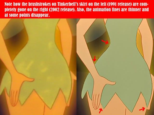
The first image, with the brush strokes and shading and everything makes it look magical and shiny, and that's probably what they were trying to do, maybe not so obvious but give that magical feeling. Its too bad its gone plain solid green.drsd2kill wrote:<img src="http://i46.photobucket.com/albums/f112/ ... SCOLOR.jpg">
You know for CDs when they mix the music they do this thing or have some program, I've forgotten what its called, that make the sound difference between the loud and the soft less. So, when you're listening to a CD and something's soft and you turn the music up and then it gets loud your parents don't yell at you from the next room. It looks like the same thing here. The color started out extremly bright, a bit too neon, maybe, that they restored it to the darker colors, and then tried to up the colors again. The latest one looks more natural, the colors aren't too dark or light, but I wish some of the brushstrokes and "orginiality" would stick.