Page 10 of 58
Posted: Mon Jan 03, 2011 10:27 am
by The_Iceflash
MJW wrote:I know this isn't really in-line with discussing The Lion King, but maybe we can expect some exciting type treatments for the next 2 Diamonds in 2012:

I created these in 10 minutes and just look at that cutting-edge typography! This qualifies me for a job in Disney marketing, right?

I actually kinda like that one for Cinderella's.
I love how 'Walt Disney' is upside down on Lady and The Tramp's.


That is genius. I love how Flounder and Sebastian are looking at... it


Posted: Mon Jan 03, 2011 10:46 am
by BellesPrince
I'm just glad Beauty and the Beast escaped this disastrous cover design.
Posted: Mon Jan 03, 2011 10:48 am
by DancingCrab
Just wait till the 3D version of that cover comes out for The Little Mermaid.

Posted: Mon Jan 03, 2011 11:05 am
by Prince Edward
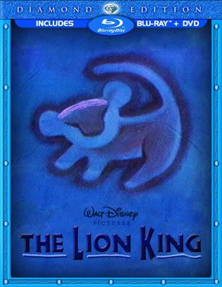
Disney Announces Plans for 15 3D Blu-Ray Releases in 2011, Including THE LION KING, TANGLED, BEAUTY AND THE BEAST and TRON: LEGACY
While the 3D format continues its move towards home entertainment with more and more titles being released on 3D Blu-ray every month, it looks like Disney is getting in on the action as well. The Walt Disney Company announced today that it plans to release at least fifteen films on 3D Blu-ray throughout 2011. Titles set to hit 3D home video include The Lion King, Beauty and the Beast, The Nightmare Before Christmas, TRON: Legacy, and Tangled. Not only will the films be presented in 3D, but the special 3D Blu-ray release will come complete with 3D menus, 3D trailers, and an introduction to the world of Disney 3D from The Lion King characters Timon and Pumba.
http://collider.com/disney-3d-blu-rays- ... ment-96856
I had to comment on this article at Collider.com just to critize the cover of The Lion King;D
Posted: Mon Jan 03, 2011 11:21 am
by MJW
I commented there, too, thanks for the link. Maybe if someone at Disney sees enough comments in various places they'll get the point.
Anyway, that article had a better picture of the cover, without the characters escaping the border:

I could probably deal with another sideways title, but PLEASE, PLEASE take "The" out of the "O" and someone, for the love of all that is good, REDRAW NALA! She looks evil!
Posted: Mon Jan 03, 2011 12:31 pm
by Jc
enigmawing wrote:

Oh my God!!
This is so... beautiful!
Could we have a higher resolution of this one, please?
Posted: Mon Jan 03, 2011 12:34 pm
by PheR
I have to congratulate Disney, the succeded in creating the most horrible looking cover in their entire history... that being said, I believe it's still has hopes, they always tweake their covers from something completely hideous at first to something more accurate in models and less ugly, I bet Mufasa's face going to change, that's a mock up from the soundtrack picture.
If they'd Get rid of the mini Nala it would actually look like we're vewing at the Pride Rock from beneath Simba's perspective and his huge head would make much more sense.
The vertical logo hurts my eyes so much that I refuse to see it in order to say something more about it LOL
Posted: Mon Jan 03, 2011 12:34 pm
by DisneyFan09
for the love of all that is good, REDRAW NALA! She looks evil!
I don't think she looks evil, but she doesn't look like herself. And while real life lionesses have antennas, she didn't had one in the movie. So I agree, redraw Nala.
Posted: Mon Jan 03, 2011 12:36 pm
by PheR
Oh look!! all those animals in the back are looking at.... ehm... what are they looking at? Pride Rock's behind them! LOL
Posted: Mon Jan 03, 2011 12:41 pm
by rodis
It's like all their creativity was wasted on the VHS tapes of the 1990s. Except for a few exceptions in the Platinum line, most were subpar and I won't even talk about the Diamond ones. They should hire someone new to do all these art works

Posted: Mon Jan 03, 2011 1:06 pm
by DancingCrab
PheR wrote:Oh look!! all those animals in the back are looking at.... ehm... what are they looking at? Pride Rock's behind them! LOL
They're walking away from the awful artwork, kind of like I'm gonna do if it doesn't change.
I've had complaints about covers before, and the sideways text on Bambi almost pushed me to the brink, still I thought I'll let it slide this once...BUT, this garbage Lion King cover just might be the first time I actually do make a new slip cover for a film I've bought and set the one it came with on fire, video tape it and send the youtube link to Disney to let them know just how much I hate it.
Posted: Mon Jan 03, 2011 1:13 pm
by Disney's Divinity
I think the cover is especially disappointing following the Platinum cover art, which I personally thought was one of the best cover arts they've had for a DVD or Blu-Ray release. Especially the box set they had.
It makes me sad that, by the time most of these lines get to the end (Platinum and now Diamond), it's like they just don't care anymore, and the releases get crappier artwork, less special packaging, worse/less bonus features, etc. Which is why I can't even imagine how bad Mermaid, Lady and the Tramp, and Jungle Book will get this time around.
Posted: Mon Jan 03, 2011 1:13 pm
by MJW
I was just trying new heads for Nala and photoshopping a few more characters into the scene when it dawned on me...
 Didn't Disney say that they were not going to supply Digital Copies of their classic films?
 I wonder why the inclusion of a digital copy is listed at the top of this package? Have they changed their mind or does that prove this is fake?
The Lion King: Diamond Edition
Posted: Mon Jan 03, 2011 1:37 pm
by Disney Duster
STOP THE SIDEWAYS TITLES!!!!!!!!!!!! AAAAAHHHHHHHH!!!!!!!!
It looked bad on Bambi, and it's bad here! I am really worried for my favorite films getting the same crappy treatment!
Here's the thing I don't get - wouldn't making the title like that be more difficult for consumers to read and recognize? Or is it that by putting the title on the side, kids can more clearly see the giant faces they recognize?
However, I like the "the" in the "O". If you all don't like it, why, what is your reason? Because it's been done before? Well guess what, it's been done before because it's a good idea! It looks nice! However, I would rather it was not in there if the title was horizontal (aka normal and right!).
Also, the reason that the characters are looking out is because they are looking over either A) the entire kingdom or B) the general greatness and mystery of life, especially if they are looking out into the sky where Mufassa is. In other words, by looking out in the sky, they kind of "sense" Mufassa even though he's "behind" or "above" them in literal direction. They "see" him.
However Nala does need re-drawing.
I agree mostly with Disneykid's opinion of the cover.
PheR, what cover did you make?
DancingCrab, the cover you made is geniously hilarious. Did you make that certain...tower pop out more?
BellesPrince, can you find me a picture of the original Bambi concept you liked better you were talking about?
Re: The Lion King: Diamond Edition
Posted: Mon Jan 03, 2011 1:47 pm
by MJW
Disney Duster wrote:However, I like the "the" in the "O". If you all don't like it, why, what is your reason?
To me, putting the "the" in the "O" is kind of a bad design move, and of all the things to do with type design, I'd say it's the most expected of them all and a little cliche. That is just my own personal opinion, and honestly, of all the mistakes they could potentially make, I can live with it.
That being said, I like they are trying too hard to make what is already a simple title more "punchy." I think they want to accentuate "LION KING" and almost leave "The" off. Kind of like when they remake old movies and shorten the title to modernize them: "The Poseidon Adventure (1972)" to "Poseidon (2006)" or "Invasion of the Body Snatchers (1956)" to "The Invasion (2007)."
I just hope the sideways trend isn't going to applied to EVERY title from this point on, Diamond or not. Imagine what the longer titles will look like! "The Many Adventures of Winnie the Pooh"...uh oh!
Re: The Lion King: Diamond Edition
Posted: Mon Jan 03, 2011 1:51 pm
by PheR
Disney Duster wrote:Also, the reason that the characters are looking out is because they are looking over either A) the entire kingdom or B) the general greatness and mystery of life, especially if they are looking out into the sky where Mufassa is. In other words, by looking out in the sky, they kind of "sense" Mufassa even though he's "behind" or "above" them in literal direction. They "see" him.
uhmm aha, and you believe that? LOL
Only Simba is meant no see his father's ghost I believe
Disney Duster wrote:PheR, what cover did you make?
this one:

but, oh well, in the end, we're going to get a better looking cover, at least chareacters wise, poor Timon looks drunk here!... but they'll change the models, just not the composition, remember what happened with the DVD, we ad horrible looking characters when we first saw it.


Re: The Lion King: Diamond Edition
Posted: Mon Jan 03, 2011 1:55 pm
by BellesPrince
Disney Duster wrote:BellesPrince, can you find me a picture of the original Bambi concept you liked better you were talking about?

Posted: Mon Jan 03, 2011 2:28 pm
by Disneykid
And that Bambi ad was later tweaked for the better for a PSA, which is why I was so sure it was going to end up being the Blu-ray cover:
http://www.stitchkingdom.com/wp-content ... sShelt.jpg
I'm not sure what Disney's marketing department is thinking. Perhaps they aren't.
Posted: Mon Jan 03, 2011 2:37 pm
by Mickeyfan1990
Re: The Lion King: Diamond Edition
Posted: Mon Jan 03, 2011 2:39 pm
by Disney Duster
MJW I think it's okay to do good ideas/techniques over again. I'd be fine seeing words within letters over and over. They often do that with anything having to do with the Oz books. They put the z in the o all the time and it looks magical.
PheR you did make a great cover but I find it too dark, I think of hot colors or bright colors when I think of this film.
And isn't Mufassa's spirit supposed to watch over all of the kingdom, over everyone, and everyone is supposed to be able to feel his spirit and believe in his spirit? So they look up at the sky and "sense" him.
Thanks BellesPrince.


