Page 10 of 40
Posted: Sun Nov 05, 2006 1:06 pm
by brotherbear
Well, considering the release for PP is only 4 months away (

), there's a chance for even more alterations to the coverart, but I dont' think i've seen any PE get a makeover more than once...or am I wrong? And I don't think that TLM's predicted coverart changed at all from its predicted one. I remember the drastic change in the LATT's cover as well as the change in TLK's cover...oh, and Bambi's.
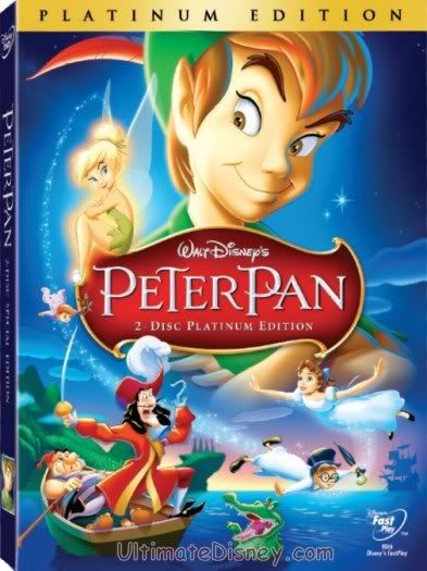
But anyway, I must say outright, that I'm VERY dissapointed that Disney is making the banner for PP green! I know that's what a lot of people here wanted, but I was really hoping that a green banner would be on the cover for The Jungle Book. To me, it would fit more on that cover than Peter's. Sorry to anyone who might dissagree with me.

And, I haven't said this yet, but I really like the red banner/logo for this PE!! I think it's a lot more artistic and stands out; more so than the previous logo for Peter Pan.
Overall, like every other PE, I'm really looking forward to this release!

-BB
Posted: Sun Nov 05, 2006 1:12 pm
by Escapay
I preferred the gold banner. It could have had sparkles and such and be considered pixie dust...
Escapay
Posted: Sun Nov 05, 2006 1:26 pm
by lord-of-sith
The banner change seems fine to me. What bothers me is that Captain Hook's expression has been changed. Can't they just give him a mean or angry face, and not this pansy scared one we have?
Posted: Sun Nov 05, 2006 1:27 pm
by Disneykid
I, too, preferred the gold banner. I am happy, though, at the minor modifications to the character's faces, especially Hook and Wendy. One oddity, though: on the first cover, it said Platinum Edition under the movie's logo, and we all assumed it was an error since a) Disney's taken to calling their Platinums Special Editions under the film logos, and b) because the spine said "Special Edition" like the other Platinums. Check it out now. The Platinum title is still under the logo, and now it even says it on the spine. Is Disney abandoning the "Special Edition" subtitles, now? If so, it seems redundant to put "Platinum Edition" twice on the front cover.
Posted: Sun Nov 05, 2006 1:32 pm
by ichabod
Well to be honest I prefer the green to the Gold, I wish they'd sort Wendy and Tink's faces though!
brotherbear wrote:...but I was really hoping that a green banner would be on the cover for The Jungle Book.
I wasn't aware of any law saying Green could only be used once for Disney DVD banners!

Posted: Sun Nov 05, 2006 1:40 pm
by Harbinger
Wow. The cover actually says "2 Disc Platinum Edition" instead of "Special Edition". Neato.
I like the color change. I got bored with it always being gold or silver. The green looks better with the rest of the package.
Posted: Sun Nov 05, 2006 2:03 pm
by singerguy04
i like the change, but i think i agree with whoever said that it should be red, i think that'd look really awesome too. I hope this starts a new trend. I would love to see the PE borders with a bunch of different colors. Maybe Fantasia will have black. ooooooooo the possibilities...
Posted: Sun Nov 05, 2006 4:24 pm
by numba1lostboy
I like the new green banner, but the red logo clashes, IMO. It looks like a Special Christmas Edition

!
I think the way they changed it so Tink is even more outstanding is crap. This is Peter's movie...Tink will have hers

.
Also, it looks silly to have the kids so spread out. And Hook's expression does make him out to look like a pansy.
Posted: Sun Nov 05, 2006 4:58 pm
by Flanger-Hanger
numba1lostboy wrote:I like the new green banner, but the red logo clashes, IMO. It looks like a Special Christmas Edition
!
I think the way they changed it so Tink is even more outstanding is crap. This is Peter's movie...Tink will have hers
.
Also, it looks silly to have the kids so spread out. And Hook's expression does make him out to look like a pansy.
If it wern't for tinker belle and her new franchise we wouldn't even have a special edition of this movie so early. So it's reasonable that she sticks out so much. I like the green better but I agree that Captain Hook should look more mean.
Posted: Sun Nov 05, 2006 5:06 pm
by Big Disney Fan
Hey, do you know if there will be trailers from the film's releases?
Posted: Sun Nov 05, 2006 8:53 pm
by disclosedtruth
The new cover is an improvement (mainly Peter Pan's face not looking like the Grinch) but I think the layout is kind of sloppy. I think John is too close to the crocodile and Captain Hook's expression should be changed.
Posted: Sun Nov 05, 2006 9:12 pm
by Rowlf_The_Dog
I like the green ... I've liked that some Platinum Editions have gotten a banner color that sort of matches the movie ... if that made any sense LOL ...
For The Jungle Book I can see a Yellow-ish (not gold) banner ...
Posted: Sun Nov 05, 2006 9:13 pm
by Disneykid
Big Disney Fan wrote:Hey, do you know if there will be trailers from the film's releases?
I'm sure the DVD will have the original theatrical trailer, but I have a feeling we won't see re-issue trailers. I've noticed that Disney usually only includes re-release trailers when they've appeared on the laserdisc version of the film in question. For films that had more low-key laserdisc presentations, they only seem to include the original trailer. Since Peter Pan's laserdisc falls in the latter category (it was basically just like the single disc SE, only with two storyboard sequences and no commentary), then we'll probably only see the 1953 trailer.
Posted: Sun Nov 05, 2006 9:27 pm
by crunkcourt
I'm still not completely satisfied with the cover, but it's a slight improvement. The green banner replacing the gold makes it look less like a Gold Collection at least.
Posted: Sun Nov 05, 2006 9:28 pm
by numba1lostboy
Flanger-Hanger wrote:numba1lostboy wrote:I like the new green banner, but the red logo clashes, IMO. It looks like a Special Christmas Edition
!
I think the way they changed it so Tink is even more outstanding is crap. This is Peter's movie...Tink will have hers
.
Also, it looks silly to have the kids so spread out. And Hook's expression does make him out to look like a pansy.
If it wern't for tinker belle and her new franchise we wouldn't even have a special edition of this movie so early. So it's reasonable that she sticks out so much. I like the green better but I agree that Captain Hook should look more mean.
I know...but that sucks.
And, just an obsessive nitpick

, it;s Tinker Bell. Belle was the one with the Beast,
.
Posted: Sun Nov 05, 2006 9:50 pm
by bprovost27
So how come they don't ofer the "old cover art" link with the new? I like to compare.
Could someone offer some advice as to were i can find the old one with the GOLD Banner?
Posted: Sun Nov 05, 2006 10:14 pm
by Escapay
bprovost27 wrote:So how come they don't ofer the "old cover art" link with the new? I like to compare.
Could someone offer some advice as to were i can find the old one with the GOLD Banner?

Escapay
Posted: Sun Nov 05, 2006 11:44 pm
by Ting Ting
I prefer the new cover art to the old. I love how the spine blends in with the rest of the cover. But truthfully, I could really care less which cover art is used. Heck, I'd buy it if it were wrapped in tin foil!
Posted: Sun Nov 05, 2006 11:52 pm
by JayT
What happened to the warm glow that was around tink and Peter's face in the old cover? Now he looks completely washed out. And, isn't his feather supposed to be red instead of orange?
Posted: Sun Nov 05, 2006 11:57 pm
by Simba3
The changes really are quite minor, but I really do prefer the look of the new cover art to that of the old. Peter Pan looks less creepy somehow and I like the green banner.