Page 9 of 20
Posted: Fri Sep 26, 2008 2:14 pm
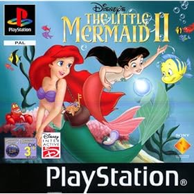
by Ariel'sprince
nomad2010 wrote:Ariel'sprince wrote:I disagree,this one of the best Disney covers.
And "meet Ariel's daughter?" I"m pretty sure that many people are trying to forgot her,not re-meet her.
this looks cheap and unprofessional. the best disney cover imo is 101 Dalmatians PE and the Lion King PE.
No,it's not,101 Dalmatians PE was alright,nothing special and The Lion King PE was fine but Simba had hugh eyeslashes.
This one of the best Disney covers ever and it's looks very professional.
Posted: Fri Sep 26, 2008 2:17 pm
by UmbrellaFish
It looks more like a coloring book cover than a DVD cover...
Posted: Fri Sep 26, 2008 2:49 pm
by nomad2010
UmbrellaFish wrote:It looks more like a coloring book cover than a DVD cover...
exactly! no shading really. no definition to the characters. not to mention they are extremely off model.
Posted: Fri Sep 26, 2008 3:22 pm
by Coolmanio
Yeah, its not my favorite cover, but we have had worse.
"shudders at Hercules Gold Collection Cover"
Posted: Fri Sep 26, 2008 6:35 pm
by PeterPanfan
Definitly one of the worst to come from Disney.
Posted: Fri Sep 26, 2008 7:04 pm
by amazon980
Can anyone here do better?
Everyone here acts like this disneys best movie ever.
It’s just a sequel not a big budget movie these are aimed 1-8yr old girls and maybe sum boys to. If this was the original Disney's the little Mermaid I would understand c'mon you guys it’s just a sequel.


Posted: Fri Sep 26, 2008 7:28 pm
by disneyboy20022
gumby17 wrote:
On The Next Episode of Aquatic Disney Family Feud:
Meet Ariel's Daughter VS Nemo and Friends
On the team of representing Atlantica:
It's everyone's favorite mermaid turn human by an evil sea witch:
Ariel
And then Meet Ariel's Daughter...Melody..she is the child of Ariel and Prince Eric and that leads me to our next contestant
Prince Eric...he is the prince that fell for a mermaid...talk about a fish tale..LOL
and then meet Eric's Father-in-law, Melody's Grandfather, and Ariel's Father...
King Triton
and then finally as a trio because they couldn't decide which one to bring on the show it's
Sebastian and Scuttle and Flounder (note that Flounder is in a fish tank)
and then the team from of Nemo's Family
Marlin
Dory
Nemo
some random shark
and a random Pelican...whose beak can more than its belly can but I don't know how in the heck it can

Posted: Fri Sep 26, 2008 8:44 pm
by Vermin Friends
amazon980 wrote:Can anyone here do better?
Everyone here acts like this disneys best movie ever.
Actually, I know of at least one person here who can do so much better.
And no, it's not one of Disney's best, but it is part of one of the greatest Disney franchises, and since TLM and TLM:AB both got great covers, I'd at least think they would try a little harder to get this one to fit in nicely with the other two.
nomad2010 wrote:UmbrellaFish wrote:It looks more like a coloring book cover than a DVD cover...
exactly! no shading really. no definition to the characters. not to mention they are extremely off model.
Agreed on
UmbrellaFish's comment. However,
nomad2010, this still seems like a rough draft, just bigger- I'm pretty sure shading and stuff will be added later.
Now for my own
opinion- as a HUGE TLM fan, I don't think this cover does the film any justice. If anything, it reflects the terrible era of badly animated DTV sequels. I think the only thing they got right on this cover is how Ariel's shells have that extra thing in the center, like she did on the original cover. I'll even give them most of her face and tail, but her waist is way too thin, and like many people have stated- she looks way too young.
If they're approaching this cover chronologically, then if Melody is a preteen mermaid, Flounder should be putting on some weight. I know he goes off-model in the film, but that's only ONE SCENE, his character obviously changed, and they need to either acknowledge that, or not include him on the cover at all.
Morgana's face looks a little... weird, as well, and Triton looks way too chunky (although that's how he appears in the film so, I'll let this one slip). Sebastian, he actually looks like he's been cut out of the original cover and just rotated, and I'm actually betting that that's all they did. And "Meet Ariel's Daughter"? Are you kidding me? I would think they'd want to promote the new game or bonus features, preferably the deleted song.
You know, looking at it now, I actually do like the layout, it's just the minor things such as major off-model-ness and stuff...
Bottom line: I'd rather have a boring layout with everyone on-model than an amazing layout with everything being off-model. I still doubt this is the final.
Posted: Fri Sep 26, 2008 9:18 pm
by singerguy04
I'm pretty sure they'll edit and update this like every single other cover-art release we've ever seen. I like the lay-out and that'll most likely stay the same, but i'm pretty sure the images will get re-vamped a little bit.
Posted: Fri Sep 26, 2008 9:20 pm
by Vermin Friends
singerguy04 wrote:I'm pretty sure they'll edit and update this like every single other cover-art release we've ever seen. I like the lay-out and that'll most likely stay the same, but i'm pretty sure the images will get re-vamped a little bit.
Thank groodness.
Posted: Sat Sep 27, 2008 2:19 am
by supertalies
Yea, look at the Sword in the Stone cover for example!
Posted: Sat Sep 27, 2008 5:36 am
by Disney's Divinity
I don't quite understand what people mean when they say the cover "has no shading." Maybe I'm blind, because everything looks shaded to me. And, also, now that I've seen a bigger version, the only problem I still have is with Ariel, though she comes off a bit older now that the picture is larger. Her hair still looks like a cape and I'm noticing that her fin looks like a wire fence. Overall, I'm incredibly impressed with this cover and I really don't see that they need to change anything--my complaints about Ariel are minor as it is.
Posted: Sat Sep 27, 2008 2:11 pm
by Juuchan17
Disney's Divinity wrote:I don't quite understand what people mean when they say the cover "has no shading." Maybe I'm blind, because everything looks shaded to me. And, also, now that I've seen a bigger version, the only problem I still have is with Ariel, though she comes off a bit older now that the picture is larger. Her hair still looks like a cape and I'm noticing that her fin looks like a wire fence. Overall, I'm incredibly impressed with this cover and I really don't see that they need to change anything--my complaints about Ariel are minor as it is.
I agree. I see shading on there too (so you're not the only one!), but yeah. Ariel does seem to be the only character that needs to change now.
That and the header line - "Meet Ariel's Daughter" . . . seriously, that is just lame. Why not something more exciting and mysterious? (although the movie's nowhere close to either . . . XD)
But I betcha I could draw a better cover. I do like the way Ariel and Melody are together, but that's (sadly) the only part I do like!
- Juuchan17
Posted: Mon Sep 29, 2008 9:50 am
by WillytheDino
Morgana looks at nothing.
She should be looking at Melody or something.
But no, she's looking in a corner. It's like they just copypasted her from the original cover (where she was watching Melody, from the top.)
Posted: Mon Sep 29, 2008 10:00 am
by universALLove
The bottom half really ruins the cover!

Get rid of Morganna and Triton and do a better lower half composition!
Posted: Mon Sep 29, 2008 10:50 am
by Thomas J
I agree to it looking like a coloring book. Those were my exact thoughts when I saw it. As far as my favorite cover art, I'd have to say that I personally think they did a great job with the Alice in Wonderland Masterpiece Edition. Probably my favorite of them all.
Posted: Mon Sep 29, 2008 12:43 pm
by DisneyFreak5282
gumby17 wrote:
Ew. When I first heard about this SE I regretted not waiting for it, because I ordered the original 2000 release used online for $21. After seeing the new cover I'm not so sure I regret not waiting, at least the cover is decent on the original release. That new cover is SUCH an eyesore!
Posted: Mon Sep 29, 2008 4:13 pm
by Thomas J
While it IS true that it is an eyesore, at least the Little Mermaid box set is beautiful.

I was going to order the Japanese TLM Platinum Edition, but never got around to doing it. Now they're using that Japanese cover for the USA box set, which is awesome.
But who knows? TLM2 cover might not be AS bad as we think. I thought that TLM Ariel's Beginning cover was horrendous, but once I got it, it didn't look so bad.
Posted: Fri Oct 03, 2008 10:51 am
by WillytheDino
I actually sorta liked this a lot...
But Flounder isn't okay.
Posted: Mon Oct 06, 2008 3:31 pm
by Juuchan17
WillytheDino wrote:I actually sorta liked this a lot...
But Flounder isn't okay.
I agree. That looks way better than both the original cover and the new one. But yeah, Flounder . . . he's gotta go. (Sorry, little guppy . . .)
However, I think as long as it looks relatively similar to the previous TLM films (I'm picturing something similar to the TLM PE release . . . switch Ariel for Melody, and BOOM. Awesome cover. XD), it'll be nice.
And of course, it so needs Eric. If he's not on the cover, he deserves to be on the back at least. He
is Melody's father, after all . . . and he's pretty decent in the film too.
- Juuchan17