Page 8 of 80
Re: Comparing Home Releases Cover Arts
Posted: Fri Oct 25, 2019 8:58 pm
by JeanGreyForever
I'm actually not a fan of most of the Alice covers. The new ones in particularly are way too cluttered and while I like the Mad Tea Party scene, the VHS covers never had the best artwork and their coloring and shading wasn't to my taste either.
However, I always liked the Gold Edition cover especially since that isn't a very common Alice image, at least compared to the Mad Tea Party, and especially the Masterpiece Edition cover because that Alice clipart comes straight from Marc Davis' work.
Re: Comparing Home Releases Cover Arts
Posted: Fri Oct 25, 2019 9:26 pm
by D82
Like Cinderella, Alice must be also difficult to draw because she doesn't look like herself in most of the covers either. I'd say the only one she looks more or less accurate in is the first VHS. My favorite though is definitely the second cover
DisneyBluLife posted. Here's the UK version with the title in English:

Maybe nostalgia plays a role in that, because I had that cover in Spanish, but I like the composition and the characters don't look too bad in it. My second favorite I think is the Masterpiece VHS cover, despite the characters not being too on-model in it, and my third one probably the Masterpiece Edition DVD. I also appreciate they tried something different for the Gold Collection cover, but I don't like the execution. And the most recent ones are too crowded/disorganized for my liking, though I prefer the Un-Anniversary Edition to the Blu-ray ones.
Cheshire_Cat wrote:That said, I always thought it was funny how they depict Alice smiling at the Mad Hatter's tea party, because if you watch the movie she doesn't seem to be enjoying herself at all.


That's true.
Re: Comparing Home Releases Cover Arts
Posted: Sat Oct 26, 2019 1:15 am
by DisneyBluLife
Cheshire_Cat wrote:Regarding
Alice in Wonderland, my favorite is definitely the Masterpiece VHS. I remember getting it for Christmas when I was little, and rushing into the living room Christmas morning to see it lying on the chair unwrapped.
That said, I always thought it was funny how they depict Alice smiling at the Mad Hatter's tea party, because if you watch the movie she doesn't seem to be enjoying herself at all.

A cover art with a smile sells easier according to marketing strategy. Keep the characters happy.

Re: Comparing Home Releases Cover Arts
Posted: Sat Oct 26, 2019 1:25 am
by Farerb
Similar to how Cinderella smiles when she flees the castle.
Re: Comparing Home Releases Cover Arts
Posted: Sat Oct 26, 2019 1:30 am
by Farerb
I never got why the Diamond Editions started doing covers with that elliptical shape. It never looked good. However I actually like the Diamond Edition of Cinderella. Signature Collection seems weird. I also like the VHS covers.
I like the Masterpiece DVD of Alice and both anniversaries editions look fine.
Re: Comparing Home Releases Cover Arts
Posted: Sun Oct 27, 2019 4:21 am
by Vlad
When it comes to Alice, I like all the covers, even the first VHS, even if it's super underwhelming. I agree, she's very hard to draw, and I don't think there is a single cover in which she looks like herself. Which is weird, because I read Ariel has a lot of her facial features, and she's drawn on model, especially in modern artwork.
Re: Comparing Home Releases Cover Arts
Posted: Sun Oct 27, 2019 10:51 pm
by Disney Duster
Marce82 wrote:So about Cinderella... I disagree that most of its covers have been good. She is poorly drawn in about half of them. I had a conversation with a disney artist once about how she is possibly the toughest female character to draw on model from Disney. I have read that too on Andreas Deja's blog too.
So...
Best ones: a tie between Classic VHS and Platinum edition. Classics: LOVE that she is in rags. I feel like this movie is heavily marketed towards girls, and the epicenter of that is the darn ball gown This movie is for everyone.
Characters are on model, and even her hair color is smartly executed (who knows what shade of blonde it is on that cover!). Platinum: Nice composition, extremely well drawn and shaded. Even if the prince is off model and steals too much attention. Cinderella isnt 100% herself, but it is a beautifully executed drawing of a beautiful woman.
Worst:
Diamond DVD: dont know who that is, but it isnt Cinderella. Face is off. Dress is off. Fairy's arm is too short, her pose is stiff. Fabric overall is poorly drawn and is often illogical (lengths and movement patterns)
Diamond blu rays: Mice are well drawn, but all faces are off-model. Cinderella's eyes are uneven, mouth is poorly drawn and even the way she is holding the shoe feels unnatural.
Meh:
Masterpiece: Great composition, pretty good execution. But its the darn cover that led to them changing her dress from silver to blue. Damn you!
UK: she is fairly well drawn, except the skirt makes no sense (different lengths in different parts) and her face is a little flat. But she looks like she is in an empty soundstage!
Laserdisc: kinda looks like a poor collage. Strange lighting on her.
Signatures: good ideas, but kinda poorly executed. And I agree with some of the comments about her expression and movement while running down the steps... oh well. Still better than Diamond!
What are you smoking? Lol The compositions of most of the covers are great and Cinderella is only badly drawn in the UK VHS, the Diamond DVD and Signatures. I guess that is "about half" as you say, but she only looks so poorly drawn in the UK VHS and Signatures. And the laserdisc doesn't look like a poor collage, it is meant to look like a storybook cover with an illuminated title. Illuminated titles have the first letter all decorated like that and sometimes it sprawls to other parts of the white cover like that.
Disney's Divinity wrote:As for the other mock-up Platinum covers, the only one aside from what they ultimately chose that I like is the one of the prince kissing her hand with all the guards behind. I think that’s a promo image from somewhere else they thought about using, or was that the first time that pose appeared?
That whole art is from one of the 1987 re-release posters.
Alice has great covers actually. For some reason she looks bad on the Classics and Masterpiece VHS covers. I like the 60th Anniversary Blu-ray the best! Great composition. Alice is in the middle, and all this great stuff from Wonderland is placed around her well. My second favorite is the Masterpiece DVD. Just the white Rabbit needs to be the correct size. My third favorite is the Gold Collection DVD. Great idea for that cover!
Re: Comparing Home Releases Cover Arts
Posted: Mon Oct 28, 2019 1:36 pm
by Vlad
Re: Comparing Home Releases Cover Arts
Posted: Mon Oct 28, 2019 9:16 pm
by Disney Duster
Oh yeah, it does have the dress transformation! Not exactly enough like it for me, but yeah, it's close. I don't see her looking like Snow White, but that's me.
Re: Comparing Home Releases Cover Arts
Posted: Thu Oct 31, 2019 11:33 pm
by Disney Duster
Sorry it's so late, but wanted to add to the Cinderella cover arts, the Video Edition of the Laserdisc:

I like that one even better than the regular laserdisc what with the latch and the edge decorations, it looks even more like a storybook!
Re: Comparing Home Releases Cover Arts
Posted: Fri Nov 01, 2019 10:31 am
by JeanGreyForever
I love the border on that myself! It really does look like a storybook. I wish we had more covers like that.
Re: Comparing Home Releases Cover Arts
Posted: Fri Nov 01, 2019 12:01 pm
by Farerb
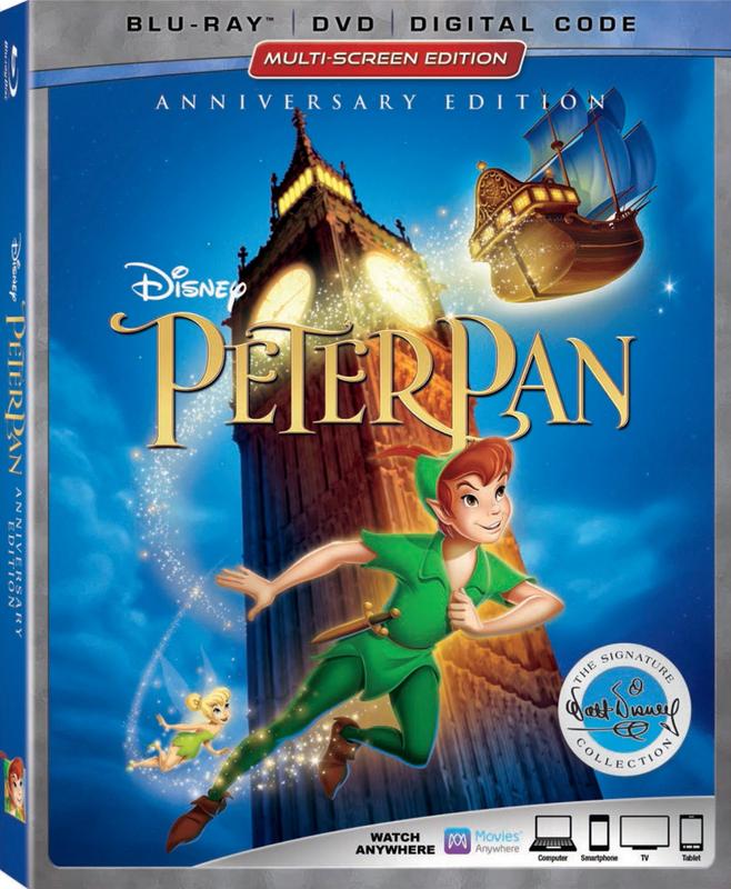
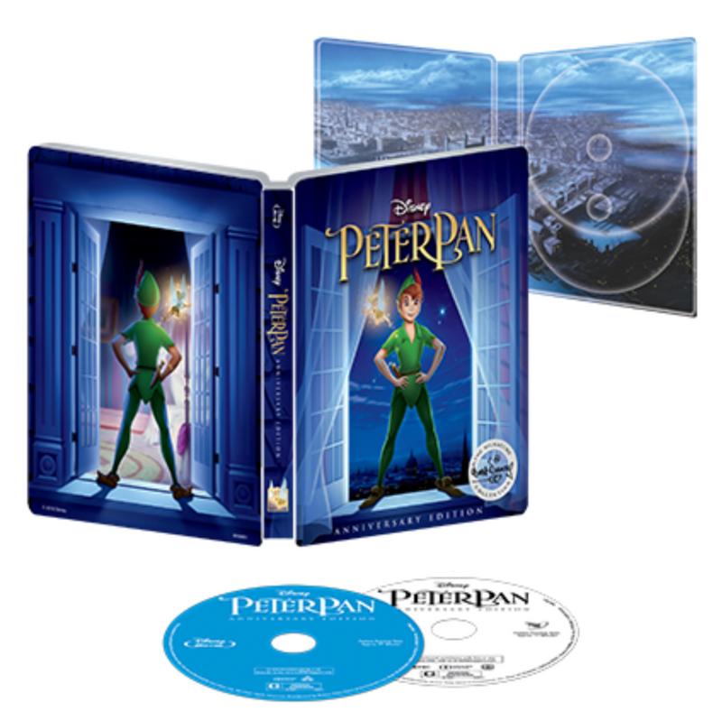
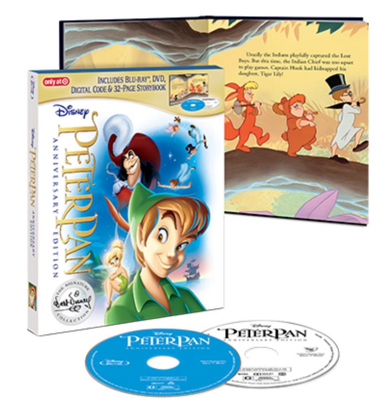
Peter Pan:
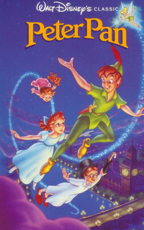
Classic VHS:

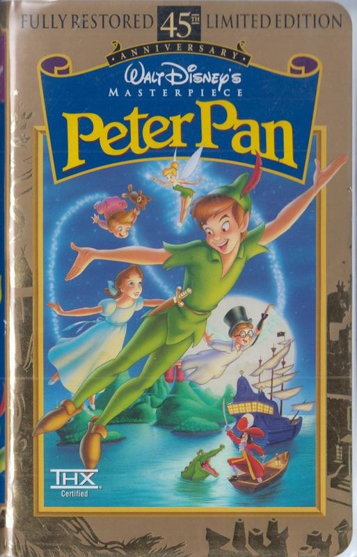
Masterpiece VHS:

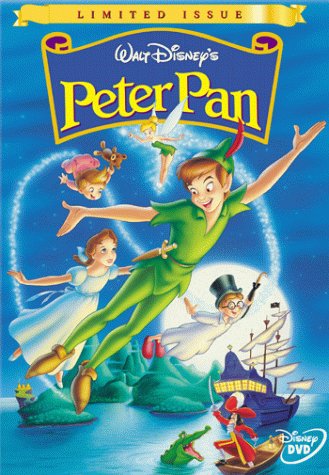
Limited Issue:

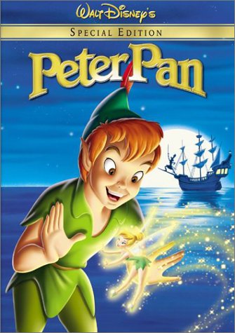
Special Edition:

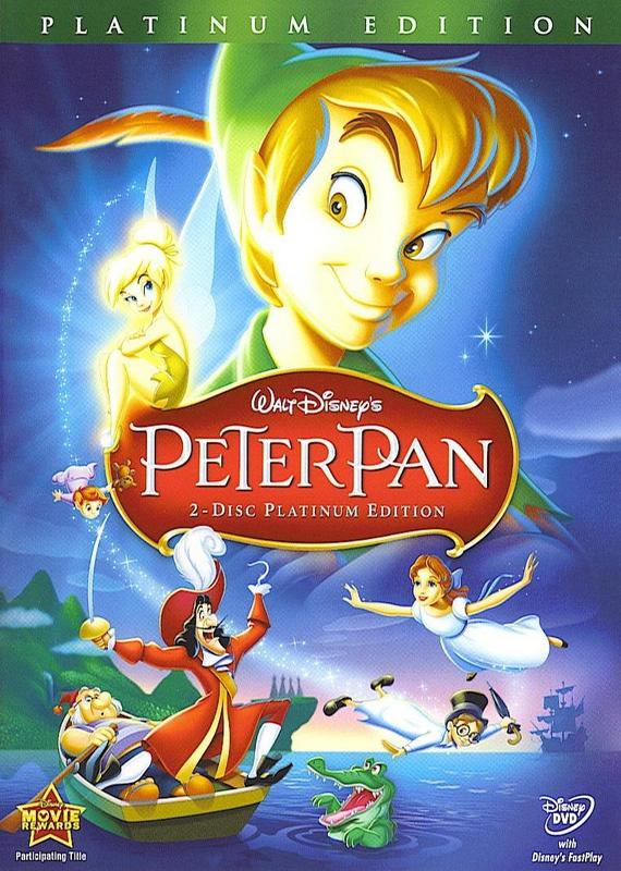
Platinum Edition:

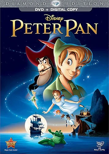
Diamond Edition DVD:

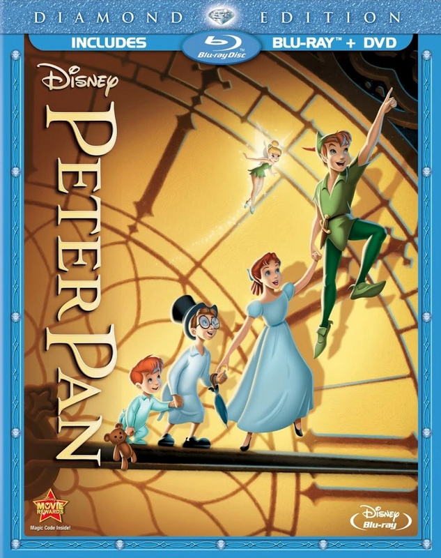
Diamond Edition Blu-ray:


Target Exclusive:

Signature Collection:

Best Buy Exclusive:

Target Exclusive:

Re: Comparing Home Releases Cover Arts
Posted: Fri Nov 01, 2019 4:06 pm
by JeanGreyForever
Peter Pan has some of the best covers imo.
I love the two VHS covers/limited edition DVD but the first VHS cover really isn't on-model compared to the second one. The Special Edition DVD cover is pretty great too and a nice department from the usual fare.
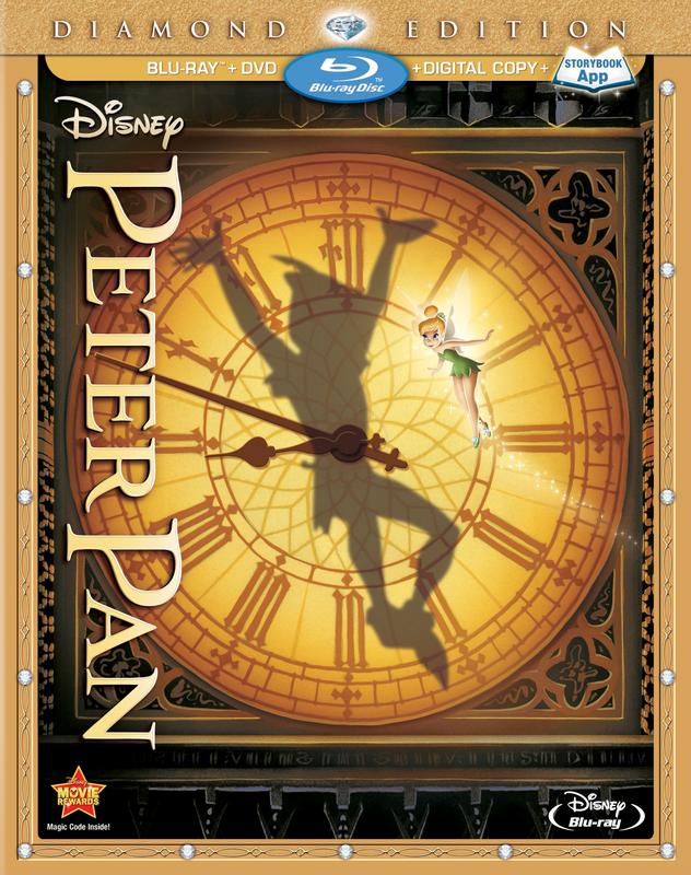
I also like the Diamond Edition Digital cover which is one of the best recent covers Disney has made.
I'm fond of the Signtature Edition cover and the Best Buy Signature exclusive cover as well although I wish Wendy was on both of them. It's funny how deep green Peter's outfit is on both covers when the restoration for the movie renders him in olive green.
Re: Comparing Home Releases Cover Arts
Posted: Fri Nov 01, 2019 5:29 pm
by Disney's Divinity
I don’t dislike any of PP’s covers. My favorite is the standard Signature cover, just like with Cinderella, followed by the Masterpiece VHS.
I think—in general— the Platinum and Signature lines had decent covers, with some exceptions. The Diamond line is easily the worst overall for me. Something about the way the characters are lit on most of the Diamond covers makes everything so cheap-looking.
Re: Comparing Home Releases Cover Arts
Posted: Fri Nov 01, 2019 10:49 pm
by Disney Duster
JeanGreyForever wrote:I love the border on that myself! It really does look like a storybook. I wish we had more covers like that.
I agree! So glad you like it! I own that version, too, though it's gotten worn and beat-up over the years, lol.
Yes, I must agree with you guys, no Peter Pan cover is bad! He really has had some of the best covers. I think the best is easily the Diamond Blu-ray with the digital copy. One image, and of the title character's shadow on the memorable clock, with the other most infamous character from the film, Tinker Bell, on it. So classy. I think the second best cover is the Signature Best Buy steelbook. Once again a single image, and just great seeing him in the window by himself, all cocky. My third favorite is the Classics VHS, probably partly for nostalgia, but I just think it looks magical.
Re: Comparing Home Releases Cover Arts
Posted: Sat Nov 02, 2019 2:04 am
by Farerb
My favorites are the Limited Issue DVD and the Platinum Edition. I also like the Diamond Edition with digital and Signature Collection. I hate the regular Diamond Edition, everyone looks off model and I don't like that they changed Michael's colors.
Re: Comparing Home Releases Cover Arts
Posted: Sat Nov 02, 2019 8:28 am
by DisneyFreak5282
Another release where I absolutely love the Black Diamond VHS cover. It's releases like this and Cinderella that make me wish Disney had put effort into their home media releases and done what Shout / Scream Factory does by including interchangeable Blu-Ray cover art so we can use this awesome art. Comparing the Black Diamond cover to the Signature Edition is so jarring, it's such an eyesore because of how off model Peter Pan has become.
Re: Comparing Home Releases Cover Arts
Posted: Sat Nov 02, 2019 3:25 pm
by DisneyBluLife
farerb wrote:My favorites are the Limited Issue DVD and the Platinum Edition. I also like the Diamond Edition with digital and Signature Collection. I hate the regular Diamond Edition, everyone looks off model and I don't like that they changed Michael's colors.
I am just analyzing now from a marketing point of view but maybe having pink on the cover would have frightened away boys to buy the movie. Michael with his pink clothes has always been placed far away at the back on most covers but here on the Diamond Edition Blu-ray he is very close and prominent.
Re: Comparing Home Releases Cover Arts
Posted: Sun Nov 03, 2019 1:54 am
by Disney Duster
farerb wrote:My favorites are the Limited Issue DVD and the Platinum Edition. I also like the Diamond Edition with digital and Signature Collection. I hate the regular Diamond Edition, everyone looks off model and I don't like that they changed Michael's colors.
Good picks, and I hate the Diamond blu-ray composition so much! I never noticed the wrong colors! I hate that, too! Glad we love the black diamond together
DisneyFreak5282.
Michael comes from when boys wore pink instead of girls, because since pink is a lighter shade of red, they thought it suited boys, since they are supposed to be attacking and aggresive, powerful, all that. Plus I guess blue was considered prettier...? So it fit girls more. Yes, that's why Disney's first princesses are more blue and the princes are more red. Also notice the pink for the baby boy in Lady and the Tramp.
Re: Comparing Home Releases Cover Arts
Posted: Sun Nov 03, 2019 1:12 am
by Farerb
Yes. Disney had a tendency to have the women wear blue and the men wear red. Even with the dogs - the females have blue collars and males have red collars. Ironically Cinderella only has blue sleeves but she's the most identified with the blue color.


