Page 7 of 40
Posted: Thu Feb 02, 2012 12:06 am
by DisneyJedi
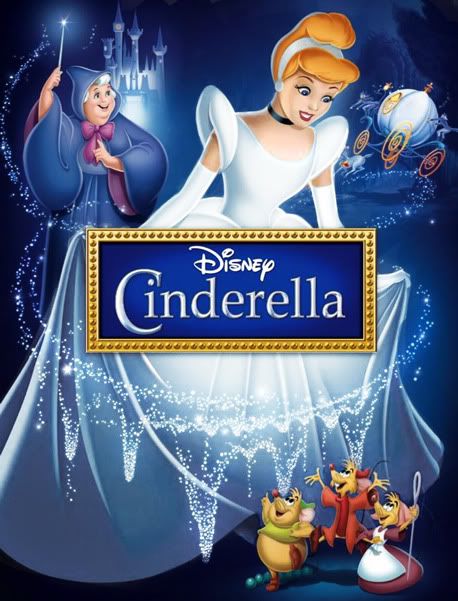
Ack! The DVD cover arts for the Diamond re-releases always look more promising than the Blu-ray cover arts!

Posted: Thu Feb 02, 2012 12:16 am
by seanjonmc
Oh wow, that Cinderella cover, or whatever that is, is amazing. Best cover I've seen for a DAC in quite a while.
Posted: Thu Feb 02, 2012 12:33 am
by Elladorine
Played around with it a little:
Posted: Thu Feb 02, 2012 1:02 am
by DisneyJedi
enigmawing wrote:
Played around with it a little:
Really, that's more like it. Her blue dress and blond hair are overrated/overused.
Posted: Thu Feb 02, 2012 12:48 pm
by Disney Duster
enigmawing wrote:Played around with it a little:
I like officially over the internet platonically love you now,
enigma.

I notice her hair, face, dress, its all better! Except I think it's glowing just a little too much! Just silver the light parts and let the dark parts be silver blue, it doesn't need to be look like she has the moon under her dress! lol But seriously, beautiful job, you really pay attention to detail. Great work.
Posted: Thu Feb 02, 2012 1:43 pm
by Super Aurora
actually it depends where the light is coming from where it hits on cinderella. if it hits her body from above in front then yes it will look like what Enigmawing depicted.
light makes color brighter on an object while darkness make the color duller and darkens.
Posted: Thu Feb 02, 2012 5:06 pm
by Elladorine
Thanks guys!

I thought the whole cover was just an overdose of blue and hoped to give it some contrast by not only desaturating the dress, but brightening it up. I did try a darker, more grey color for the dress, but it didn't look right, and I do like the idea of it catching the light as Super Aurora pointed out.
And I wonder . . . if I can spend just a few minutes on this to make it look more like Cinderella, why can't the original hired artist?

<a href="
http://twitpic.com/8ex735" title="Don't know why I like to "fix" Disney covers, ... on Twitpic"> Direct comparison.
Posted: Thu Feb 02, 2012 6:55 pm
by Disney Duster
Yea but...the light is so strong you can't really see the top part of her dress. That's what I meant. Thanks for the direct comparison. There are some things from each one that I like better than the other, but yours is obviously the "improved" version in most areas.
SWillie! wrote:I wish they would give an artist at Disney Animation the duty of cover art. I mean, Mark Henn could make a gorgeous Cinderella cover, on model, in a matter of seconds for God's sake.
You know, I did realize, an animator might only be good at the drawing part, not necessarily the composition. A layout artist or art director might be better at that aspect.
Posted: Thu Feb 02, 2012 7:47 pm
by Super Aurora
Disney Duster wrote:
You know, I did realize, an animator might only be good at the drawing part, not necessarily the composition. A layout artist or art director might be better at that aspect.
Animators does know and have learn how to draw composition. It's one of the basic fundamentals all artist learn. Whether you're animator, illustrator, fine artist, etc.
Posted: Thu Feb 02, 2012 8:24 pm
by Disney Duster
I just realized. She should also have her foot sticking out showing the glass slipper. She's big so it will be big, it will be perfect and give more balance and things to see in the cover.
Super Aurora wrote:Animators does know and have learn how to draw composition. It's one of the basic fundamentals all artist learn. Whether you're animator, illustrator, fine artist, etc.
Okay. Well it is the general composition of this cover that I think is great. Just not completely the execution.
Posted: Mon Feb 06, 2012 5:49 am
by Sotiris
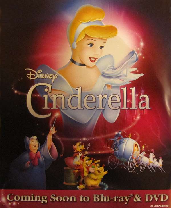
Scan of the Canadian Booklet Page

Posted: Mon Feb 06, 2012 5:18 pm
by Prince Edward
Disney is using that image on their Facebook-page for Cinderella:
www.Facebook.com/Cinderella
Posted: Mon Feb 06, 2012 6:26 pm
by Disney Duster
Ohhhh, the castle's in it too!!! It's faint, and in the pink light, but it's right by Cinderella's arm! I thought it was just the white fairy dust sprinkling down.
But: the castle is backwards, I can tell because the clock tower and turret-less tower need to be on the left, not the right, and it probably shouldn't too faint to be able to see like that.
Also, in the UK version, which I hope is how the UK layout will look, the castle is covered up by the title, so they should put the castle down with the three other images, and move the images slightly closer together (perhaps only move the coach closer to the mice). The castle could go about underneath the second "l" and "a" in the title and be close to the coach so that it looks like it's rising in the distance that the coach is headed for! Like this (but done better lol):
[img]CinDiamondUKhorizontalcastleadd.jpg[/img]
Posted: Wed Feb 08, 2012 4:40 am
by Sotiris
Better Image of the UK Cover

Posted: Wed Feb 08, 2012 7:52 am
by Victurtle
Cut off the bottom and allign it with the DE border, and we have a mock up
Thanks for the image, cover looks great!
Posted: Wed Feb 08, 2012 9:55 am
by Sotiris
Victurtle wrote:Thanks for the image, cover looks great!
No problem!
Posted: Wed Feb 08, 2012 12:55 pm
by CampbellzSoup
I bet this one is going to be rolled aorund in glitter just like the Snow White and Beauty and the Beast covers just for you Duster.
Posted: Thu Feb 09, 2012 10:35 am
by NeverLand
Can't Wait!
Posted: Thu Feb 09, 2012 10:47 am
by Sotiris
NeverLand wrote:Can't wait!
Thanks for the image!
Posted: Thu Feb 09, 2012 5:27 pm
by Disney Duster
CampbellzSoup wrote:I bet this one is going to be rolled aorund in glitter just like the Snow White and Beauty and the Beast covers just for you Duster.
Hehe I hope so!!!!
Thanks for the image
Sotiris! You don't have to say your welcome, I think you end up saying that too much! Just saying you don't need to, gives you a break. But I'm glad I now see that the garden trees are in the cover!!!
And thanks
Neverland! That's probably the best image yet! I can see something by the coach, like the path to the castle with shrubs...I wish I could tell what it was!
How do you all like my little adds to this cover? I added the castle to the first and the castle and the stepmother's chateau in the second one.
[img]CinDiamondUKhorizontalcastleaddbetter.jpg[/img]
[img]CinDiamondUKhorizontalcastlechateauadd-1.jpg[/img]


