Page 6 of 58
Posted: Mon Sep 20, 2010 12:46 pm
by PheR
thanks!
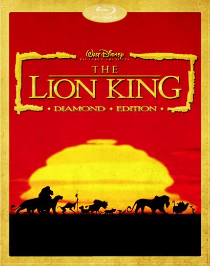
and... about the border, well, all diamond titles have the same one

Posted: Mon Sep 20, 2010 1:43 pm
by Elladorine
Maybe they should only put the borders on slipcovers, and have borderless art on the actual case!


Personally, I'd love to see something super-simple, like the silhouettes that were a major part of the merchandising back when the film was new (seeing them always take me back to the summer of '94), and maybe some gold foil if they *have* to do a border.

Posted: Mon Sep 20, 2010 4:28 pm
by PheR
singerguy04 wrote:.
by the way, PheR that cover is beautiful. I hope the final design does end up similar to that.
thanx! I'd really love if they used a similar concept If they go with a blue palette.
enigmawing yours is really classy, I love it
Posted: Tue Sep 21, 2010 12:34 am
by REINIER
I know it sounds sacrilige to most, but in this case I'd really love it if they released Simba's Pride on Bluray too...

As for those covers sofar, great effort people, love them both

Posted: Tue Sep 21, 2010 4:33 am
by geniuswalt
Well, since they got rid of Cogsworth's new animation piece and replaced it with the original one
http://www.youtube.com/watch?v=bZzxxBZUD-o
at least in the original theatrical cut of Beauty and the Beast on the upcoming Diamond Edition I do hope they'll do the same with the alligators in the "I just can't wait to be king" sequence in Lion King which, some will remember, was sadly maimed with newly designed crocodiles created for the IMAX release

Unfortunately I can't seem to find a screen capture online
Posted: Tue Sep 21, 2010 4:48 am
by Scamander
I found some of the crocodiles and the waterfall, the originals are above:


I must admit, I like the new ones better.

Posted: Tue Sep 21, 2010 4:54 am
by Wonderlicious
geniuswalt wrote:Unfortunately I can't seem to find a screen capture online
Are you talking about this?
<center>


</center>
You can find out about this and a lot of the changes made in UltimateDisney's very own
review of The Lion King from 2003!

Posted: Tue Sep 21, 2010 5:12 am
by The_Iceflash
^That I want fixed for the Diamond release. Color issues are one thing, re-animations are something else all together.
Posted: Tue Sep 21, 2010 5:41 am
by yukitora
I need the originals - that scene had some an impact on me as a child (as did the Simba? Siiimbaaaaaa? scene) and I was just constantly disappointed when they were replace by appalling new footage.
Posted: Tue Sep 21, 2010 9:14 am
by jpanimation
I'm personally not bothered by the new waterfall but what was the point in re-animating the crocodiles? Also, anyone else find it hypocritical of the company to make sure the original title cards are in place for the Walt-era classics (the RKO ones) but now they're hell bent on replacing the original blue castle openings on their 90s classics?
Posted: Tue Sep 21, 2010 9:43 am
by ajmrowland
I like the newer crocodiles(the extra style is far from appalling) and the older waterfall.
and I agree with jpanimation, though they put the new logo at the end of the film when most people would turn off the dvd player.
Posted: Tue Sep 21, 2010 11:08 am
by KubrickFan
jpanimation wrote:I'm personally not bothered by the new waterfall but what was the point in re-animating the crocodiles? Also, anyone else find it hypocritical of the company to make sure the original title cards are in place for the Walt-era classics (the RKO ones) but now they're hell bent on replacing the original blue castle openings on their 90s classics?
Finally showing us the RKO logos seemed to be an exception, because on most DVDs, and probably all VHSes those were replaced with the Blue Castle opening. I just hate it that they replace it. Would anyone not recognize it? I find that hard to believe. They replaced the logos with Toy Story and Toy Story 2, and The Nightmare Before Christmas too for some reason.
Posted: Tue Sep 21, 2010 1:43 pm
by Kyle
I actually prefer the new waterfall, its more detailed and just better overall. with the crocks however, I think they should go back to the old ones if possible. the graphic look of the old ones fits the style change of this scene more. I heard the reason for the change was copyright related, not sure if that's true or not.
Posted: Tue Sep 21, 2010 1:50 pm
by CampbellzSoup
the new crocs flow better with the rest of the animals too in my opinion...they look more "animated" like the other animals.
The morning report is horrible though - hopefully it's only included as a special feature and not even as part of the special restoration yuck.
Posted: Tue Sep 21, 2010 1:52 pm
by Kyle
they made it optional before, they'll do it again, Im sure. It was never anything more than a gimick in the first place, and that's how they have been treating it. They seemed to know full well that the song didn't work well in the original draft, it was cut for a reason. I do enjoy the novelty of seeing a fresh animation sequence added in, but its no doubt inferior to the original cut, and they acknowledge that by giving us the option to take it out.
Posted: Tue Sep 21, 2010 5:42 pm
by Disneykid
The waterfalls don't bother me, and to be honest, the new crocs don't, either. What bugs me are the birds INSIDE the crocs. In the original version, they lifted up their wings joyfully almost like a gospel choir which fits with the line, "let's hear it in the heard and on the wing." Their movements were also in synch to the music itself. The new birds just randomly hop up and down with blank looks on their faces. To me it kills that bit. Hopefully Beauty and the Beast's release is an indication that we'll get the birds back for The Lion King's theatrical cut.
Posted: Tue Sep 21, 2010 9:45 pm
by toonaspie
jpanimation wrote:I'm personally not bothered by the new waterfall but what was the point in re-animating the crocodiles? Also, anyone else find it hypocritical of the company to make sure the original title cards are in place for the Walt-era classics (the RKO ones) but now they're hell bent on replacing the original blue castle openings on their 90s classics?
Definitly! I know that it's easy to assume that black and red logo seems more in tune with the opening sequence but the blue logo was nostalgic and I think puts you more on the edge of your seat.
Posted: Wed Sep 22, 2010 4:58 am
by DisneyChris
enigmawing wrote:Personally, I'd love to see something super-simple, like the silhouettes that were a major part of the merchandising back when the film was new (seeing them always take me back to the summer of '94), and maybe some gold foil if they *have* to do a border.

Great cover! Those silhouettes always take me back to the summer of '94 too... good times. That artwork would look great on the Collector's Blu-ray Box Set of the film (I'd be really upset if they don't make one cos they did it for the Platinum DVD).
I too hope they restore the original animation as well as giving you the option to view the new, like they did this time with
Beauty and the Beast. However they still dropped the original blue castle logo for
Beauty... so every time you lose some, win some. Is it too much to ask for everything intact?
Posted: Wed Sep 22, 2010 7:58 am
by geniuswalt
Wonderlicious wrote:geniuswalt wrote:Unfortunately I can't seem to find a screen capture online
Are you talking about this?
<center>


</center>
You can find out about this and a lot of the changes made in UltimateDisney's very own
review of The Lion King from 2003!

Thank you, the images you posted definitely support my point. I
always thought the best thing about the crocs was the way they were drawned and animated, (a naif style) which made them funny and fit in the mood and style of the whole sequence
Posted: Thu Sep 23, 2010 12:17 am
by REINIER
Very interesting pics indeed, it bothers me that next to changing the animation they also found the urge to colour correct this sequence...why


 </center>

</center>